Any way you look at it, William McDonough and Michael Braungart’s Cradle to Cradle is an unusual book.

It’s a book that invites the reader to envisage a world in which the concept of waste does not exist, and where re-use is preferred to recycling; in short, a world where products have a true life-cycle, rather than a passage from cradle-to-grave.

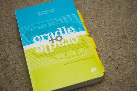
It’s an exciting book, if only because the physical artefact embodies its message:
cradle-to-cradle.jpg

Cradle to Cradle is not made out of paper, you see. It’s a format called Durabook. The Durabook is made of a kind of plastic, and is entirely waterproof. More interestingly, it’s entirely reusable – the ink can be easily removed to allow reprinting or notebook use, and the “paper” itself can be melted down and reused without giving off toxins. It’s a good environmental citizen, essentially: reusable, up-cyclable, and with no harmful byproducts. (It’s also surprisingly heavy for such a slim format).

I found it an interesting read. I found a lot of their later commentary on designing services probably the most interesting and relevant – a lot of discussion on refactoring products (which, by their nature, are designed for disposal) into services (wherein the product can be upcycled or removed from the equation, as it’s the service that matters). The Linc concept mobile phone is a good illustration of the thinking the book suggests.

At times, though, I found it depressing; a lot of the innovations pointed to are McDonough and Braungart’s own, and it would have been good to see more examples from people other than them. Similarly, at times the scale of the challenges described in the book seems colossal, and perhaps impossible.

But I think, taken with a pinch of salt, it’s an interesting read, and there’s some good meat within it. With that in mind, here’s what I marked out for myself as being interesting:

p.24, on Henry Ford’s innovations:

“In 1914, when the prevailing salary for factory workers was $2.34 a day, he hiked it to $5, pointing out that cars cannot buy cars. (He also reduced the hours of the workday from nine to eight). In one fell swoop, he actually created his own market, and raised the bar for the entire world of industry.”

I really enjoyed the section on Ford. They point out that a lot of Ford’s innovations really were more environmentally-friendly than the wasteful, inefficient factories that had preceded them. This doesn’t make it good, per se, but it’s worth bearing in mind. And I love “cars cannot buy cars”.

p.46, on the sentiments of the American Pastoral writers:

“[Aldo] Leopold anticipated some of the feelings of guilt that characterise much environmentalism today:
“When I submit these thoughts to a printing press, I am helping cut down the woods. When I pour cream in my coffee, I am helping to drain a marsh for cows to graze, and to exterminate the birds of Brazil. When I go birding or hunting in my Ford, I am devastating an oil field, and re-electing an imperialist to get me rubber. Nay more: when I father more than two children I am creating an insatiable need for more printing presses, more cows, more coffee, more oil, to supply which more birds, more trees, and more flowers will either be killed or … evicted from their several environments.”

p.60, on the struggle between what Jane Jacobs described as commerce and the guardian:

“Any hybrid of these two syndromes Jacobs characterizes as so riddled with problems as to be ‘monstrous’. Money, the tool of commerce, will corrupt the guardian. Regulation, the tool of the guardian, will slow down commerce.”

p.61, on regulation being a signal of design failure:

“In a world where designs are unintelligent and destructive, regulations can reduce immediate deleterious effects. But ultmiately a regulation is a signal of design failure. In fact, it is what we call a license to harm: a permit issued by a government to an industry so that it may dispense sickness, destruction, and death at an ‘acceptable’ rate.”

p.66-67, on sacrifice and “eco-efficiency” as a way of trying to cut down on the bad things humans do:

“In very early societies, repentance, atonement, and sacrifice were typical reactions to complex systems, like nature, over which people felt they had little control. Societies around the world developed belief systems based on myth in which bad weather, famine, or disease meant one had displeased the gods, and sacrifices were a way to appease them…

But to be less bad is to accept things as they are, to believe that poorly designed, dishonorable, destructive systems are the best humans can do. This is the ultimate failure of the ‘be less bad’ approach: a failure of the imagination. From our perspective, this is a depressing vision of our species’ role in the world.

What about an entirely different model? What would it mean to be 100 percent good?”

It takes them a while to get to that point (in a ~180 page book), but that’s the real kicking-off point for the more interesting arguments – by reframing the problem in a world that doesn’t have a concept of waste, what kind of answers emerge?

p.70, on rethinking the “entire concept of a book” (which is something the artefact of Cradle to Cradle itself does, as mentioned earlier):

“We might begin by considering whether paper itself is a proper vehicle for reading matter. Is it fitting to write our history on the skin of fish with the blood of bears, to echo writer Margaret Attwood?”

p.80, on “nature’s services”:

“Some people use the term nature’s services to refer to the processes by which, without human help, water and air are purified […] We don’t like this focus on services, since nature does not do any of these things just to serve people.”

True “services” have to intend to service a particular need – you can’t just apply the s-word to any available substrate or process.

p.84:

“Western civilization in particular has been shaped by the belief that it is the right and duty of human beings to shape nature to better ends; as Francis Bacon put it, ‘Nature being known, it may be master’d, managed, and used in the services of human life.‘”

p.87, on new approaches to zoning:

“We agree that it is important to leave some natural places to thrive on their own, without undue human interference or habitation. But we also believe that industry can be so safe, effective, enriching, and intelligent that it need not be fenced off from other human activity. (This could stand the concept of zoning on its head; when manufacturing is no longer dangerous, commercial and residentail sites can exist alongside factories, to their mutual benefit and delight.)”

That would make Sim City interesting.

p.88; professor Kai Lee talks to members of the Yakima Indian Nation about the long-term plans for storing nuclear waste within their territory.

“The Yakima were surprised – even amused – at Kai’s concern of their descendants’ safety. ‘Don’t worry,’ they assured him. ‘We’ll tell them where it is.’ As Kai pointed out to us, ‘their conception of themselves and their place was not historical, as mine was, but eternal. This would always be their land. They would warn others not to mess with the wastes we’d left.

We are not leaving this land either, and we will begin to become native to it when we recognize this fact.”

This reminds of Tom Coates’ Native to a Web of Data – we will become native to the web when we recognise that the data structures we create and impose on it will stick around forever, and that we should design them as such.

p.102, on “deflowering” a new product:

“Opening a new product is a kind of metaphorical defloration: ‘This virgin product is mine, for the very first time. When I am finished with it (special, unique person that I am), everyone is. It is history.’ Industries design and plan according to this mind-set.”

p.103:

“What would have happened, we sometimes wonder, if the Industrial Revolution had taken place in societies that emphasize the community over the individual, and where people believed not in a cradle-to-grave life cycle but in reincarnation?”

p.104, describing the two discrete metabolisms of the planet:

“Products can be composed either of materials that biodegrade and become food for biological cycles, or of technical materials that stay in closed-loop technical cycles, in which they continually circulate as valuable nutrients for industry. In order for these two metabolisms to remain healthy, valuable, and successful, great care mus be taken to avoid contaminating one with the other.”

p.120: fittest vs fitting-est

“Popular wisdom holds that the fittest survive, the strongest, leanest, largest – perhaps meanest – whatever beats the competition. But in healthy, thriving natural systems it is actually the fitting-est who thrive. Fitting-est implies an energetic and material engagement with place, and an interdependent relationship to it.”

p.128, on misunderstanding Le Corbusier’s intent:

“Modern homes, buildings, and factories, even whole cities, are so closed off from natural energy flows that they are virtual steamships. It was Le Corbusier who said the house was a machine for living in, and he glorified steamships, along with airplanes, cars, and grain elevators. In point of fact, the buildings he designed had cross-ventilation and other people-friendly elements, but as his message was taken up by the modern movement, it evolved into a machinelike sameness of design.”

p.144, on people’s affinity for certain types of visual:

“According to visual preference surveys, most people see culturally distinctive communities as desirable environments in which to live. When they are shown fast-food restaurants or generic-looking buildings, they score the images very low. They prefer quaint New England streets to modern suburbs, even though they may live in developments that destroyed the Main Streets in their very own hometowns. When given the opportunity, people choose something other than that which they are typically offered in most one-size-fits-all designs: the strip, the subdivision, the mall. People want diversity because it brings them pleasure and delight. They want a world of [paraphrasing Charles De Gaulle] four hundred cheeses.”

p.154, on criteria for new product design:

“High on our own lists [of criteria] is fun: Is this product a pleasure, not only to use, but to discard? Once, in a conversation with Michael Dell, founder of Dell Computers, Bill observed that the elements we add to the basic business criteria of cost, performance, and aesthetics – ecological intelligence, justice, and fun – correspond to Thomas Jefferson’s ‘life, liberty, and the pursuit of happiness’. Yes, Dell responded, but noted we had left out a most important consideration: bandwidth.”

p.172, on the aspects of marketing and selling eco-friendly products:

“A small but significant number o consumers chose to buy the lotion in a highly unattractive ‘eco’ package shelved next to the identical product in its regular package, but the number who chose the ‘eco’ package skyrocketed when it was placed next to an over-the-top ‘luxury’ package for the very same product. People like the idea of buying something that makes them feel special and smart, and they recoil from products that make them feel crass and unintelligent. These complex motivations give manufacturers power to use for good and for ill. We are wise to beware of our own motivations when choosing materials, and we also can look for materials whose ‘advertising’ matches their insides, again as indicative of a broader commitment to the issues that concern us.”

p.185, in a section on “preparing for the learning curve”:

“Biologist Stephen Jay Gould has captured this concept nicely in a way that can be useful to industry: ‘All biological structures (at all scales from genes to organs) maintain a capacity for massive redundancy – that is, for building more stuff or information than minimally needed to maintain an adaptation. The ‘extra’ material then becomes available for constructing evolutionary novelties because enough remains to perform the original, and still necessary, function’. Form follows evolution.”

And that’s all, really. I enjoyed it a lot – though I found its message difficult and overfacing at times, and the perspective perhaps a little smug, there was lots of good stuff in it and it provided food for thought. Thanks to Tom for letting me borrow it, and to Mike for the format this blogpost takes.

Andrei Herasimchuk posted this to the IxDA mailing list, as part of a (reasonably interesting, given the usual turgdity of the list) discussion. The quotation itself was just too good not to lift.

Too much emphasis cannot be placed on the importance of three- dimensional models. We come to this step after we have analyzed and evaluated hundreds of designs and blueprints, trying to bring some quality to the product that will make it easier to use without increasing the cost, more pleasant to look at without any drastic changes in the factory routine. When our ideas have been formulated, we design in clay, then plaster, finally in a material that will simulate the material to be used in manufacturing the actual product. Wherever possible, such models are done in full size. In developing the exterior of a train or a ship, accurate scale models must suffice.

The cost of a model is more than compensated for by future savings. It not only presents an accurate picture of the product for the executives, but it also gives the toolmakers and production men an opportunity to criticize and to present manufacturing problems. Models of some products can be made for a few hundred dollars. Full- scale models of ship or train interiors can cost many thousands of dollars. A mock-up of a modern passenger airplane cabin may cost $150,000 but it will be worth it, for it permits engineers and designers to develop techniques of installation that would not be otherwise possible. Furthermore, sales executives can bring potential customers into a faithful, full scale fuselage to see what it offers, long before production begins. It is far more effective to sit in a chair that judge its comfort by a picture of it.

Henry Dreyfuss, Designing for People, 61-62.

This doesn’t just apply to ships and trains, does it? We’re back to sculpting versus painting again.

Jens Alfke writes about the beauty of the $0.99 iPhone Application. I think he makes a reasonable point: when somebody else is taking care of a lot of the overheads of both distribution and payment processing, there are no compelling negatives to developing micro-priced software applications.

You find where download mp3 music on player, You need mp3 music download from online mp3 archive

What kind of application are you going to sell for $0.99? It doesn’t seem like a lot of revenue for something that you might call “useful” – but I don’t think there’s a lasting market for one-dollar “toy” applications.

I think the interesting market that becomes opened when you apply this kind of thinking to a particular platform – namely, the iPhone/Touch interface – is one of selling interface.

A good way of explaining this is with a currency or unit converter application (bear with me).

As it stands, if you want to convert from, say, imperial weight to metric, you can just fire up the iPhone’s built in Calculator application and bang out some arithmetic – as long as you can remember the conversion ratio.

If you don’t know the conversion ratio, you can go online – for free, because you’ve got an airtime contract, or pervasive wifi – and look it up, perhaps even finding a nifty Javascript conversion tool. But that’s a long way round for such a simple task.

Or, I can sell you my $2 weights-and-measures converter. It doesn’t do anything fancy, because we’ve already established that the maths isn’t beyond any potential iPhone user. So the single thing I can sell you on – and the single reason you’d buy my app over the long way around described above – is because of its interface. How easy is it to use? How satisfying? Does it simply a complex task?

The iPhone exposes “interface” as an obvious criteria for purchasing things. Because the interface is so hands-on, so direct, users can easily spot when an interface stinks, or when it’s as easy to use as Apple’s own applications. Given that: let’s make an application where the interface is the primary feature, and the functionality is essentially trivial.

Here’s what my hypothetical weights-and-measures conversion application might look like. You choose what you want to convert to and from via a pair of drop-down boxes at the top of the screen. The drop-down highlights which things on the right-hand side are similar types of measurement to those on the left – so that when you select “metres” on the left-hand side, the units of length on the right-hand side are highlighted. And then, underneath, are two vertical, gradated rules – much like on a slide rule. Above them is the exact value readout; at the centre of the screen is a red marker line. You flick one “ruler” up and down with your thumb, and the other moves in accordance to display the converted value. You can then read exact values out at the top of the screen. If you want to slide horizontally, tip the phone on its side and the accelerometer will tell the software to rotate the screen.

The really neat thing isn’t the conversion at all – it’s just two big rules that you can flick about with your finger. But when you’re out shopping and have only got one hand free, maybe that’s exactly the interface you need. The app is a basic, trivial task, that’s enlivened by a useful interface.

Now, obviously I can’t charge you $10 for this. If I asked for $10, most people would either keep guesstimating weight when they go out shopping, or just use the calculator like they’ve always done. But for $2… it becomes much more of an impulse purchase. You’re not purchasing functionality; you’ve got that already. Instead, you’re putting down $2 for the interface I’ve built.

I’m not saying that interface alone isn’t worth a lot, or that it’s worth $2. Far from it. But taking a task that the user could already do and designing an appropriate, specific interface for it, that makes it pleasurable and immediate to use – that’s worth more than nothing. $1, $2 – as long as it’s less than a coffee, but more than nothing, that’s fine. That’s a business model. Not a complete one, or one to base an entire company off, but a business model nontheless.

The iPhone and iPod touch are devices that thrust their interface and interactions front and foremost. They’ve established within a market full of – in places – terrible interaction design, that it’s OK to pay a premium for devices that work well. People who’ve bought an iPhone or an iPod Touch have already made that premium decision. The iPhone Application Store tells us that it’s OK to pay a smaller sum for software that works well. It doesn’t matter that it’s not premium software, or that the software isn’t sophisticated; what matters is that we’re make money from genuine interaction design, rather than a list of features. That feels like another tiny watershed moment.

Making bridges talk

28 February 2008

I’ve written before about how wonderful Twitter can be as a messaging bus for physical objects. The idea of overhearing machines talking about what they’re doing is, to my mind, quite delightful.

So when I found an untapped data source for such an object, I thought it was worth having a poke. Half an hour of scripting later and Tower Bridge was on Twitter. It tells you when it’s opening and closing, what vessel is passing through, and which way that vessel is going. The times are determined by taking the scheduled time for the “lift” and subtracting five minutes for the opening, and adding five minutes for closing – the official site suggests that, at rush hour, lifts should take five minutes to open and close tops.

That’s it, really; it’s just a simple case of scraping some data and outputting it. It’s not a hugely frequent event, so won’t disturb you very much; if anything, it’s just a little insight into the heartbeat of the Thames.

As a note on its design: it’s very important to me that the bridge should talk in the first person. Whilst I’m just processing publicly available data on its behalf, Twitter is a public medium for individuals; I felt it only right that if I was going to make an object blog, the object should express something of a personality, even if it’s wrapped up in an inanimate object describing itself as “I”.

And, if you want proof that it works… how about this:

Tower Bridge on Twitter

I’d set the server up yesterday; suddenly, this morning, it twittered into life, and we charged out of the office around the corner to the bridge, where the MV Dixie Queen was getting into position for its lift. As it went through, I took a picture. That was a very satisfying moment.

(Thanks to Tom for helping me bash a crontab and a few other server-shaped things into shape. If you’re interested in the technology, which is really not very relevant, it’s about thirty lines of Ruby that glues together a combination of: wget, Hpricot, John Nunemaker’s Twitter gem, and cron.)

Updated June 22nd 2011 with the new URL for the bot, following this whole series of events.

I acquired Reading the Everyday from work several years ago, and only recently got around to reading it, in part after Alex’s hugely enthusiastic feedback. It turned out to be a wonderful read. I’m not particularly well-versed in cultural studies, so much of the French work Moran refers to is somewhat new to me. It is, however, fascinating to see such a uniquely British study of the everyday; just as the French ideals of le quotidien are very much rooted in 50s France – and the Parisian suburbs especially – so Moran focuses on a Britain that developed in the 60s, 70s, and 80s, through the booming newtowns into Thatcherism.

The book gets especially good as it moves out of criticism of theory and into more focused case-studies, on everything from bus-shelter advertising and queuing to the M25 and traffic lights. Anyhow, enough rambling. On with the quotations, from dog-eared pages, or (more often) just stuff I underlined. It’s been a while since I read a book with a pencil so vigorously in hand!

p.3:

“It is hard to stand at a bus stop, as the single-occupant cars stream by, without feeling somehow denied full membership of society”

p.7:

“Henri Lefebvre suggests that everyday life is increasingly made up of this ‘compulsive time’, a kind of limbo between work and leisure in which no explicit demands are made on us but we are still trapped by the necessity of waiting.”

p.47, on the final episode of The Office:

“It is about the forgetfulness of office life, the way that its impersonal procedures do not acknowledge the finite trajectory of individual lives, despite the leaving dos and retirement parties that lamely suggest otherwise.”

p,65, in a wonderful section all about the Westway:

“In truth, the Westway provokes conflicted emotions, commensurate with our cultural confusion about the relationship between the individual freedom of driving and the collective horror of traffic congestion.”

p.86, on how we read images from CCTV cameras:

“The telltale digits in the corner of the screen revealing the date and time convey not the reality of round-the-clock surveillance but the specific moment at which an extraordinary event happened or was about to happen.”

p.98, on motorways as an example of what Marc Augé called “non-places”:

“The importance of the road sign in the non-place, for Augé, is that it allows places to be cursorily acknowledged without actually being passed through or even formally identified.”

p.101, quoting Chris Petit’s commentary on his film “London Orbital”:

“[the M25 is] mainline boredom, a quest for transcendental boredom, a state that offers nothing except itself, resisting any promise of breakthrough or story. The road becomes a tunnelled landscape, a perfect kind of amnesia.”

and later in that page, on Iain Sinclair’s book of the same name:

“Sinclair notes that in the nineteenth century, the area now occupied by the M25 housed mental hospitals and sanatoriums, and represented the safe distance to which Victorians would remove contaminated parts of the city.”

p.108, in a section on service stations:

“When they first opened, young people would drive to the service stations at high speeds to play pinball, drink coffee and eat ice cream, as a more alluring alternative to the only other all-night venue, the launderette.”

I never thought of that – launderettes as the only mainstream 24-hour venue in the provinces. Like so much of the book – a great wake-up call.

p.132, in the chapter on “Living Space”, Judy Attfield offers commentary on home makeover shows like Changing Rooms:

“…such shows elevate a notion of design, which she defines as ‘things with attitude’, over the banal reality of material culture, which she calls ‘design in the lower case’.”

Totally. I loved this distinction – the idea that things with attitude, so valued at the temporary level (a cool thing in a shop, the first five minutes of staring at a made-over room) are not necessarily the things we want to spend long periods of time with.

p.145, quoting Paul Barker on ‘Barratt’s transformation of Britain’s vernacular landscape’:

“When the social history of our times comes to be written, he [Lawrie Barratt, the company’s founder] will get more space than Norman Foster. You can search out Foster masterpieces here and there. But Barratt houses are everywhere. Foster buildings are the Concordes of architecture. Barratt houses fly charter.”

p.157, on Moran’s trip to Chafford Hundred, a new housing-estate-cum-new-village in Essex:

“Walking around Chafford Hundred, it is not long before I am completely lost – partly because the sameness of the houses provides no landmark, and partly because the curvilinear streets are disorientating. Invented in American tract developments to close off the vista and protect the viewer from the unwelcome sight of an endless row of subdivisions, the curvilinear street has the unfortunate side effect of destroying any sense of direction… getting lost in Chafford Hundred seems like a metaphor for housebuilding as a political black hole.”

p.161:

“In a note to its clients, [investment bank] Durlacher observed: ‘Probably the best indication of difficulties in the market will be when Property Ladder is no longer commissioned”

p.164, on the design of the Trabant:

“Its accelerator pedal even had a point of resistance part of the way down to discourage excessive fuel consumption.”

Moran points out that everything about the Trabi was counter to the traditional “counternarratives of speed, status and freedom” that cars espouse in the Western world, but I love the idea of the values of a society and culture being literally built into the products it produces; the socially-responsible accelerator pedal feels like a very good example of that.

p.167, on the problematic aspects of “mourning and coping narratives” in a post-9/11 world:

“…they confront us with and ‘ordinary life’ whose normality is never questioned. It is more difficult to make a similar imaginative connection with Iraqis or Afghans killed by bombs dropped from fighter planes, because their daily lives are not so easily recognizable or represented.”

Moran talks a lot about the dangerous ideals of “ordinary life” and “ordinary people” in his books – concepts we know are very dangerous in the concept of design. The idea that their are specifivites in our understand of the everyday that do not map elsewhere is a very important one, and a reminder that if anything is presented of foreign culture in the media – especially the news media – it is rarely the truly “everyday”.

More on that further down the page:

“Richard Johnson points out that the term ‘way of life’, which has a particular resonance in cultural studies and was constantly reiterated by politicians such as Tony Blair and George Bush in the months after September 11, ‘resists instant and “fundamentalist” moral (or aesthetic) claims to superiority without letting go of evaluation entirely’. It conflates ‘the necessary sustaining practices of daily living and the more particularly “cultural” features – systems of meaning, forms of identity and psycho-social processes – through which a world is subjectively produced as meaningful'”

p.169 – the final page, and a wonderful quotation from Henri Lefebvre to conclude these notes:

“Man must be everyday, or he will not be at all.”

A great book, then. There’s masses in it about ideas of mundanity and the everyday, and I got a lot out of it from a design perspective, particularly. It also looks like it will overlap with Adam Greenfield’s “The City Is Here For You To Use” quite nicely. Highly recommended!

I recently worked with Matt Webb on a proof-of-concept for a new interaction pattern for web applications, that we’ve nicknamed Snap. Matt demonstrated this pattern in his closing keynote at Web Directions North. Matt’s presentation, entitled “Movement”, is now online, as is a longer explanation of the Snap pattern at the Schulze & Webb blog.

Given Matt’s side of things is now online, it seemed only right that I share my side of the story.

We’re demonstrating a concept that’s previously been referred to as RSS-I – “RSS for Interaction“. This is an idea Matt mentioned in his ETech 2007 keynote, from Pixels to Plastic, and also in a presentation from Barcamp London in 2006. Here’s Cory Doctorow writing about the first mentions of the idea. Matt’s new name for this pattern is a bit catchier: Snap, which stands for “Syndicated Next Action Pattern”.

If you’ve read those links, it’ll describe a certain pattern for interaction. If you’re lazy, and haven’t read them, in a nutshell: what if RSS feeds could prompt you not only to updated and new content, but also actions that need to be performed?

This is the kind of thing best explained with a demonstration. And so Matt asked me to build a small application – a to-do list program – to demonstrate Snap at WDN. Our application isn’t anything fancy, and it won’t replace your GTD app of choice just yet, but it does demonstrate some of the interactions that Snap affords rather neatly.

You can watch a short screencast of the application here (The application is called “Dentrassi”. For more on that, see this footnote).

In the application, a user can add todo-list items to it, set a priority, and “tag” them as belonging to a project. There are several listing views of the data in the application. The inbox shows all items in progress that don’t belong to a project (ie: aren’t tagged). There are list views for each tag, and also for items that have been deferred to the future. So far, so good.

All of this data is also available as Atom feeds. The Atom feeds present the same information as the website, with one neat difference: at the bottom of every item, there’s a form embedded. And in that form, you can do everything you can do to the item on the site: defer it, tag it, complete it, or trash it.

So not only can you read all the data you’d normally see on the site, you can also interact with it, without leaving your feed reader. When you complete a successful interaction, a big tick appears.

The big tick was something we stubmled upon whilst we were making Dentrassi. If you’re on the web-app side of Dentrassi, and you mark an action completed, you get a typical Rails-style “flash message” letting you know what’s happened. This was also the case in the feed, to begin with – you’d post the form, and then the web page would render inside the feedreader’s viewport. Which is OK, but not great. Then we hit upon the idea of treating requests from feedreaders and browsers differently. There’s no magic user-agent-sniffing – the RSS feeds have an extra hidden field, that’s all. When that field is set, you get a big tick (or a big cross, if you try to work on stale data). You can see in the video that Matt’s added a really simple “add another task link” to the “big tick” page in certain states, to speed up task entry. Once the big tick was in place, it started to feel like I was actually making a thing, rather than a hack.

There’s also an extra feed, which we’ve called the admin feed. This only ever has two items: a generic message telling you the state of the system – how many things are in it, how many are completed – and a form that lets you create a brand-new todo. From your RSS reader.

That’s it. It’s not very sophisticated, but it demonstrates the interaction Matt’s described pretty well: the syndication of interaction, rather than content.

What’s the future for this kind of thing? I don’t know. “Enclosures for interactions” was the best way I could describe one future I’d like for it: the idea that endpoints for interactions could be specified just as we currently specify things like referenced media files; then the user interface for Snap is down to the tool, rather than the feed itself. That’s easily the most exciting future, but it requires standards, and toolmaker support, and people like Tim or Sam to be onboard (or whoever the Tim and Sam of Snap might be), and all that takes time.

(And: when you can let the agent define the interface, what interfaces you could build! I suggested pedals – I can have my yes/no tasks up in a window and rattle through them with my feet whilst I’m reading, or writing email, or whatever, just like foot-controlled dictation machines. Because Snap emphasises, rather than obscures, the natural flow state we get into when we’re working our way down a list, it generates a sense of immediacy around the simple action of “doing tasks”. The forms can be contextual to the actions in question – complete/wontfix, yes/no, attend/watch – whilst the actual interaction the user performs remains the same.)

Snap also demands different kinds of RSS readers. Traditionally, readers cache all information, meaning as items “fall out” of the feed they remain within your feed reader. But we don’t want that; we’d like items that fall out to disappear. A Snap feedreader should be an exact mirror of all the atom feeds available to it, not a partial mirror.

That’s precisely the opposite behaviour of existing, content-oriented feedreaders. Right now, most of what we’ve shown is a little bit of a hack: we’re relying on the fact that, for whatever reason, you can use <form> elements in an Atom feed, we’re relying on this being a local application, for a single user, and we’re relying on it working on a very limited number of user agents (I’ve only tested NetNewsWire and Vienna so far). There’s a way to go before full-scale RSS-I is possible – but there’s nothing to stop people taking a simple, hacky approach right now.

And so that’s what we did. Because a simple, hacky approach that exists beats any amount of RFC-drafting and hypothesising. The most valuable thing we have to show for this so far is that it works.

How it works doesn’t really matter. As such, you’re almost certainly never going to be able to download the source code for this application. The code really isn’t important; it’s not bad at all, but to distribute it would be to miss the point. What we’re trying to demonstrate with this is a particular interaction, and that can be demonstrated through narratives, screengrabs, and screencasts.

That’s all there is to say; Matt’s longer post on his company blog encompasses everything I’ve not mentioned here (and a few things I have), and as such, should be viewed as a companion piece. It’ll be interesting to see what happens from here – how, as things like Action Streams take hold, patterns like Snap have a growing place in the web ecology. It’ll also be interesting to see what happens with, say, standards for these kinds of things – enclosures and the like – and how the tool manufacturers react. All in all, it was a fun project to work on, and I hope other people find the interaction as exciting as Matt and I do.

(Matt mentions that I nicknamed that application “Dentrassi”. I find it useful to have names for things; when I’m sitting at ~/Sites/ and am about to type rails foo to kick off a new project, it’s nice to have something – anything – to call the application. I thought about DEmonstrating RSSI, and the only word in my head that had things in the right order was DEntRaSSI. The Dentrassi, for reference, are an alien race from the Hitch-Hiker’s Guide to the Galaxy. I’m not a Douglas Adams nut, or anything – it was just the only word in my head at the time. So rails dentrassi it was, and off we went.)

I bought a new mouse recently, and was very impressed with it as a piece of product design – so much so that, much like Jack and his Bang and Olufsen radio, I felt it was worth writing about a bit. (Apologies to Mike Migurski for paraphrasing his “blog all dog-eared pages” concept)

Logitech VX Nano

This is the Logitech VX Nano. It’s a wireless laptop mouse, so it’s quite small. It’s not bluetooth; it has a wireless receiver.

Underside

The wireless receiver is stored inside the battery compartment, on the underside.

Receiver-20080123.jpg

Here’s the view inside the battery compartment: two AAA batteries stacked, and the receiver just above it. You push the eject button to pop the receiver out. When you pop it out, the mouse turns on; when you click it in, it turns off. You can also turn the mouse off with the power button you can see – eg, when you’re putting your laptop to sleep.

Size comparison

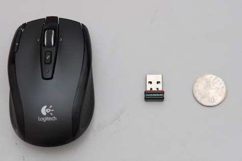
And here’s the receiver. That’s why they call it Nano. Impressive, eh? The reason the receiver’s inside the battery compartment is that they don’t expect you to unplug it from your laptop much – it’s small enough to leave in all the time. Like so:

Receiver in laptop

It’s so small it doesn’t even stick out the side of the new Apple keyboards.

So the receiver’s a marvellous feat of engineering. But it doesn’t stop there; it’s also a lovely mouse to use.

Closeup of top

There are five buttons: left and right, obviously; button 3 is the small “search” button; buttons 4 and 5 – nominally back and forward – can be seen top left.

What’s really exciting is the mousewheel.

Wheel-20080123.jpg

The wheel is weighty, metal, and has a rubberized grip. It’s 2D – you can nudge it left and right. That’s not the cool bit, though.

When you move the scrollwheel, to begin with, it subtly clicks as it passes each detent. So far, so scroll wheel. However, when you push it down, it clicks very loudly, and with a great mechanical feeling. And then, when you spin it… there’s no resistance. It spins entirely freely; the ratchet disengages. And all of a sudden, you understand why it’s a weighty bit of metal – it acts as a flywheel, and spins very freely. You can gently roll it, flick it, and stop it immediately with a light touch. And then a single click puts it back to detented mode.

It’s a wonderful device; a really nice mouse, with lots of lovely design features that manage to be stylish, technically brilliant, and genuinely useful; I’m enjoying it more than my previous Microsoft laptop mouse (which was great, despite its somewhat oversized receiver).

One last touch I really liked. This:

Bag-20080123.jpg

It even comes with a small mesh bag for you to put it in. Why do I like that? Well, it shows that Logitech know that a) you’re going to transport the mouse around a lot and b) that they want you to treat it as a premium product. If you throw it into your bag, it’s going to get all dinged up and scuffed in no time. So you also get a nice, fairly anonymous, perfectly-sized neoprene/mesh bag.

It’s the little touches that make a lot of the difference. A thoroughly recommended product – and it still makes me grin every time I eject that receiver.

Adam Greenfield recently mentioned this:

“The ability to ‘read’ a medium means you can access materials and tools created by others. The ability to ‘write’ in a medium means you can generate materials and tools for others. You must have both to be literate.”

That neatly taps into a lot of what I’m thinking about (and failing to write about here) at the moment. Things like this, and mixing your own paint, and programming-as-act-in-its-own-right versus programming-as-necessary-evil, and a whole host of other questions (such as what it is I actually do).

Things are slowly coalescing. This quotation coalesced a great deal, and deserved more than a mere del.icio.us link…

Deliberance

18 November 2007

Time for my second post about the Epson R-D1, which I was lucky enough to play with when my colleague Lars bought one recently.

Along the top surface of the camera is what looks like a film-advance lever: the winder you crank to move to the next shot on a film camera. Obviously, there’s no film to advance on the digital camera. But the lever still serves its other traditional purpose: it re-cocks the shutter for another shot.

I’ve marked it in the photograph below.

Initially, I thought this was another of the R-D1’s ersatz “retro” features. After all: there’s no real need for such functionality. Even the Leica M8 abandons the film-advance lever. But once I used the camera, the lever made sense to me.

Firstly: it’s somewhere to rest your thumb. That may sound like a silly thing to say, but if you’ve ever used a rangefinder, or an old SLR with a slim body and no moulded grip, the lever becomes a useful way to counterbalance the body in your hand. It’s nice to have that familiar anchor-point to rest on.

But far more importantly than that: it makes the act of taking a photograph more considered. It brings to mind one of my favourite quotations about photography, from Ansel Adams:

“…the machine-gun approach to photography is flawed… a photograph is not an accident; it is a concept.”

I love that. Photographs are not something that is taken; they’re something that is made. An image is considered, composed, and then captured. And the life of that image ends there. To take another, you must re-cock the shutter, and start again.

And so the shutter-cocking lever makes the very act of making a photograph with the Epson more deliberate. That “ersatz” retro touch is actually fundamental to the way the camera demands to be used. As a result, you end up taking fewer photographs with the Epson – there’s none of the mad “double-tapping” that sometimes becomes habit with a DSLR. It feels more genteel, more refined – and I think the pictures you end up making with it are all the better for that.

Swings and readouts

07 November 2007

My colleague Lars has just bought an Epson R-D1. If you’re not aware of it, it’s a digital rangefinder (roughly modelled on a Voigtlander) that takes Leica M Bayonet lenses, is hard to find, and noticeable cheaper than a Leica M8.

Epson R-D1

It’s obviously a niche camera: M lenses aren’t common nor cheap, the rangefinder is hardly a mass-market camera paradigm these days, and it’s largely manual – aperture priority, manual focus.

One thing that really caught my eye – and that I initially dismissed as ersatz Japanese retro-fetishery – was the readout on the top. Which looks like this:

To explain: the largest hand, pointing straight up, indicates how many exposures are left on the current memory card. As you can see, the scale is logarithmic – 500+ is the maximum, and as it counts down, the number of remaining exposures is measured more accurately.

The E-F gauge at the bottom measures not fuel, but battery power.

The left-hand gauge indicates white balance – either auto or one of several presets.

Finally, the right-hand dial represents the image quality: Raw, High, or Normal.

Once you know what it means, it’s a wonderfully clear interface: your eye can scan it very quickly. It’s also hypnotic watching it update. To alter the image quality, for instance, you hold the image quality lever with your right hand and move the selection knob (positioned where the film-rewind would be on a Leica) with your left. As the quality alters (and the rightmost needle flicks to the appropriate setting), the exposures-remaining needle swings around to reflect the new maximum number of pictures.

You can’t always see the benefits of analogue readouts in still photographs; this one is a case in point. Once it starts moving – and you start having a reason to check that readout – their clarity becomes immediately obvious.

So whilst I may have thought this kitsch to start with… it turns out to be one of my favourite features on the camera.

(As for that manual “film advance” lever… I’ll write about that in another post. It’s something I found similarly kitschy to begin with, but understood in the end.)