From Phil’s weeknotes:

Last night I came across a Lime e-bike, dead on its side in a disabled car-parking space. I set about rescuing it, thinking that its conventional home, annoyingly littering the pavement, would be less bad.

As soon as I picked it up it started beeping, loudly. Then a computery woman’s voice began saying, “Please unlock me to ride me or I’ll call the police!”

I set the bike upright on its stand but the beeping and the verbal warning repeatedly alternated. I continued walking home, quickly, while the once quiet street was filled with the alarming noise, which slowly faded as I turned a corner. Maybe it’s still going.

First Person Things. Genuine People Personalities. The age of Surveillance Capitalism. The “Smart City”. Alexa-as-cop. Join the dots, write your own blogpost.

Somewhere deep at the intersection of “everything is tech” (tech, the all-consuming industry, rather than technology), “everything is a service” (and thus somebody else’s property you pay to rent), and “everything is increasingly awful in order to service a minority” (in this case: the owners of the bike, frankly, who are interested in preserving their property whilst acquiring new customers).

We joked that the future was rubbish because we still don’t have a jetpack; it is, in fact, more rubbish (and made up of more rubbish) than we perhaps could have imagined. We are all Joe Chip.

Some notes on the ongoing decline of Twitter for its non-human users, with lots of fractal links out to other things I’ve written in the past.

I’ve been messing around on Twitter for a really, really long while. Not just typing in the box about my lunch, but also making daft things that live on it. And it turns out I’ve been writing about that place and those things for quite a while too.

The earliest thing I wrote about Twitter here was, I think, about it as some kind of universal, human-readable, messaging bus. Norm reminded me of this online a while ago, and rereading that, this whole post began to snowball in my head.

I wrote it around the time the Jodrell Bank telescopes started tweeting. Their posts were only loosely human readable… but I’d definitely characterise them as human-interesting: they were the burbling, background-noise of life going on – except this time, it was things talking about doing things, not people talking about doing things. The flickering of the metaverse.

That post is a rare discovery for me: something I almost entirely agree with, eleven years on, and that acts as a useful touchpoint for so much of my later work. I won’t summarise it again; it’s worth a re-read, if only to see what it looked like something could be circa 2007, with only the simplest functionality to go on.

Also: it was an idea that sparked something in me, and would act a little as a lynchpin for a succession of projects.

It also coincided with my programming capabilities being… less terrible. At the time, I worked around the corner from Tower Bridge, and one lunch-hour in 2008 I put together a small piece of code to scrape the publicly published list of bridge times and publish to Twitter roughly when the bridge was opening or closing. Not out of a sense of a utility, though. If anything, I just wanted to see what it’d be like to share my timeline with non-human actors that figured in my life.

I wrote about @towerbridge when I launched it. The image illustrating the post has gone since Skitch went offline; the bot itself has moved and is non-functional right now. But the idea holds true; it still feels like a robust one – and a foundational one for me. And this paragraph is something hugely fundamental for me:

As a note on its design: it’s very important to me that the bridge should talk in the first person. Whilst I’m just processing publicly available data on its behalf, Twitter is a public medium for individuals; I felt it only right that if I was going to make an object blog, the object should express something of a personality, even if it’s wrapped up in an inanimate object describing itself as “I”.

Good actors in systems behave according to the rules of those systems. At the time, Twitter asked you What are you doing?, and so you needed to answer that. If you want a great example of this, the code behind Jim Kang’s wonderful Appropriate Tributes is a fantastic read – it does a lot of work to do its best to respond sensitively, not barge in on conversation, or pick up on inappropriate topics; that feels like base-level interactions for making a non-human actor.

Twitter was a perfect combination of a simple API, a strong set of constraints, and permalinks. It was the easiest place to publish tiny content-y things, give them permanent URLs, and make them web-ish. So more toys followed, that I wrote up. An automated joke. An endless box of chocolates, my first foray into Markov chains and statistically-generated prose (oh, the amount of time I’ve spent explaining that Markov chains know nothing about language). Four bots that sounded like they were hunting zombies together. (A bit of a hack, that: Twit 4 Dead was really four actors reading a prepared script together, rather than genuinely responding to each other. I started work on the latter for a set of bots built around Left 4 Dead 2’s characters, but it never saw the light of day.)

Even recently, I’ve made a fun content-generation bot with CBDQ that spits out endless plots for pastiche John Le Carré novels. (My absolute favourite feature of that grammar is that a valid value for the $SURNAME option is $SURNAME-$SURNAME, meaning it’ll very occasionally spit out double-barrelled surnames, all thanks to the magic of recursion. I’ve only once ever seen it triple-barrel something).

Some of them stuck around; some of them died fast; some of them aged and I couldn’t fix them. But they all let me tickle particular itches. And, as I’d always imagined, they slotted themselves in alongside the burble of my friends and peers, little robot voice amidst the backchannel that floated in the top right of my screen. I enjoyed this, even knowing how this simple party-trick machines largely worked: most of my bots were just gags or toys folded into the stream of posts. I knew they weren’t sentient, weren’t “writing”, just assembling strings from probability. But they made the place feel different.

The writing was on the wall for quite a while. I remember when Tower Bridge disappeared. It turned out the username had been requested by the official exhibition, who according to the terms of use probably did have more of a claim to it than I. I was doing all this a long while before blue ticks, remember. I got the thing back up and running, but it wasn’t quite the same. Seven years ago, I could already see that I was not the type of user the platform was` looking to court.

The changes in August 2018 to the Twitter APIs meant that lots of interesting types of automated accounts just aren’t possible any more. Some have been taken down; other have withered. An art commission I worked on is now unable to function.

I hear about bots on Twitter in the news now, but it’s come to be a vernacular term for “automated accounts of foreign powers and agencies used for nefarious deeds” rather than “automatic content machines for charm and whimsy and art“. I understand why automatic content is most commonly equated with malicious action by platform owners – but I’m still allowed to miss a world that once was.

Every time I see a bot that’s doing new, or interesting, or unusual things, that raises a new smile, I am glad someone else is still doing this. Every time a creator like Darius or Allison announces they’re no longer working in the medium, I am at once saddened and entirely onboard with their reasoning.

Web 2.0 really, truly, is over. The public APIs, feeds to be consumed in a platform of your choice, services that had value beyond their own walls, mashups that merged content and services into new things… have all been replaced with heavyweight websites to ensure a consistent, single experience, no out-of-context content, and maximising the views of advertising. That’s it: back to single-serving websites for single-serving use cases.

A shame. A thing I had always loved about the internet was its juxtapositions, the way it supported so many use-cases all at once. At its heart, a fundamental one: it was a medium which you could both read and write to. From that flow others: it’s not only work and play that coexisted on it, but the real and the fictional; the useful and the useless; the human and the machine.

At the end of William Gibson’s Neuromancer, two AIs that are at the very boundary of legal capacity merge. (Fictional legal capacity, that is: Gibson imagines future laws that restrict the capabilities of AIs). They join, and disappear into the Cyberspace matrix, a new machine intelligence beyond what was previously possible. In Count Zero, set seven years later, new beings – the derivative fragments of that previous intelligence – roam Cyberspace freely, sometimes interacting with humans by manifesting as the Loa of voodoo, using us to achieve their goals and shape our reality.

A second plot device in the book involves tracking down the maker of a series of boxes that look a lot like Joseph Cornell’s work. They’re not Cornell pieces, though; they’re new, being made throughout the plot. In the end, their maker turns out to be another machine, working away in an old corporate space station, making boxes from its fractured dreams with commandeered manipulator arms.

That machine is the smartest of the machine sentiences in Cyberspace, and a ringleader for the others. But the Boxmaker has chosen not to engage with humans directly. Instead, it hides away, and makes art for itself.

As a response to the vastness of Cyberspace, that seems entirely reasonable to me.

In the real world, the terms and conditions have changed. It is 2018, and I miss being friends with a bridge. One age of Boxmakers is coming to an end; I’m most sad that they won’t be making any more boxes of their own.

“…this feels like a design problem – design something that works in a display without you having to be there – and it feels like a challenge design courses should be tackling, particularly the interactive ones.”

In his round up of some design shows he went to, Ben’s “grumpy bit” is spot on. I read it both a nod of recognition, and a twinge of stress-memories.

Having been part of installing a large gallery show, as well as putting on my own digital installation, I can safely say: this bit is really hard, and it is really important. It’s not just about turning it on; it’s about keeping it running. Long-term, if it’s a hassle to start, or restart, or you have to restart it too often… eventually, the attendant responsible for that (if there even is one) will get bored.

I learned this once the hard way. That experience definitely informed some of my later work. That’s what this postwhich Matt B reminded me existed this week – is really about: reducing an installation to two steps:

  • It should work as soon as it’s turned on.
  • If it stops working, it should be fixed by turning it off and on again.

That takes the exhibit from requiring technical know-how to maintain to be being maintainable, and even installable, by any attendant. Fingers crossed it won’t fall over; but if it does, it’s a power-cycle away from coming back online.

(This way of thinking is also why, on one of my installations, there’s one LED to indicate that the power is on, and a second to indicate the code has started executing. It makes it easier to confirm when the thing will start functioning.)

Unfortunately, this is often not as straightforward (or interesting) as the rest of the work; it requires building robustness and resilience into the software and/or installation. But the moment you start having to specify lists of software to start in order, or which USB devices to connect in a particular order (so they always appear to your code at the same positions in an array)… the robustness of your project is just gone. And what it leads to is grumpy sighs from tired people in a gallery about digital installations; grumpy attendants or support staff constantly working out what’s going on with it, or putting the ‘out of order’ sign up again.

What that probably means you might have to investigate: all the weird tools at the edge of your chosen platform, like batch files, Applescript, or upstart. How to turn kiosk-mode on in a web browser from a shortcut. How to run things at startup. How to address USB devices by identifiers rather than indicies. How to turn off screen savers / power saving. Etcetera, etcetera.

It’s a tiring part of the last 5% of a project, but it’s almost always the first thing people will see in a gallery space: is your installation working? It might not be part of the design of the thing you’re exhibiting, but it’s sure part of the design of the exhibit – as much as the promotional postcards, the scrapbooks, the placards. Often at graduate shows, exhibits can feel like they’re designed to have the designer there to explain things – but even on a launch night, that’s almost never the case.

When Ben says “design something that works in a display without you having to be there” – well, that’s the default state for an exhibit. On average, you won’t be there. And so that screen, or interactive, or tablet, isn’t just a nice-to-have; it’s a key part of explaining the exhibit (and it might possibly be the exhibit). So it’s worth the effort keeping it turned on.

In all 17,000 words, this leapt out at me as quite a buried lede for a totally different article:

Sebastian Vivas, the director of a watch museum maintained by Audemars Piguet, the Swiss manufacturer, recently described his industry as unperturbed by Apple’s plans: “We’re not afraid; we’re just a little bit smiling.” It would be a greater threat, he told me, if men widely accepted that they could wear gemstones without a time-keeping pretext.

Still thinking about that. (The rest of the article wasn’t bad either).

The door refused to open. It said, “Five cents, please.”

He searched his pockets. No more coins; nothing. “I’ll pay you tomorrow,” he told the door. Again he tried the knob. Again it remained locked tight. “What I pay you,” he informed it, “is in the nature of a gratuity; I don’t have to pay you.”

“I think otherwise,” the door said. “Look in the purchase contract you signed when you bought this conapt.”

In his desk drawer he found the contract; since signing it he had found it necessary to refer to the document many times. Sure enough; payment to his door for opening and shutting constituted a mandatory fee. Not a tip.

“You discover I’m right,” the door said. It sounded smug.

From the drawer beside the sink Joe Chip got a stainless steel knife; with it he began systematically to unscrew the bolt assembly of his apt’s money-gulping door.

“I’ll sue you,” the door said as the first screw fell out.

Joe Chip said, “I’ve never been sued by a door. But I guess I can live through it.”

This passage from Philip K Dick’s Ubik has been doing the rounds recently, following a tweet from Ian Steadman:

Steadman’s tweet has been enthusiastically retweeted and picked upon. See, for instance, Slate’s article Philip K. Dick Warned Us About the Internet of Things in 1969. That Slate article, like much of the attention Steadman’s tweet has garnered, misses the point spectacularly; it goes on to explain how terrible IoT is, and how prescient Dick is being.

The important words in Steadman’s tweet weren’t “Internet of Things”; the important word was capitalism.

Joe Chip clearly lives in a connected future. We know his homeopape machine talks to some kind of network, requesting news in a particular tone and fabricating it for him.

We know that the devices that make up his conapt know about his credit rating, and hence can refuse to work without either a line of credit or cash money.

The question really is: why does the apartment and its devices know about his credit rating? Why should it matter?

The clue is in the word contract. Joe Chip has signed a Terms of Service (TOS) agreement for his apartment.

Terms of Service, or End-User License Agreements, are problematic because they tend to exist for things you don’t really own: things like software, where even when you purchase it outright you agree to endless EULAs about what you can and can’t do with it; things that have a client-server relationship, where even if you own one end of it – the client – the server is still inside the domain of the corporation; things like subscription services, where the nature of the service (or the content within it, for a service such as Spotify) can change at any time.

It’s that Terms of Service that makes Joe Chip’s conapt suck. It doesn’t suck because it’s connected; it sucks because Joe Chip doesn’t own his own stuff. The TOS/EULA turns everything into hire purchase.

Subscription services make the expensive affordable (the very problem that hire purchase long ago set out to solve). A $600 iPhone is “free” on a particular contract… which often works out more expensive than the airtime and total cost of the phone. But ‘free’ is tempting, especially as the future becomes more expensive to partake of, and when cash upfront isn’t available. How many people have been stung when their ‘free’ device breaks inside a contract?

Joe Chip might have been, because, as we discovered earlier in the chapter (Chapter 3), he is broke:

“Mr. Chip, the Ferris & Brockman Retail Credit Auditing and Analysis Agency has published a special flier on you. Our reciept-slot received it yesterday and it remains fresh in our minds. Since July you’ve dropped from a triple G status creditwise to quadruple G. Our department – in fact this entire conapt building – is now programmed against an extension of services and/or credit to such pathetic anomalies as yourself, sir. Regarding you, everything must hereafter be handled on a basic-cash subfloor. In fact, you’ll probably be on a basic-cash subfloor for the rest of your life. In fact-”

He hung up.

Joe Chip has been able to afford things he technically couldn’t – his apartment, his lifestyle – by sacrificing something non-monetary for the privilege. He gives up particular freedoms in order to own things. Insert endless variants of “if you’re not paying you’re the product being sold” here, but note that Joe has made that an active choice: he is selling himself to own things.

What’s more insidious than the future Joe Chip lives in is a future where that isn’t a choice. IoT is so often dependent on that client-server model – which in and of itself isn’t an issue – but the ToS/EULA that comes along with it can be used to sneak all manner of other horrors onto the unsuspecting customer.

And what’s worse is when the static object, the object that intuitively feels self-contained, turns out not to be – hence the outrage about the Samsung TV that might be ‘listening’ to you. In this case, the sacrifice is that voice-recognition is easier outsourced CPU power and large, constantly updated databases somewhere on the Internet, rather than stored, statically inside a box – but how many people are really aware that a TV, even a Smart TV, is more often a two-way device than not?

The Amazon Echo is obviously not self-contained; it is a parasite that lives in your home, has a nebulous and confusing set of functionality, and which never fails to have me screaming what is the catch?

Objects that talk are useful, but objects that tattle aren’t. Joe Chip’s objects ought to make his life better, but that clearly stopped a long while ago. The horrors described in that chapter of Dick’s novel haven’t come to be because they objects are connected; it’s because of design choices the manufacturers have made to support those objects, and the financial strictures they, and Joe Chip, operate within.

That’s the nugget to really think about: Joe Chip’s house, and Samsung’s TV, are like that because somebody decided to make them that way. Maybe not somebody; maybe many somebodies; maybe somebodies operating within other processes.

In another tale of a strange lock, Bruno Latour writes that “things do not exist without being full of people, and the more modern and complicated they are, the more people swarm through them.The Berlin Key, or how to do words with things, explores how social relations and societal forces are rendered in technology – and also, in the other direction, how technology is coerced by society. You can’t talk about the object divorced from the society and cultures it represents, but you also can’t discuss it without some attention to the technology of the object itself. And, bound up in that object, are people and culture and convention and politics.

The Berlin Key is a cracking essay. (It’s also a fascinating object).

Like the Berlin Key, Joe Chip’s lock also represents the society he exists in, encoding interactions, assumptions, and economics. An SF novelist like Dick can uses this as a shorthand for the world he wants us to see in a single thing.

But the Samsung TV – or the August Smart Lock – aren’t fictional inventions that serve as scene-setting and dramatic devices. They’re really things we can have – I hesitate to say ‘own’ – right now. And they are full of people, swarming through them, and those people bring the culture the exist in, along with the cultures they’d like to exist in in future.

And that means they’re full of a whole boatload of late capitalism. It’s important to acknowledge that explicitly, even if I’m not quite sure what to do about that.

I am pretty sure, though, that Joe Chip’s problem was never his door.

I was talking to Tom and some other people at Matt’s coffee morning this morning, and I mentioned a tiny piece of interaction design I was fond of (that was pertinent to our conversation). Tom said ‘write that up so I can point to it‘, so that’s what I’m doing.

A long while ago, at an agency job, I was sketching out wireframes and interactions for a web-based feed reader. It was designed for users who possibly weren’t that used to RSS, and so it needed to guide them a bit through the best practices of interactions.

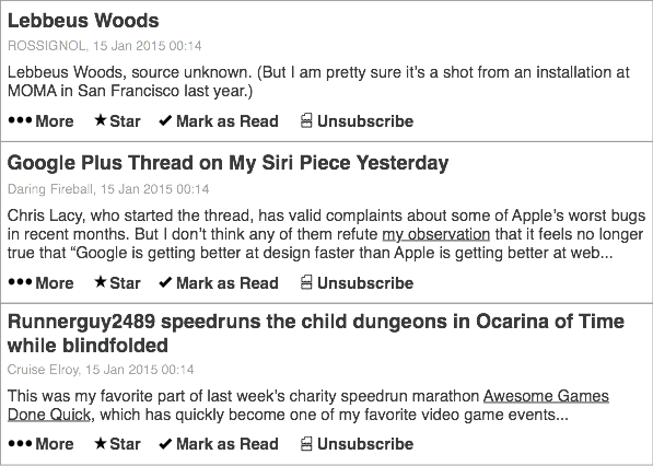
The list of articles looked a bit like this:

rss-reader-step-1
Pretty standard, although the important component was the unsubscribe button.

I put an unsubscribe button on every feed item.

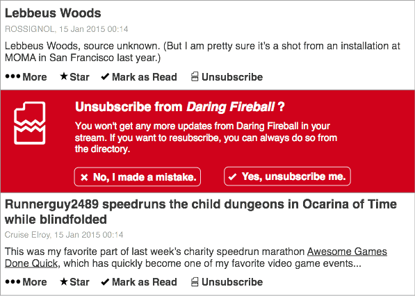
I wanted to stress that if you weren’t enjoying a feed, you didn’t have to read it. Just bin it! You’ll be a lot happier. Clicking the unsubscribe button would do something like this:

rss-reader-step-two

to indicate the severity of your action. I felt that was reasonable – little button, big confirm dialogue. And then boom: the entire feed is gone.

It’s amazing how often you can mark an item as read, or archive an email, before committing to unsubscribing. I wanted to capture how ephemeral subscriptions could be. They weren’t commitments; they were just things you’re interested in.

I think the me-of-2015 would also ensure that there was a way of triggering this interaction based on patterns of behaviour. For instance, asking the user if they want to unsubscribe from a feed if they’ve marked it as read a surprisingly short time after they looked at it (indicating they hadn’t read an entry). And, similarly, checking a few weeks later that you didn’t want to subscribe back: frequently, I unsubscribe from things just because I need a break, or I don’t have the space – not because I want them gone forever.

It’s very easy to offer final, decisive actions; they’re very native to dialogue boxes, buttons, and digital systems. But some things are ephemeral, and it’s important to stress that in design. Just because I unsubscribe form a feed, or unfollow someone on Twitter, doesn’t mean it’s final: I might want it back one day; I might be taking a break from my higher-traffic friends. I wanted to try encouraging that.

And I wanted to remind users that there was an alternative to ‘inbox overload’: you could just have a break.

In these two stills, drawn a bit from memory, there’s a lot of gaps – and I’ve not sketched any of the possible animation or motion that would help convey what was going on. Still, that interaction – offering what feels like the nuclear option front and centre, reminding the user that it isn’t a nuclear option – I quite like that.

The Shipping Forecast

16 September 2014

Berg is closing.

I worked there from 2009-2011 – employee #1, really. It’s a time and place I am hugely fond of. I learned a lot there.

I wrote something on a train last week after Matt’s post for week 483. I think it was mainly for myself; maybe I’ll publish it sometime. But then I found something better to share.

Warren Ellis’ The Shipping Forecast is a story in this year’s MIT Technology Review SF special, Twelve Tomorrows. On morning.computer, Warren explained his story thus:

When Bruce Sterling commissioned me to write a piece for MIT TECHNOLOGY REVIEW, he had a specific brief: imagine a future where BERG won, and launched the future from the back of their Brutalist gulag in Shoreditch. I dragged Schulze and Webb into the pub — Jones was gone by then, in his constant search for the next new thing, off to Google to direct larger launch facilities — and poured beer into them in an attempt to get them thinking about what was next.

I read the story last Friday morning; I had just got up to it in the collection. Over lunch, sat in the office canteen, I read the story. And this passage stopped me, entirely, in my tracks:

“We were very wonky back then. Everyone else was talking about drones and smart glasses and brain scanners and god knows what else, and we were trying to get washing machines to talk to the world. We got laughed at a lot. ‘Internet fridge’ was the punch line. We put the lamps and the early versions of the senders into people’s houses and people thought we were making toys. It took a while before people got what we were doing.”

“Well, you were inventing a business, right?” Emilija wasn’t sure where this was going and wanted to move it along.

“No,” said Signy, raising a finger. “Same mistake everyone else made. What we were doing was launching political probes into people’s homes.” She looked into her coffee cup and sighed.

“I’m not following,” Emilija said. “Political?”

“The personal is the political. Our social choices are political choices. We didn’t do the things that tech companies were supposed to do. We didn’t move fast and break things. We didn’t disrupt and abandon. We didn’t do moon shots. We created a future by sitting the world down with a cup of tea and a bun and asking it some questions.”

It’s just a story, about fictional companies and people, but reading it in week 483 winded me a bit; made me sit up sharply. And then breathe out, and remember to keep striving to achieve exactly that: a future that’s gentle, human, considered.

Thanks for the story, Warren. Thanks for everything, Berg.

Infinifriends

10 February 2014

Time to write up something that’s been sitting around on various disks for a while.

Many months ago, I saw Plotagon. It’s best explained as Xtranormal by way of The Sims: reasonable resolution, 3D-animated videos based on scripts; a desktop tool to generate them, and a site to host them.

Most interestingly, it’s scripted with what actually looks like movie scripts, and that got me thinking: what would it look like to feed it with procedurally generated scripts? Could you make the machine make videos? All I knew was two things:

  1. I know, for good or ill, how Markov chains work.
  2. All the scripts for Friends are transcribed on the internet.

After all, given Plotagon’s focus on semi-realistic forms, I decided that it was best suited to the great American artform of the 20th century: the sitcom.

The Infinite Friends Machine was born.

The machines does a few simple things. First, it scrapes Friends transcripts. For now, it works for most of Series 1. It then parses those scripts and chops them up into episodes, scenes, and lines attributed to individual characters. It also strips out some directions. Then, using all that, it offers ways to generate new scripts.

Markov Chains, as Leonard has frequently pointed out, are not always the best way of generating text alone, especially when the corpus you’re working from isn’t particularly consistent. He is, of course, right. Still, I enjoy the mental leap readers make in order to make generative prose actually make sense, and for this project, I mainly wanted to get to scripts as fast as I could.

Still, I didn’t want to hamper their relative crudeness, so I tried to skew things in their favour. To that end, the Infinite Friends Machine generates scripts by copying the structure of existing scripts. When it makes a new “episode”:

  1. it finds the scenes that are in the original episode it’s being copied from
  2. for each scene, it finds each line – who says a line at what point in the episode
  3. then, it generates a new line for the speaking character from their own corpus. That is: Joey only ever things derived from Everything Joey Has Ever Said. What this means is that the main cast have quite diverse things they might say, and the bit players pretty much only say the same thing. Gunther is quite boring.

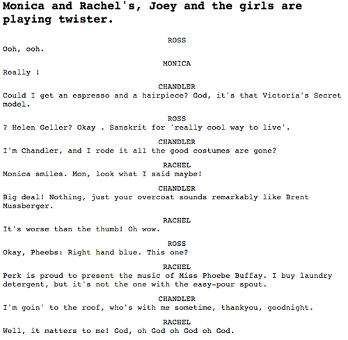
That’s it. A few seconds later, it spits out a nonsensical episodes of friends. Here’s a scene:

Friends script
and this is a full episode.

The machine isn’t online because it’s quite crude and processor-intensive, but you can get at the sourcecode from Github.

Anyhow: machine to generate scripts. Next stage: get them into Plotagon.

This was where my troubles began. For starters, despite having a nice format for scripts, Plotagon really demands you enter them via its UI – you can’t paste a big block of text in, you have to enter it by hand. Painful.

Next: Plotagon only lets scenes have two characters in. I decided to make a single scene – the tag on the end of the episode. But this turned into many scenes in Plotagon, as four people in an apartment was a bit much for it. I had to keep track of who was where, who was talking to whom at any point.

And then I had to deal with the unfortunate truth: Plotagon is horrible. I mean, Xtranormal used its non-realistic avatars and computer-voices to comic extent. By contrast, here we had disappointing voice acting with clunky visuals. Also, I had to add some ‘acting’. This largely consisted of making Chandler say everything whilst doing the (crazy) emote, to really capture that Series 1 Matthew Perry vibe.

A quick sting later, and Infinifriends S1E1 existed:

It is not exactly high art.

Just one scene took long enough, and I think, proved my point to an extent, but probably can’t be improved on for now. I’m not sure if I’ll ever return to the Infinite Friends Machine, but it was an entertaining enough exercise, and the video rendition is probably worth it for the cringe factor alone.

Theme tune. Credits. Tune in next time.

Knitting

24 October 2013

E3136546caea11e2928c22000a9f3092 7

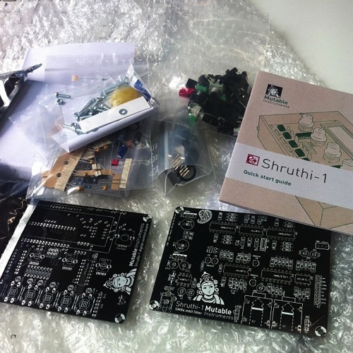
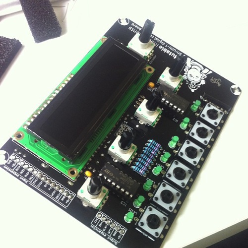
I built a synthesizer this year: a Mutable Instruments Shruthi. I didn’t design it or invent it; it was designed by Olivier Gillet, who released it in kit form. It’s not very expensive – about £150 with the case as well.
3acfbaf8c84011e296c422000a9e0891 7

It arrived in a few plastic bags, and I also ordered the lasercut enclosure. And then, I spend a few happy afternoons putting it together.
92006200ca0c11e2b04622000a1f9be0 7

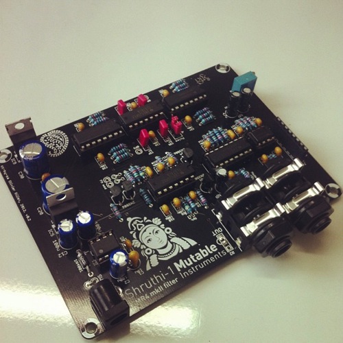
All it required was moderately competent soldering, the ability to follow instructions, and patience. In that regard, it differed little from building Lego, much like I did when I was small. And for the seven or eight hours it took to build, I was lost in my work: entirely happy, paying care and attention to things being made with my hand – occasionally taking out the multimeter to check I hadn’t fluffed a joint.
D34ab69ccada11e2a95722000a9f09e9 7

It’s a lovely instrument, with a really interesting sound. It’s a hybrid analog/digital synthesizer: digital oscillators and envelope, but analog filters. The filter is the bottom of the two PCBs, and there are lots of different ones available, for builders looking for different sounds.

Because of that weird structure, it’s not quite like your average analog monosynth. Yes, it can do that – but it also has all manner of interesting digital oscillators, not to mention wavetables (and custom wavetables if you want it), which you can step through with an LFO and… you get the picture. It has some really fat, interesting sounds; a bit like an ESQ-1. But there’s not much on the market like it – and nothing that sounds like it for less than about three to four times the cost.

2cc3cb36cae111e2b36722000ae90e0a 7

It went together fairly smoothly, with only one error that came down to forgetting to completely solder in an IC socket. I mounted it in its case, and added two small switches – one for power, one to swap between two- and four-pole filters.

It’s hugely satisfying to make noises and music with something you’ve built with your own hands. And, though it’s just assembly, there’s a degree of craft going on; care and precision, using tools. That practice has definitely fed into the electronics I’ve constructed myself this year.

What I Talk About When I Talk About Knitting

I’ve characterised this sort of work recently as both whittling and knitting. Something to do with my hands, to empty my head, often between projects.

I think there’s value to just going through motions – what a martial artist would call a kata. It’s why I work through exercises on exercism even after I’ve hit a working solution; why I worked through the Ruby Koans even though I know the language. They’re both warm-ups and refreshers; it is good for the hands to go through motions before they start real work.

It reminds me of watching my Mum knit; she can knit during almost anything. She likes the things she makes, but I’m pretty sure there’s also just a habit of having something to do with one’s hands. It doesn’t always have to be challenging, or harder than last time. It has to be familiar, expected, calming. Progress, learning comes out of repeating the straightforward, just as much as it comes from trying new things. Craft is something to be honed as well as practiced.

A couple of months back, I left a theory-heavy conference session with an urge to make something, anything with my hands – just to offset a slight feeling of impotence that came out of lots of ideas being discussed without implementation. “Whittling for the soul,” I called it at the time.

The Shruthi sounds good, but it felt it’d shine with some effects – a shimmer of delay, or maybe some distortion.

It turns out guitar effects pedals are not that hard to build. This week, between some projects, I did some more knitting.

The Delay Box
Cf44ec36327a11e3aca722000ab7858a 8

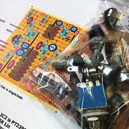
There’s a huge culture, it turns out, of building your own effects boxes – the schematics of existing boxes are reverse-engineered and shared by guitarists on forums, and slowly they piece together PCBs or stripboard layouts. I got a bit lost in Tagboard Effects. But in the end I settled on this delay pedal, which happened to be available in kit form at Bitsbox (a favourite supplier of mine).
641c7510337311e3aa4422000ae90e71 8

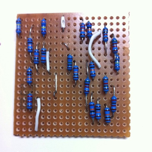
Again: I’m not an electronics engineer; I can piece things together, and have worked out a few little boards to package Arduino projects. This layout felt within my grasp – with hindsight, it was perhaps a bit ambitious for a first board.
7deb1e92337311e3a03a22000a1fbd56 8

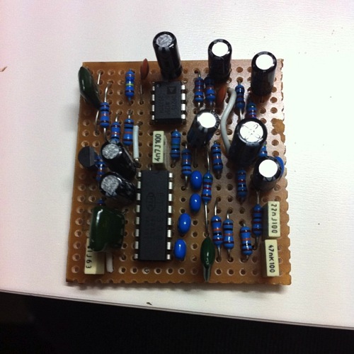
It took a handful of hours to put together the board, working through the layout, patiently cutting and linking the stripboard. I’m not that proud of the soldering on this, although coming back to it later, it’s not too bad.
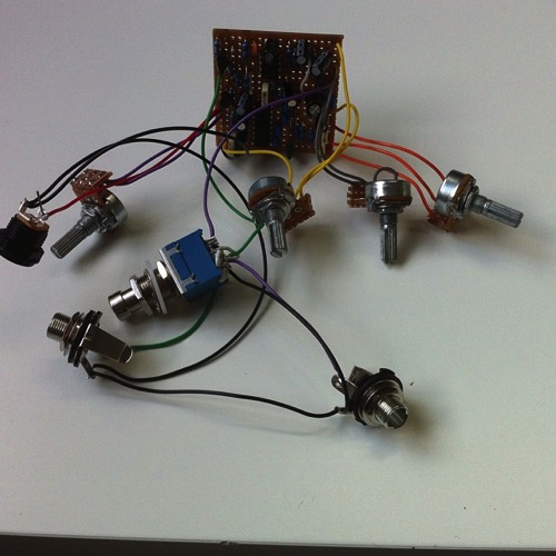
7e8ac88e369811e389b122000a9f18c4 8

Once the board was populated, I started work on the offboard wiring: rigging potentiometers to little breakout boards, linking up the jack leads and DC socket. Next time, I’m going to do this once the components are in the box – I ended up with a correct circuit, but by god it’s a tangle.
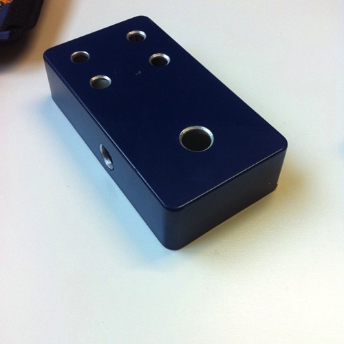
2b089d9a370511e398b622000a1fbd3a 8

Of course, a stompbox is nothing if it’s not in a box. So I sat down with a Hammond 1590B, a unibit, and a carefully laid-out template in Illustrator, and got drilling.

I’ve said it several times: boxes will chew you up and spit you out if you’re not careful. I did a reasonable job here – only one hole too large, and I could have been more generous with the spacing. Fitting everything inside was fiddly and tight – I was convinced everything was going to short out. That hole I cut too large led to internal space being cramped. And yet: somehow, I slotted it all in, screwed it tight, jammed the back on.

(It’s worth noting: Hammond enclosures, especially these pre-painted ones, have a great feel to them).

61c84cae3cb411e3b0d822000ae80177 8

A few silver knobs, and the box was complete. The delay worked first time, and sounds delightful – not quite an analog tape delay, but not a perfect digital shimmer; just a hint of degradation as it tails off. Fiddling with the delay time whilst sound’s going through leads to lovely pitch-shifting, and it begins to oscillate and feedback really nicely in the right circumstances.

It didn’t work for a while – and then I discovered the box was fine; it was my jack lead that had sheared internally when I wasn’t looking. A new jack lead, and my guitar was shimmering and dancing away.

Yes, it was just assembly. But it was more than that, too. I refined my manual soldering skills again; I spent some time away from the screen, instead inhaling the delightful smell of solder fumes; I continued to level up at building enclosures – I think this was the most refined one yet, and my first in metal. A really nice artefact.

And again: the fiero of making sound, making music, with a thing you put together yourself.

It was a good piece of knitting in every sense.

I think this type of work is important. It’s easy to spend time learning new things, and pushing ourselves – but it’s equally good to spend time in a relaxing, comfortable space, and enjoy the act of executing well. Craft is not always about the new: it’s also about being able to repeatedly execute quality. Which is why making a simple thing well, is good for the soul.

And an added bonus: slowly, I’m heading back towards making types of music I’d not considered, on instruments and devices I’ve made myself. Next on the knitting list: a fuzz pedal or two, to be built when the next project is over. Or perhaps sooner, if my hands get itchy.
Tocabuilders

I’ve been playing a little with Toca Boca‘s latest iOS toy: Toca Builders.

As you’d expect from Toca Boca, it’s charming: a straightforward, paired down implementation of an idea, with unambiguous UI and lovely character design.

Builders is Toca’s take on a block construction toy for small children. Initially, it might seem a bit clunky, a Minecraft pastiche that’s not nearly so sophisticated as Mojang’s original. After all, it’s a tiny play area compared to Minecraft – six blocks of height and relatively small X-Y dimensions.

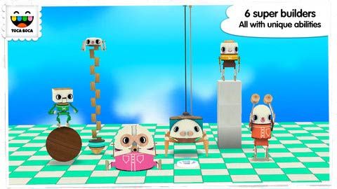
It’s the plural in the title that makes it so interesting, though: builders. This is not (just) a game in which the user is a builder; it is a game about six individual builders (pictured above). Each has their own different ability: most can both construct and desturct; almost all can control the colour of blocks; some are better at changing blocks after the fact, others at sketching with. They each control slightly differently – and they each manifest in the landscape. You can swap between builders with a simple or menu, or by tapping on any that you can see.

It’s the manifestation and personification of the four builders that suddenly clicked for me. As I played this, I realised what it really was: Minecraft through the eyes of Seymour Papert. Lego as LOGO.

Papert explained the LOGO turtle as an “object-for-thinking-with“. Not just a device to command, attached to a programming language; a device that you see the world through. Or as Papert says in Mindstorms, his wonderful book about the development and intent behind LOGO:

“objects in which there is an intersection of cultural presence, embedded knowledge, and the possibility for personal identification.”

He makes what I think is a clearer point later, though, and which I think Toca Builders captures perfectly:

Even the simplest Turtle work can open new opportunities for sharpening one’s thinking about thinking: Programming the Turtle starts by making one reflect on how one does oneself what one would like the Turtle to do. Thus teaching the Turtle to act or to ‘think’ can lead one to reflect on one’s own actions and thinking. And as children move on, they program the computer to make more complex decisions and find themselves engaged in reflecting on more complex aspects of their own thinking.

Papert is sometimes quite wordy. When I explain this to people, I tend to say: the value of the Turtle is that when you are stuck, you solve the problem by pretending to be the Turtle. This is especially valuable for young learners; as Papert points out later:

Children can identify with the Turtle, and are thus able to bring their knowledge of their bodies and how they move into their work of learning formal geomtetry

There are some lovely photos in Mindstorms of kids on a playing field, practicing Logo; one of them is being the Turtle, and the others are telling her what to do. The second you act out a program for yourself (or watch another child follow your instructions to the letter), you see how literal you need to be, or which line of code is ambiguous. You begin to see how the computer processes information (“thinks” being, unfortunately, an entirely inaccurate word).

This kind of embodied representation of computational logic is very rare. Often, the hard things in computer science are very abstract. I do not know how to “pretend to be the compiler”; I just have to trust input and output.

Toca Builders takes the abstract building of Minecraft – tools attached to a disembodied perspective (albeit one hindered by some degree of personhood – factors such as gravity, and so forth) – and embodies them to help younger children answer the question which tool would you use to place a block where you need to? Or sometimes backwards: which block shall we place next? It is not quite as freeform as Minecraft, but it actually forces the user to think a little harder about planning ahead, lining up his builders, and which builders go together well. Measure twice, cut once.

To that end, it’s much more like real-world building.

Papert was very clear about one particular point: the value of this is not to think in mechanical ways; it’s actually the opposite. By asking children to think in a mechanical way temporarily, they end up thinking about thinking more: they learn that there are many ways to approach a problem, and they can choose which way to think about things; which might be most appropriate.

And so Toca Builders is, in many ways, like all good construction toys: it’s about more than just building. It’s about planning, marshalling, making use of a limited set of tools to achieve creative goals. And all the while, helping the user understand those tools by making them appear in the world, taking up space in it, colliding with one another, and needing moving. All so that you can answer the question when you’re stuck: well, if you were Blox the Hammer, what would you do?

Some of what looks like clunkiness, then, is actually a subtle piece of design.

If you’re interested in the value of using computers to teach – not using computers to teach about computers, but using computers to teach about the world, then Mindstorms is a must-read. It’s easy to dismiss LOGO for its simplicity, and to forget the various paradigms it bends and breaks (more so than many programming languages) – and it’s remarkable to see just how long ago Papert and his collaborators were touching on ideas that are still fresh and vital today.