Appealing UX at tourfilter

03 January 2007

I was, partly in jest, invited to join tourfilter by a friend today. What started as an elaborate social-networking joke turned into a really positive piece of user-experience I wanted to document.

What I wanted to share was the sign-up process. Normally, with social-networking sites, you have to endure some form of semi-elaborate sign-up before you’re allowed in… and then you start having to ram content in. Tourfilter neatly turns that on its head.

Tourfilter is a site that scrapes listings pages for information about your favourite bands, generating emails, RSS, or iCalendar files to keep you up-to-date. It’s a really simple, single-minded site that gives music fans personalised listings.

For a new user, there’s a form on the left of the homepage with a large textarea, in which you write the names of bands you like. I entered one band name… and via Ajax, a huge list appeared to the right of the field, of other bands I might like. Of course, I did, so I started clicking on some of them to add them to my form… and the process slowly became addictive. Pretty soon, I had a long list of bands I’d be potentially interested in seeing in London. The Ajax made it very compelling, and pretty quick. And, of course, the more bands I added, the more useful the fly-out Ajax list was, because it had better data to compare against.

Underneath the text box are three fields: username, password, and email address. Once you’ve filled them out, all you have to is click the submit button… and your brand new account is created, with all the information you’ve just filled out.

So tourfilter reverse the customary process: you add your initial data first, and only then create the account. Once you’ve done that, everything’s ready to go. I really enjoyed this experience: the Ajax element quickly showed the value of the site, which only increased the likelihood of me signing up.

I think tourfilter still has a little way to go – sometimes its scraping leaves something to be desired – but still felt its compelling sign-up process was worth commending.

Around a year or more ago, I had an interview for a job (which I was offered, and which for various reasons I had to turn down). There were two great questions in it:

Give me an example of design you love,” and “Give me an example of design you hate“.

The first was tricky. I needed something I not only loved but that I could explain why loved it (and not sound too cliché at the same time). In the end, I went with the Nintendo Wavebird, for its use of technology (the wireless), texture and shape (both of which vary across all buttons).

It was much easier to find something I hated, though. I’ve always hated – with a real passion – the automatic loos on trains, such as those on Virgin. They drive me absolutely mad.

They have three buttons inside: open, close and lock. When you step inside one, the “close” button flashes, indicating you should press it. Fine. Once you press it, the door shuts, and the “lock” button flashes, indicating you should lock it. Again, fine; you push lock and hear a clunk. What frustrates me is that then the open button flashes and so, obviously, you push it, and the door wanders open, leaving you frantically hammering “close” to stop looking like a wally who can’t work the doors. It’s not just me, either; I’ve seen lots of people do it!

I was asked how I could improve this design.

I think the problem comes in the use of three buttons. Open and close as two seperate buttons I can take, but lock isn’t really a button – it’s a toggle; you need to be able to see both locked and unlocked states. So I suggested keeping two buttons for open and close, and implementing a lever for locked/unlocked. Ideally, the lever should be horizontal, to indicate the locking motion, and to distinguish itself from the two vertical buttons.

It’s a design problem I run into quite a lot, usually on the web, where a collection of radio buttons are used not to switch between several states of one condition, but to represent several unrelated ideas.

Train toilet controls
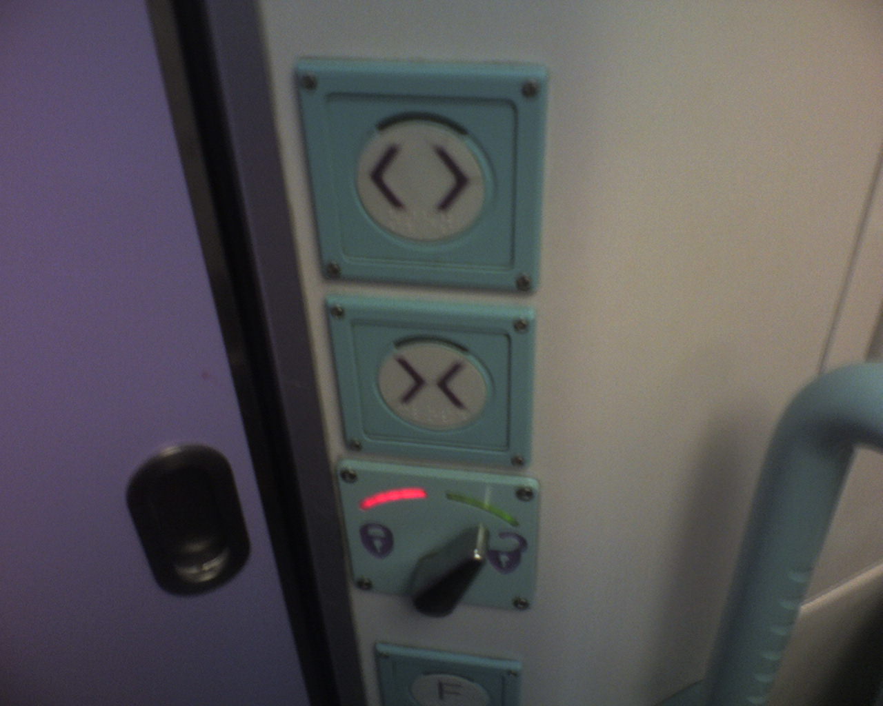
So imagine my surprise when, on the train home this morning, I found that the First Great Western toilets have been substantially modified (see left). At the top, open and close – and then a flick left/right switch for locking, with a red light for ‘lock’ and green for ‘unlocked’.

Much better. I didn’t make a mistake, and was confident that the door was locked (or unlocked) thanks to the visual indication of a lever. It makes me wonder if someone from FGW was sitting in on that job interview…

To cut a long story short: the slides for the talk I gave earlier this week are now available. You can find out more about the talk on the talks page of this site, or you can download the PDF (1.5mb). It should be fairly self-explanatory.

(A brief summary for those of you unable to scroll or click: it’s a client-side-developer’s perspective on Rails, and how to integrate client side development into the build process).

A quick heads-up to two brief speaking engagments I’ve got coming up on the horizon.

First, I’ll be talking about software to tell stories with at the London Techa Kucha night on 25th July that Steve and Tom are running. That’ll be a radio-edit of the talk I gave at Reboot, more or less.

Then, I’ll be talking at LRUG on August 8th, looking at how as a Rails developer you can work effectively with front-end designers and client-side developers, and how you can keep the integrity of your front-end code at the same level as the back-end.

Come along if you feel like it. And if you found out about these events through the blog, do say hi.

Ze knows him some ugly

17 July 2006

“Ugly when compared to pre-existing notions of taste is a bummer, but ugly as a representation of mass experimentation and learning is pretty damn cool”

Ze Frank is so on the money. Good Show, go and watch it.

Availabot!

25 June 2006

So, now that Jack‘s show is happening, S&W have finally decloaked Availabot.

Wow. Suddenly lots of cryptic conversations with Matt over the past few months make sense – mass production, Chinese toy factories, the hell of USB serial communications.

It’s a lovely thing. I really like the emphasis on the individuality – rapid fabrication of appearance, username hard-coded into hardware – one physical thing represents one digital thing, and it’s obvious and understandable without the need for a Thinglink idea or a product code. Matt Jones’ Availabot looks like Matt Jones. When I hand you the red-headed one with a quiff, you know it’s mine; plug it into your computer and that’ll confirm it.

Also, it harks back to the peripheral vision idea of Glancing, I guess; I really like this quotation on the page:

Rather than showing up on your screen, it shows availability as a physical object in the world. That means that you can move the puppet out of view when you don’t want to be distracted, watch out for it when you’re working on other tasks, and have a background awareness of your friends from the corner of your eye.

Hiding things by hiding them on your desk, not your “desktop”. Paper bags, stacks of books, not command-H. We procrastinate (or indicate busy-ness) physically, after all. Made me grin.

Anyhow: awesome concept, probably complex in execution, but very elegant nontheless. I hope it goes somewhere!

I’ve been thinking about tagging a lot recently. One particular thing came to my attention yesterday, and I think it’s worth noting in public.

Users use tags to hack the UI. Tagging isn’t just metadata; it’s metadata you can use.

To wit: a friend mentioned that one of the problems he had with Flickr was that you couldn’t see al the photos from a particular date. Oh, but you can, I said, and showed him the Archives page which does exactly that – it lets you trawl through photographs by date. It’s a really nice piece of design, in fact, so if you’ve never looked at them, go and check them out.

Of course Flickr lets you see things by date – it’s one of the key pieces of data it associates with every picture. Yes, there’s some confusion between “date uploaded” and “date taken on” but that’s dealt with – Flickr lets you view by both.

My friend hadn’t found this supposed lack in functionality a hinrdance, though. Instead, he’s just tagged his photos with a tag for the year (eg ‘2006’) and, sometimes, a tag for the month (‘September’). He’s not the only one – hunt around Flickr for the preponderance of tags like ‘200506’ or ‘20031224’. Lots of people do it.

Why do they do it? Two reasons. Firstly, they’re adding data that they either don’t think is there or that they can’t find. Even though Flickr stores date information, and they can see that at the bottom right of each picture, if they can’t manipulate that data – if they can’t pivot around it – then they store the data in a way they can use it – they stick it in a tag field. And that leads to the second reason: they’re making something to click on.

Making a tag is like making a shortcut button. One click on “2006” shows me all my pictures from 2006. So does the “archives” function but it’s not quite as fast, to be honest, and not as immediately intuitive.

This is true of all tagging systems – tagging makes links, that’s they way it works. So as well as using tags to store data, tags get used to extend and build upon the user interface. As a developer, this has an unexpected bonus. If you see lots of tags emerging storing data you already track (such as dates), consider that the method for accessing data by date might not be obvious (or simple) enough. And if you see enough data of identical format being tracked – often in the form of machine-readable tags, such as geotags, then perhaps it’s time to consider adding a new feature. Tags are a great way to track how uses actually make use of your service.

Matt addresses the issue of the philosophers of Lagado, with regards to Don Norman’s take on the “simplicity” of Google:

“it would be more convenient for all men to carry about them such things as were necessary to express a particular business they are to discourse on”

I refer to it as the “map of the world the size of the world” problem, but I forget where I obtained that concept – it might have been Gulliver, too. The most perfect map of anything is a 1:1 representation of it – you end up making a copy. The trade-off in any navigation aid – menu, sitemap, chart – is accuracy of representation versus accuracy of content (I think). You need a perfect representation – an outline – but you don’t need a perfect rendering of content, because you’ll get that at the destination.

I face this problem a lot in design and IA; you come up with a solution that will work with the current content – and then “current content” grows. And for a while, things scale, but then they stop scaling, and you end up cramming it all in at the top because, well, all the content is competing with one another. And so you end up with a map of the world the size of the world.

The next step is to stop, refactor, and start again – if you have that luxury. Google, by contrast, never let things grow: it’s still practically the same homepage they started with. They avoided the feature-bloat by never letting it happen, and instead, launched their other product by and large, seperately. They may have occasionally integrated them into the results screen, but never the home page. So then usability comes down to intuition (and why shouldn’t it? Even Norman argues that objects should be intuitively usable). mail.google.com – what do you know, it works. maps.google.com – it works. And in making people guess the subdomains, you’re creating better users – users who work out what they’re really looking for quicker. That makes them more adept at your product – because Google’s product is find, after all – and more adept consumers of the internet.

The map-of-the-world problem stems from that horrid, oh-so-web-1.0 site archetype: the portal. We tread a fine line now – at one extreme, a single search box as a gateway to content; at the other, comprehensive indexes and subindexes, homepages of horrendous complexity. I don’t think the “single search box” approach is valid for many, but people are moving that way, and it’s good – away from horrendous taxonomies and indexes and subpages and sitemaps and towards a more organic, find-orientated paradigm.

Don Norman doesn’t believe in find. He likes devices to be “their own instruction manual”, remember – you shouldn’t need to read the book, it should just be obvious. This leads to his crazy telephones with millions of discrete buttons for each function. He’s kind-of right, but he doesn’t like a middle-ground of adaptability, multi-purpose interfaces. Google riles him not because it’s the middle ground in his way of thinking, but the polar opposite.

Revolution

16 September 2005

Everyone knows about it. The designers are going nuts, the gamers are going nuts. I’ve been having mental explosions since this morning and that’s been most enjoyable.

The Nintendo Revolution controller has been unveiled. It’s very, very, very important.

I don’t quite have time to articulate the mental explosions right now – and indeed, many people are hitting the same nails on the head as me. Gillen is probably the most succinct:

“If you don’t like the Revolution controller, you are fundamentally part of the problem and killing the fucking art form”

He is fundamentally right.

Quark rebrand

12 September 2005

So whilst everyone’s been talking about the Guardian‘s brand new look, a far less significant relaunch almost slipped under the radar. Fortunately, my work email tells me that Quark have rebranded and redesigned their site. All looks a bit shiny to me; quite like the new “Q” logotype, the site’s pretty enough, but I’m not a fan of the pale grass-green at all. Is the whole lot just too futuristic for the slightly cranky product? We’ll see. The preview of Quark 7 essentially suggests it’s playing serious catchup to Indesign CS2 (at long last).