Making bridges talk

28 February 2008

I’ve written before about how wonderful Twitter can be as a messaging bus for physical objects. The idea of overhearing machines talking about what they’re doing is, to my mind, quite delightful.

So when I found an untapped data source for such an object, I thought it was worth having a poke. Half an hour of scripting later and Tower Bridge was on Twitter. It tells you when it’s opening and closing, what vessel is passing through, and which way that vessel is going. The times are determined by taking the scheduled time for the “lift” and subtracting five minutes for the opening, and adding five minutes for closing – the official site suggests that, at rush hour, lifts should take five minutes to open and close tops.

That’s it, really; it’s just a simple case of scraping some data and outputting it. It’s not a hugely frequent event, so won’t disturb you very much; if anything, it’s just a little insight into the heartbeat of the Thames.

As a note on its design: it’s very important to me that the bridge should talk in the first person. Whilst I’m just processing publicly available data on its behalf, Twitter is a public medium for individuals; I felt it only right that if I was going to make an object blog, the object should express something of a personality, even if it’s wrapped up in an inanimate object describing itself as “I”.

And, if you want proof that it works… how about this:

Tower Bridge on Twitter

I’d set the server up yesterday; suddenly, this morning, it twittered into life, and we charged out of the office around the corner to the bridge, where the MV Dixie Queen was getting into position for its lift. As it went through, I took a picture. That was a very satisfying moment.

(Thanks to Tom for helping me bash a crontab and a few other server-shaped things into shape. If you’re interested in the technology, which is really not very relevant, it’s about thirty lines of Ruby that glues together a combination of: wget, Hpricot, John Nunemaker’s Twitter gem, and cron.)

Updated June 22nd 2011 with the new URL for the bot, following this whole series of events.

I recently worked with Matt Webb on a proof-of-concept for a new interaction pattern for web applications, that we’ve nicknamed Snap. Matt demonstrated this pattern in his closing keynote at Web Directions North. Matt’s presentation, entitled “Movement”, is now online, as is a longer explanation of the Snap pattern at the Schulze & Webb blog.

Given Matt’s side of things is now online, it seemed only right that I share my side of the story.

We’re demonstrating a concept that’s previously been referred to as RSS-I – “RSS for Interaction“. This is an idea Matt mentioned in his ETech 2007 keynote, from Pixels to Plastic, and also in a presentation from Barcamp London in 2006. Here’s Cory Doctorow writing about the first mentions of the idea. Matt’s new name for this pattern is a bit catchier: Snap, which stands for “Syndicated Next Action Pattern”.

If you’ve read those links, it’ll describe a certain pattern for interaction. If you’re lazy, and haven’t read them, in a nutshell: what if RSS feeds could prompt you not only to updated and new content, but also actions that need to be performed?

This is the kind of thing best explained with a demonstration. And so Matt asked me to build a small application – a to-do list program – to demonstrate Snap at WDN. Our application isn’t anything fancy, and it won’t replace your GTD app of choice just yet, but it does demonstrate some of the interactions that Snap affords rather neatly.

You can watch a short screencast of the application here (The application is called “Dentrassi”. For more on that, see this footnote).

In the application, a user can add todo-list items to it, set a priority, and “tag” them as belonging to a project. There are several listing views of the data in the application. The inbox shows all items in progress that don’t belong to a project (ie: aren’t tagged). There are list views for each tag, and also for items that have been deferred to the future. So far, so good.

All of this data is also available as Atom feeds. The Atom feeds present the same information as the website, with one neat difference: at the bottom of every item, there’s a form embedded. And in that form, you can do everything you can do to the item on the site: defer it, tag it, complete it, or trash it.

So not only can you read all the data you’d normally see on the site, you can also interact with it, without leaving your feed reader. When you complete a successful interaction, a big tick appears.

The big tick was something we stubmled upon whilst we were making Dentrassi. If you’re on the web-app side of Dentrassi, and you mark an action completed, you get a typical Rails-style “flash message” letting you know what’s happened. This was also the case in the feed, to begin with – you’d post the form, and then the web page would render inside the feedreader’s viewport. Which is OK, but not great. Then we hit upon the idea of treating requests from feedreaders and browsers differently. There’s no magic user-agent-sniffing – the RSS feeds have an extra hidden field, that’s all. When that field is set, you get a big tick (or a big cross, if you try to work on stale data). You can see in the video that Matt’s added a really simple “add another task link” to the “big tick” page in certain states, to speed up task entry. Once the big tick was in place, it started to feel like I was actually making a thing, rather than a hack.

There’s also an extra feed, which we’ve called the admin feed. This only ever has two items: a generic message telling you the state of the system – how many things are in it, how many are completed – and a form that lets you create a brand-new todo. From your RSS reader.

That’s it. It’s not very sophisticated, but it demonstrates the interaction Matt’s described pretty well: the syndication of interaction, rather than content.

What’s the future for this kind of thing? I don’t know. “Enclosures for interactions” was the best way I could describe one future I’d like for it: the idea that endpoints for interactions could be specified just as we currently specify things like referenced media files; then the user interface for Snap is down to the tool, rather than the feed itself. That’s easily the most exciting future, but it requires standards, and toolmaker support, and people like Tim or Sam to be onboard (or whoever the Tim and Sam of Snap might be), and all that takes time.

(And: when you can let the agent define the interface, what interfaces you could build! I suggested pedals – I can have my yes/no tasks up in a window and rattle through them with my feet whilst I’m reading, or writing email, or whatever, just like foot-controlled dictation machines. Because Snap emphasises, rather than obscures, the natural flow state we get into when we’re working our way down a list, it generates a sense of immediacy around the simple action of “doing tasks”. The forms can be contextual to the actions in question – complete/wontfix, yes/no, attend/watch – whilst the actual interaction the user performs remains the same.)

Snap also demands different kinds of RSS readers. Traditionally, readers cache all information, meaning as items “fall out” of the feed they remain within your feed reader. But we don’t want that; we’d like items that fall out to disappear. A Snap feedreader should be an exact mirror of all the atom feeds available to it, not a partial mirror.

That’s precisely the opposite behaviour of existing, content-oriented feedreaders. Right now, most of what we’ve shown is a little bit of a hack: we’re relying on the fact that, for whatever reason, you can use <form> elements in an Atom feed, we’re relying on this being a local application, for a single user, and we’re relying on it working on a very limited number of user agents (I’ve only tested NetNewsWire and Vienna so far). There’s a way to go before full-scale RSS-I is possible – but there’s nothing to stop people taking a simple, hacky approach right now.

And so that’s what we did. Because a simple, hacky approach that exists beats any amount of RFC-drafting and hypothesising. The most valuable thing we have to show for this so far is that it works.

How it works doesn’t really matter. As such, you’re almost certainly never going to be able to download the source code for this application. The code really isn’t important; it’s not bad at all, but to distribute it would be to miss the point. What we’re trying to demonstrate with this is a particular interaction, and that can be demonstrated through narratives, screengrabs, and screencasts.

That’s all there is to say; Matt’s longer post on his company blog encompasses everything I’ve not mentioned here (and a few things I have), and as such, should be viewed as a companion piece. It’ll be interesting to see what happens from here – how, as things like Action Streams take hold, patterns like Snap have a growing place in the web ecology. It’ll also be interesting to see what happens with, say, standards for these kinds of things – enclosures and the like – and how the tool manufacturers react. All in all, it was a fun project to work on, and I hope other people find the interaction as exciting as Matt and I do.

(Matt mentions that I nicknamed that application “Dentrassi”. I find it useful to have names for things; when I’m sitting at ~/Sites/ and am about to type rails foo to kick off a new project, it’s nice to have something – anything – to call the application. I thought about DEmonstrating RSSI, and the only word in my head that had things in the right order was DEntRaSSI. The Dentrassi, for reference, are an alien race from the Hitch-Hiker’s Guide to the Galaxy. I’m not a Douglas Adams nut, or anything – it was just the only word in my head at the time. So rails dentrassi it was, and off we went.)

I bought a new mouse recently, and was very impressed with it as a piece of product design – so much so that, much like Jack and his Bang and Olufsen radio, I felt it was worth writing about a bit. (Apologies to Mike Migurski for paraphrasing his “blog all dog-eared pages” concept)

Logitech VX Nano

This is the Logitech VX Nano. It’s a wireless laptop mouse, so it’s quite small. It’s not bluetooth; it has a wireless receiver.

Underside

The wireless receiver is stored inside the battery compartment, on the underside.

Receiver-20080123.jpg

Here’s the view inside the battery compartment: two AAA batteries stacked, and the receiver just above it. You push the eject button to pop the receiver out. When you pop it out, the mouse turns on; when you click it in, it turns off. You can also turn the mouse off with the power button you can see – eg, when you’re putting your laptop to sleep.

Size comparison

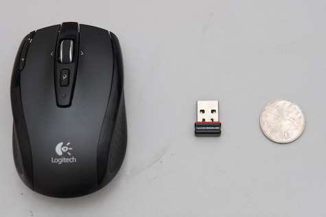
And here’s the receiver. That’s why they call it Nano. Impressive, eh? The reason the receiver’s inside the battery compartment is that they don’t expect you to unplug it from your laptop much – it’s small enough to leave in all the time. Like so:

Receiver in laptop

It’s so small it doesn’t even stick out the side of the new Apple keyboards.

So the receiver’s a marvellous feat of engineering. But it doesn’t stop there; it’s also a lovely mouse to use.

Closeup of top

There are five buttons: left and right, obviously; button 3 is the small “search” button; buttons 4 and 5 – nominally back and forward – can be seen top left.

What’s really exciting is the mousewheel.

Wheel-20080123.jpg

The wheel is weighty, metal, and has a rubberized grip. It’s 2D – you can nudge it left and right. That’s not the cool bit, though.

When you move the scrollwheel, to begin with, it subtly clicks as it passes each detent. So far, so scroll wheel. However, when you push it down, it clicks very loudly, and with a great mechanical feeling. And then, when you spin it… there’s no resistance. It spins entirely freely; the ratchet disengages. And all of a sudden, you understand why it’s a weighty bit of metal – it acts as a flywheel, and spins very freely. You can gently roll it, flick it, and stop it immediately with a light touch. And then a single click puts it back to detented mode.

It’s a wonderful device; a really nice mouse, with lots of lovely design features that manage to be stylish, technically brilliant, and genuinely useful; I’m enjoying it more than my previous Microsoft laptop mouse (which was great, despite its somewhat oversized receiver).

One last touch I really liked. This:

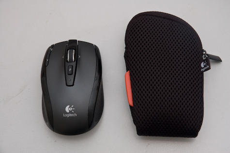
Bag-20080123.jpg

It even comes with a small mesh bag for you to put it in. Why do I like that? Well, it shows that Logitech know that a) you’re going to transport the mouse around a lot and b) that they want you to treat it as a premium product. If you throw it into your bag, it’s going to get all dinged up and scuffed in no time. So you also get a nice, fairly anonymous, perfectly-sized neoprene/mesh bag.

It’s the little touches that make a lot of the difference. A thoroughly recommended product – and it still makes me grin every time I eject that receiver.

Adam Greenfield recently mentioned this:

“The ability to ‘read’ a medium means you can access materials and tools created by others. The ability to ‘write’ in a medium means you can generate materials and tools for others. You must have both to be literate.”

That neatly taps into a lot of what I’m thinking about (and failing to write about here) at the moment. Things like this, and mixing your own paint, and programming-as-act-in-its-own-right versus programming-as-necessary-evil, and a whole host of other questions (such as what it is I actually do).

Things are slowly coalescing. This quotation coalesced a great deal, and deserved more than a mere del.icio.us link…

Deliberance

18 November 2007

Time for my second post about the Epson R-D1, which I was lucky enough to play with when my colleague Lars bought one recently.

Along the top surface of the camera is what looks like a film-advance lever: the winder you crank to move to the next shot on a film camera. Obviously, there’s no film to advance on the digital camera. But the lever still serves its other traditional purpose: it re-cocks the shutter for another shot.

I’ve marked it in the photograph below.

Initially, I thought this was another of the R-D1’s ersatz “retro” features. After all: there’s no real need for such functionality. Even the Leica M8 abandons the film-advance lever. But once I used the camera, the lever made sense to me.

Firstly: it’s somewhere to rest your thumb. That may sound like a silly thing to say, but if you’ve ever used a rangefinder, or an old SLR with a slim body and no moulded grip, the lever becomes a useful way to counterbalance the body in your hand. It’s nice to have that familiar anchor-point to rest on.

But far more importantly than that: it makes the act of taking a photograph more considered. It brings to mind one of my favourite quotations about photography, from Ansel Adams:

“…the machine-gun approach to photography is flawed… a photograph is not an accident; it is a concept.”

I love that. Photographs are not something that is taken; they’re something that is made. An image is considered, composed, and then captured. And the life of that image ends there. To take another, you must re-cock the shutter, and start again.

And so the shutter-cocking lever makes the very act of making a photograph with the Epson more deliberate. That “ersatz” retro touch is actually fundamental to the way the camera demands to be used. As a result, you end up taking fewer photographs with the Epson – there’s none of the mad “double-tapping” that sometimes becomes habit with a DSLR. It feels more genteel, more refined – and I think the pictures you end up making with it are all the better for that.

S60 Touch: flip-to-silence

02 November 2007

So, the latest version of Nokia/Symbian Series 60 has been previewed. There’s even a swanky video for it:

I’m still thinking about a lot of it. It’s clearly aiming at a slightly different market to the one Apple’s gunning for. There’s an interesting separation between “stuff that needs a stylus” and “stuff you can do with fingers/thumbs”. In reality, I think people veer towards thumbs if possible. Does that mean they’ll ignore the UI elements that are so small they need a stylus? Not sure. I haven’t given that enough thought, as I said.

The best bit of the video, though, is nothing to do with touch. It’s the bit where the model silences the phone ringing on the coffee table simply by physically flipping the phone over.

As an interaction, that presumes a lot. It presumes you leave your phone out, and if you do, you leave it face up. Many people leave their phones out (so they can see them skitter across the table when a call/SMS comes in) but face down, so the screen doesn’t annoy them. (Blackberries, with their persistent flashing light, are a prime candidate for face-downing). At the same time, it embraces that behaviour: when the screen lights up, you hide the screen and the phone silences. I like that.

Of course, you could do that on any old phone with a cheap accelerometer inside it. I wish it wasn’t part of some “premium” touch interface, but part of a lowest-common-denominator combination of hardware and software. Oh well.

Rattling

30 October 2007

The other night, Matt was showing me his newly unlocked iPod Touch. I was playing with the shell application – just poking around, running top, etc – and rotated the iPod onto its side, just to see if the screen-rotation stuff worked in the third-party application.

After a while, Matt picked up what I was doing – as I poked around, when I found an app that felt like it should have a horizontal view, I would tip the iPod over, wait a second, and then tip it back.

It reminds me of a running joke my parents had with me ever since I was little. I used to pick up Christmas presents and shake them, and if they rattled, I’d assume that they were Lego (Lego, at the time, being the only kind of present I got that rattled). Ever since, we’ve always joked that rattling presents are Lego. And just like I rattled presents to see if they had the potential to be Lego, so you “rattle” the iPod to see if an application has the potential to be rotated.

You don’t necessarily need a visual signpost (an icon or alert) that such functionality is available; you just rotate the device, wait a second, and then flip it back. As a user, you’re interrogating the user to see if that particular interaction is possible. Is that good design? In some kinds of interaction, I don’t think so; you don’t want to poke every button or crawl through every menu just to find out what is or isn’t possible.

With the iPod/iPhone, though, we’re not crawling menus; we’re just interrogating the device to see if it supports a single kind of interaction. We only want a true or false back from it. Couple that boolean response with the simplicity of the accelerometer interface, and these “rattling” interactions come at a much lower cost.

I like rattling as a metaphor for this kind of interaction; it’s the equivalent of responds_to? in Ruby, I guess. What are other good examples of rattling-type interactions I’m missing? And how good are the implementations of it in software or on the web?

New lick of paint

30 September 2007

So, if you occasionally drop by the website, you might notice there’s a new lick of paint around the place. Nothing too drastic on the surface – under the hood was more drastic.

infovore.org is now running on WordPress 2.3, after a long hiatus on 2.0.x (due to the way the site worked). I’m now relying way less on hacks and custom plugins, and way more on the core codebase. Tagging, for starters, is now native. That’s nice.

I’m also using categories a bit more effectively – you’ll notice some main ones on the right, there, and I’m looking to focus my writing around these topics, I think. It’s a long job to go back and recategorise four years of posts… but I’m going to do it, somehow! In the meantime, if you fancy re-orientating yourself around the site, the new-look archives might hint at what’s going on better.

There’s been all manner of WordPress jigerring, too – mainly around the way the breadcrumb-header works, and how each category colour-codes a lot of its posts.

I’m pleased with the new look. I’m afraid I’ve not tested it in IE6/7, yet, and I’m sure there will be a few rough edges around the place. Let me know if you find any. I think the only one I found was, in my tag migration, everything got tagged as “holiday”. Oops.

(This is a post I wrote on an internal blog at work, and I wanted to reproduce it outside the firewall because, well, I find the issue so fascinating. Given more time, I’d rewrite it for Infovore, with a slightly less preachy tone. But for now, here it is, warts and all…)


This Flickr support thread is a must-read if you’re interested in online communities, and in particular, how they change as they grow.

Flickr’s always been a playful place to hang out; after all, it grew out of Game Neverending. The staff are known for injecting their sense of humour into the product. And so, when that silliest of invented-on-the-Internet-festivals, International Talk Like A Pirate Day rolled around, they decided to have some fun.

What they did was really very trivial, namely:

  • They overlaid a pirate flag onto the Flickr photo
  • They altered the explore page algorithm to display only pirate-related pictures
  • As a bonus, they added an extra option to their langauge-selector at the bottom to every page, to translate text into “Pirate”

All of which was only online for a single day. Sounds fairly harmless, right?

Oh no. Check out the thread. A lot of users – who weren’t aware of the jokey “holiday” were shocked and angry. Many assume the site – or worse, their computer, had been hacked, explaining that they saw the pirate flag as a “universal signal for hackers”. Several pointed out that it’s only funny if you know about it, and complained of Flickr’s bias towards all things American. One person pointed out that many users, for whom English is not a first language, are “already making a great effort” to communicate, and the last thing they need is confusing jokes. With a lot of people, it didn’t go down so well. The mangling of the “explore” page went down even worse – some users complaining that all they want to do is make “beautiful pictures” and share what they deem “art”, but instead the Flickr staff have to engage in “childish” behaviour. (Needless to say, many people complaining about their pictures not making explore were, to be frank, making pictures that had little hope of making explore anyhow).

At the same time, fans of the site fought back a little in the thread, pointing out it’s nice to be part of a community that hasn’t sold its fun-loving soul to the corporates, or that they appreciated the joke. For them, it was exactly the kind of thing they expected from the site – probably because they’d all been users for much longer and appreciate the history. For many of the newer users, less versed in the lore of the community, it was more jarring.

What impresses me is how the staff reacted: they didn’t break frame once. They turned up in the thread, answered the odd question here and there, made the users feel like they were being listened to – and at the same time carried on talking like pirates. They were gently deflating the group ego, and being amusing in the process. But more importantly: they were reinforcing the community values, and also the conceit of the day’s joke. They were making it quite clear: this is a place where we have fun. Not forever, not maliciously, but we like the gags, and they’re staying.

Ultmiately, though the thread has over 400 posts from nearly as many users, that’s still a vastly small fraction of the users of the site – which, remember, has about 1.3bn photographs on it as of now. The thing about a vocal minority is that it’s still a minority. The majority were not vocal enough to complain, or presumably care. That, too, speaks volumes.

It’s a good reminder that, whilst it’s healthy to have a sense of perspective when dealing with user requests and, no matter how community-driven your site is, it’s still perfectly reasonable gentle control over the community’s values. At the same time, it clearly demonstrates the way that communities, by necessity, become more conservative as they grow, and become more conservative as they have to represent a greater spread of languages, cultures, and values. It is, perhaps, a necessary evil of internationalisation. Balancing the focus of the community with the demands of an ever-broadening spread of users is difficult, and the whole thread makes for a great illustration of this difficulty. Do read it if you get a chance. By turns, it’s both amusing and informative.

(And, of course, it’s a reminder that some jokes just don’t translate.)

Eliel Saarinen

26 June 2007

“[objects should be design in their] next largest context – a chair in a room, a room in a house, a house in an environment, environment in a city plan.”

This quotation has emerged several times in the past few weeks. Every time it feels more and more pertinent. Read it; remember it; it is important.