I went to see 1917 when it came out, early this year. Remember cinemas? And at the time, there was something nagging at me throughout. A short while after, I wrote it down, and only now am getting around to publishing this.
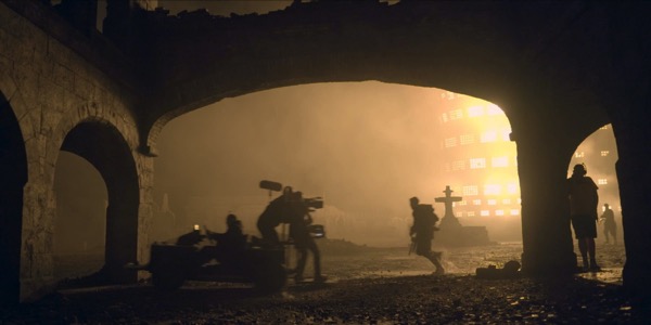
above: Roger Deakins, shooting 1917 and definitely not thinking about Gears of War in the slightest.
I saw 1917 on a really big screen, at a city cinema. It looked really good. I knew it would look really good because the DoP was Roger Deakins, who I am an unashamed fan of, and who has shot some of my favourite films in the past decade or two. (Jarhead! True Grit! Lots more Cohen Brothers films! Sicario! Well, I like his work).
I also know that it was meant to look really good, because the marketing was very keen for me to know that the film was one continuous shot, as if I wouldn’t notice, and here, have lots of behind-the-scenes footage of it.
(The behind-the-scenes footage is catnip if you like how things are made, and how cinematography works, which I do, and I do, so it was catnip.)
But I’m not sure I cared about that piece of technical showmanship, in the end. It is a good enough film, with strong performances, a truly spectacular night sequence lit by flare and fire, and some cracking sound work.
(Seriously, the sound in it is superb, both in terms of recording and post-work, and it sounded great on a big Atmos rig, and I wish they’d go on about the sound like they go on about the pictures, because the interview in this episode of Tonebenders made it clear how hard wireless rigs on sets that big were).
What bugged me were two things. Firstly: I never really understood why it was this single shot, short of something mealy-mouthed about “immersion”. And secondly, I don’t think they went nearly far enough with the potential of that approach, and the grammar it affords.
The camera has agency: it plays a role in the scene, just like the narratorial voice plays a role in a book. A locked-off camera is a third-person narrator – perhaps stagey and theatrical in nature if too static, but it observes what’s going on in front of it. Within a scene, it can feel like limited third-person – this shot is the confines of our knowledge; how you connect shots with editing will determine how omniscient our perspective really is.
But throw that camera onto a handheld rig in an action sequence and the camera develops a personality; it is another person in the scene, perhaps another character in the drama. In that infamous opening of Saving Private Ryan, the handheld camera is a first-person perspective; at times, a documentarian, the sideways pans and motion blur echoing Robert Capa’s photographs from the era. Later, a handheld camera at head height runs forwards, panting forward in the mix suggesting it’s the perspective of a character.
The way a camera moves gives it character. Steadicam affords directors a great deal, but also – for me – feels most omniscient, because it is the most immediately artificial. Here, it says, I am both first person and yet stable, steady, floating through a scene: a first person camera with no immediate personhood. It is as much a shortcut to the uncanny as it is to dynamic scenes.
There’s a shot Deakins uses a lot, especially early on in 1917: facing the protagonists, them walking towards it. We can see them, and how they react to things around them; we cannot see what they’re going towards, what they are reacting to. It’s not uncanny, just unusual; it’s a second-person camera, focusing on a you, staring back at its subject but not letting onto why they are what they are. It’s a powerful early motif in the film, and it works precisely because we are getting to know these characters, and need to stare them in the eye.
We parse cameras by how they move, then, and as the film goes on, 1917‘s camera becomes more and more unreal, and harder to parse. This is partly a technical decision: if you’ve seen the behind-the-scenes footage, you’ll see how ‘the shot’ is composed not just of multiple shots, but also of camera hand-offs and transitions: a handheld camera moves to a vehicle, or onto a crane, or a crane is lifted onto a wire, and so forth. And this means the grammar of the camera changes mid-sentence. I’m fine with it not always being easy to parse, but sometimes I think it dilutes what a camera can mean.
Early on, Schofield and Blake are crossing into No Man’s Land. They approach a barbed-wire fence; one remarks that there’s only one gap in the entire fence. They crawl through the only gap in the fence… and the camera remains parallel to them, moving through some kind of non-gap. The steadicam asserts its unreality. Similarly, it tracks them down the edge of a crater, descending to eye level, before letting them walk into the background, around the edge of the flooded crater… whilst it continues its glide, straight across the water. It’s a camera that flaunts its unreality, wants to remind you how showy it is, but I’m never quite sure why.
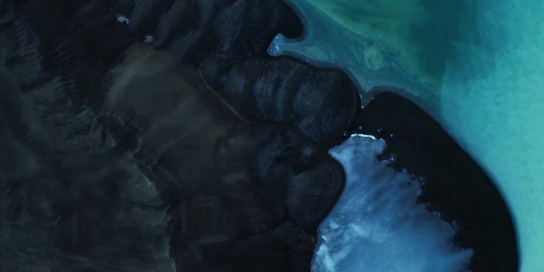
Around the time I saw 1917 I was also watching Season 4 of The Expanse. That show makes an interesting and meaningful decision with its usage of drone footage – or, perhaps, CG-imitating-drone footage, or most likely, a combination of the two, overheads composited or adjusted by computer – to depict an alien world being explored. Specifically: it uses the language of the straight-down-overhead shot. It immediately brings to mind satellite keyhole photography, the slippy photographic maps we see online, and thus you fall into thinking about maps, and cartography, and discovery. It’s an unusual shot but it has clear meaning built into it from the second you see it.
Before and Afters compiled their top ten list of one-ers, and the thing that stands out in all of them is the purpose they serve: illustrating a passage of time; building tension; holding attention; establishing consistency.
There’s a highly artificial one-er in David Fincher’s Panic Room (put together by Buf): some burglars are trying to break into a house, and, when they fail to get in one door, go around the back. The camera begins in the bedroom of the house, descends to the front windows, walks along them, tries to enter a keyhole, and then glides away from the keyhole and through the house – at one point, through the handle of a coffee pot – before ending up at the rear keyhole, where it encounters the burglars again. It’s a creamy glide of a shot, and the VFX have dated a little. It’s also more than a little showy. But it does serve a useful function: Panic Room takes places on a single location, and rather than establishing consistency of time, this shot establishes consistency of space: it lays out the house, the connections between the rooms, makes it clear that there really is no escape, and that the geography we are being shown is going to be important for the film later.
Or you can condense time – use the oner to suggest “everything is happening at once”. Gareth Evans does exactly that in a thrilling camera-hand-off shot in The Raid 2, which in the cinema I barely noticed, because I just read the whole thing as “breathless simultaneous action”. And that’s conveyed by a camera passing between cars, and then through a car, and then onwards, and it’s done with a cameraman dressed as a car seat:
And the thing with one-ers is that they end. The cut at the end of Alfonso Cuaron’s unbearable long takes in Children of Men is the moment you can breathe out. He establishes tension, and then lets it dissipate, or come to a climax. Edits are rhythm, and films vary their rhythm according to the needs of their story, letting their pace echo their narrative.
How do you replace that rhythm with no edits?
This is where 1917 is most successful for me: it moves away from the directness of edits-as-rhythm and instead uses tempo to dictate pace; the shifting grammar of the camera enables that, as does a carefully theatrical approach to direction (from Sam Mendes, who began his career in the theatre). The film may be a continuous shot, but it still has clear breaks between scenes. In one, tree blossoms start floating into view until they dominate the image and a new colour palette tells us we’re in a new scene. (Palette shifts are used a lot in the film as transitions). In another, our protagonists – having been alone for a long while – meet another group of soldiers. First two, who speak to them, and then, out of shot, a whole battalion turns up, and slowly invades the frame.
“How did you not notice [the other soldiers]?” is the facile question to ask of the characters at this point, because really, what goes on in that shot is a classic stage scene transition: one scene ends, the set is filled with actors already in character, moving into position for sensible reasons like “needing a piss”, and then the next scene begins. It’s just the film has felt quite literal until this point, and scene changes like this flirt with a less literal approach to direction and imagery. I liked these.
Throughout the marketing, the production team were honest: the film is a single unbroken shot, but it is emphatically not a single unbroken period of time. In one scene, involving unconsciousness, this is immediately obvious, but I think it’s truer more often than not in the film: it is using the dreamlike time of a single-set play, rather than the realistic time of a single take such as Victoria or, to give credit where credit’s due, Timecode.
My absolute favourite take like that in the film is the shot that begins the night-time sequence. Schofield wakes up in the top floor of a building, goes downstairs, and leaves. The camera doesn’t follow him; it goes forwards, out of the window of the building, and glides down to street level – our Steadicam turned into a crane – and then Schofield walks into shot in front of it. He didn’t run down the stairs: somehow, time passed faster for everyone in the world than it did for the camera. It’s playful, impossible, but visually it works. It didn’t just flaunt the impossibility of the camera; it played with it. I loved it as a clue that this camera was not nearly as literal as it would have you believe.
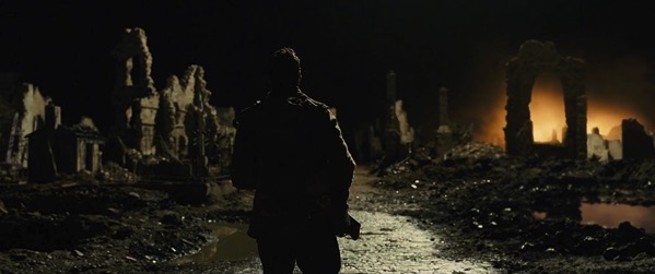
It also drops behind Schofield straight into a shot out of Gears of War.
Because of course, we do have a model for this virtual camera that changes mode all the time. We do: it’s the most virtual camera of all, the videogame camera. And, perhaps more specifically: the camera in a videogame cutscene.
The strangely gliding camera in videogame cutscenes is often, to be honest, a bad thing, for the reasons mentioned above. Why is it moving? Why is it spinning?
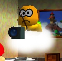
(In Mario 64, the answer is “because Lakitu is floating on a cloud, holding the camera on a fishing rod)
As games have moved towards the cinematic, they have largely started to embrace the edit as a way of telling stories, rather than just the roving, floating camera. (Although there are notable exceptions; God of War (2018) goes for the exact-same single-take gimmick as 1917 and… perhaps makes it work better, even if it’s nowhere near as well shot as Deakins’ work on the movie).
The interesting thing that thinking about the alien camera of 1917 as a virtual camera does is it suddenly gives us grammar to parse it. Game cameras often shift mode or perspective precisely to distinguish between interactive sequences, and sequences where exposition is happening to the player. Lots of games are very good at story telling, but even more aren’t, and I’m describing something highly dated when I talk about this. And yet: “cut scenes”, so named because they cut away to them, are still a thing in 2020, so I’m still going to write about them.
The character on screen was active and playable when the camera was in our chasing-third-person, limited-third-person, or first-person perspective; all of a sudden, the wide shot, group scene, or second-person camera immediately tells us: they have stopped doing and now story is happening to them. 1917 is less clumsy with its transitions, and it uses far more modes for each perspective, but it shoots action and exposition in highly different modes.
Perhaps the videogame attachment to alien, gliding cameras is because of the way their costs – both monetary and digital, in the sense of runtime memory footprint and asset storage – are so different. With a virtual camera and assets, camera moves are largely free – just shift some variables, and let the engine work out how to render a new frame in the next 33ms. On a set, camera moves involve logistics, grip, rigging, setups.
By contrast, an edit is cheap in film: cut earlier, cut later, cut between two shots back and forth, it’s quite straightforward. In-game, you need both sets of assets around for a cut, both fighting for memory and storage, ready for one to be swapped out for another.
That’s easy enough when you’re essentially jumping between two virtual cameras on the same set, but consider how Effect and Cause, the time-travel level in Titanfall 2, presents time-travel as a smash cut: you jump back and forth between the same level geometry in different time periods. The solution, much like The Prestige, is staring you in the face: there are just two largely identical sets of geometry, offset in space, and jumping in ‘time’ is really shifting the camera in space to the ‘past’ or ‘future’ set. An easy enough gimmick, it just requires twice the level geometry in memory. The costs are on memory, then, and also on development time – “just make sure the two sets are perfectly identical” is a constraint and a half.
And all this before you consider camera movement. The virtual camera has no ‘behaviour’ without it being invented, coded – it is work to inject handheld shake into a 3D game camera, wheras you’ll get it immediately when you take a heavy camera off a tripod. The smooth glide that requires grip is just the default for a camera with no weight, mass, or optics.
But really, the thing that set me off on this whole path – 2500 words on 1917, and virtual cameras, and cutscenes, was this:
Why is the cutscene direction in 50 Cent: Bulletproof more inventive than most mega-budget modern games? pic.twitter.com/WrAAxTRfZE
— Andy Kelly (@ultrabrilliant) January 9, 2020
Let’s just parse that shot: the camera goes through the van, out the back, and into an overhead shot of the area the characters are talking about.
It is silly, and perhaps a bit amateurish, but it’s also playful, and weird, and the sort of thing you can only do with a virtual camera. Why not play with the form when you can?
1917 is not a licensed shoot-em-up starring 50 Cent, but I sometimes wished it were more like 50 Cent: Bulletproof than Rope. Every time the film’s camera hinted towards a more surreal flow of time, or a heightened unreality, it worked better; every time it flaunted its own improbability to no end, it worked less. I wish it could have been more playful; perhaps Roger Deakins needs to watch more videogames.
