How long before Rovio enter the hardware market?

I’m serious. This is what Android was surely designed for: cheap, off-the-shelf, no-brand tablets, spruced up with a canny rebrand.

And what could be better than the inevitable $100-200 tablet, running Android 3.0 out of the box, and – even more crucially for the target audience – pre-installed with Angry Birds. One step further, maybe: Angry Birds Universe, the eternally updating, subscription-driven, physics-based puzzler.

The cherry on the top: by default, the device just boots into Angry Birds. What else were you going to use your tablet for? The whole Android universe is there, of course – it’s the extra-added-value – but it’s really just a footnote on throwing birds at pigs.

I’m not even sure that it wouldn’t fly off the shelves.

Take a deep breath; it might not happen. But given everywhere else Rovio are, it doesn’t feel like an extravagant extrapolation to move them into consumer electronics.

There was a line in this blogpost about what it’s like to QA Kinect games that really caught my eye.

The cameras themselves are also fidgety little bastards. You need enough room for them to work, and if another person walks in front of it, the camera could stop tracking the player. We had to move to a large, specially-built office with lots of open space to accommodate for the cameras, and these days I find myself unconsciously walking behind rather than in front of people so as not to obstruct some invisible field of view.

(my emphasis).

It sounds strange when you first read it: behavioural change to accommodate the invisible gaze of the machines, just in case there’s an invisible depth-camera you’re obstructing. And at the same time: the literacy to understand that there when a screen is in front of a person, there might also be an optical relationship connecting the two – and to break it would be rude.

The Sensor-Vernacular isn’t, I don’t think, just about the aesthetic of the “robot-readable world“; it’s also about the behaviours it inspires and leads to.

How does a robot-readable world change human behaviour?

It makes us dance around people, in case they’re engaged in a relationship with a depth-camera, for starters.

Look at all the other gestures and outwards statements that the sensor-vernacular has already lead to: numberplates in daft (and illegal) faces to confuse speed cameras; the growing understanding of RFID in the way we touch in and out of Oyster readers – wallets wafted above, handbags delicately dropped onto the reader; the politely averted gaze whilst we “check in” to the bar we’re in.

Where next for such behavioural shifts? How long before, rather than waving, or shaking hands, we greet each other with a calibration pose:

Calibration pose

Which may sound absurd, but consider a business meeting of the future:

I go to your office to meet you. I enter the boardroom, great you with the T-shaped pose: as well as saying hello to you, I’m saying hello to the various depth-cameras on the ceiling that’ll track me in 3D space. That lets me control my Powerpoint 2014 presentation on your computer/projector with motion and gesture controls. It probably also lets one of your corporate psychologists watch my body language as we discuss deals, watching for nerves, tension. It might also take a 3D recording of me to play back to colleagues unable to make the meeting. Your calibration pose isn’t strictly necessary for the machine – you’ve probably identified yourself to it before I arrive – so it just serves as formal politeness for me.

Why shouldn’t we wave at the machines? Some of the machines we’ll be waving at won’t really be machines – that telepresence robot may be mechanical, but it represents a colleague, a friend, a lover overseas. Of course you’d wave at it, smile at it, pat it as you leave the room.

If the robot-read world becomes part of the vernacular, then it’s going to affect behaviours and norms, as well as more visual components of aesthetics. That single line in the Kinect QA tester’s blogpost made me realise: it’s already arriving.

My lightning talk from Culture Hack Day is now online as a video.

The lightning talks were meant to offer a provocation to the audience. I chose to point at the value of technology in creating art and cultural artefacts. Hack days are so often focused on repurposing and remixing; I think that hacking on culture should, in part, be about creating it as well.

What followed is an eight-minute whistle-stop tour through some art that interests and excites me, and a consideration of how technology might be used within that sort of work. I rather enjoyed this: nice to think outside some of my usual boxes, and focus on some more personal interests.

Dylan is six or seven, and frustrated that his toys don’t live up to their promise:

If the Etch A Sketch and the Spirograph had really worked they would probably be machines, not toys, they would be part of the way the adult universe operated, and be mounted onto the instrument panels of cars or worn on the belts of policemen. Dylan understood and accepted this. These things were broken because they were toys, and vice versa. They required his pity and patience, like retarded children who’d been entrusted to his care.

Jonathan Lethem – The Fortress of Solitude.

I’m enjoy the book a lot, but that paragraph leapt out at me early on and has been dog-eared since.

Margaret talks a lot about one possible pillar of good game design being “how is this interestingly hard?” I described this to her, and she suggested that what distinguished many (but not all) toys as toys were being things that were interestingly shit.

Of course, not all toys are; many of the very best are just genuinely interesting. I immediately leap to Lego to answer that one. But broken-in-interesting-ways allows for subversion and exploration; enjoying it not despite, but because of brokenness. Difficult-in-interesting-ways allows for mastery. Both are interesting, and worth pursuing.

And yet: reading Dylan’s disappointment, as he realises the Spirograph is just not as tolerant a device as the cover of the box suggests, I felt that same feeling in my gut; the same feeling I felt at six or seven, realised all my efforts with my Etch A Sketch were doomed to being rubbish. Interesting, but broken.

Robin Sloan drops some smart science:

Also: what’s a media inventor, anyway? Here’s my (totally made-up) definition: It’s somebody primarily interested in content who also experiments with new technology, new processes, and new formats. Allen Lane was a media inventor. Early bloggers were media inventors. Right now, the indie video game scene is full of media inventors.

Fundamentally, I think, a media inventor is someone who isn’t satisfied with the suite of formats that have been handed down to him by his culture (and economy). Novel, novella, short story; album, EP, single; RPG, RTS, FPS — a media inventor doesn’t like those choices. It turns out a media inventor feels compelled to make the content and the container.

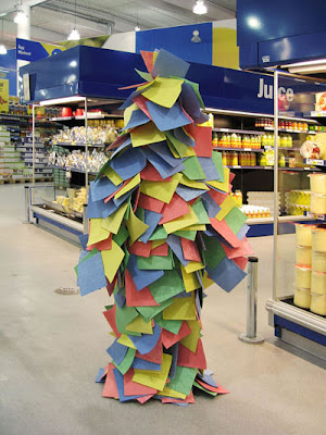
Like it was made out of post-it notes, of course.

Second Order Effects

15 January 2009

Seth Godin recently wrote about the end of newsprint, and how he frankly didn’t care. I think he’s correct about some aspects of journalism, but to talk about newspapers without talking about actual physical newspapers is crazy.

What will we miss?

All the second-order effects. We’ll miss the daily conversation with the guy on the newstand. We’ll miss the cuttings that our parents and grandparents send us in the post. We’ll miss seeing other articles in our peripheral vision as we read – complete articles with photographs and boxouts, not just headlines – as opposed to the ads that surround the online edition. We’ll miss scrawling notes in the margin. We’ll miss leaving them lying around the flat for our flatmates to read. We’ll not have anything to wipe our shoes on.

I say this as someone who’s happy reading from a computer screen, if not from an e-reader. The second-order effects of newspaper journalism being transmitted in physical newspapers are just as compelling a reason for their existence as the intended outcome.

This reminded me of something else that’s been on my mind, relating to another newspaper; this time, one my friends made.

Russell and Ben’s lovely paper is receiving a slowly escalating amount of attention. I’m glad, because it’s really good, and because there’s a (passable) piece of writing by me and lots of (very good) writing by many of my friends in there.

But I’m curious – and perhaps a bit concerned – as to what others might take away from it.

The most important thing about this isn’t “hey, they printed stuff off the internet“. The most important stuff is all the craft, all the second-order effects it has; the details Ben writes about in his excellent post on designing and making the thing; the tangibility it gives to work we’ve done that our non-technical friends (and especially relatives) might never see; the ease of distribution amongst small, hand-to-hand circles it affords; the way you design for (small) mass production rather than one-offs; the reminder that small-scale print is affordable and doable.

Let’s not forget the importance of the immediate first-order effect: this is a beautiful thing, lovely to hold, great to read, fun to show others. In and of itself, it’s delightful (in every sense of the word).

Russell and Ben are, I think, somewhat correct in their closing comment, that “2009 feels like a year for printing and making real stuff in the real world. Its going to be exciting“, but that’s something to consider with caution: making real stuff, printing real things alone, isn’t going to be enough; you’ve got to have the thought, the details, the affordance of second-order effects as well.

I’m excited, for many reasons, as to what 2009 might hold; I hope there’ll be, for me at least, a sizeable amount of making spread across all manner of media – words, things, screens. And, especially, the things that can’t make up their mind which they are. I’m not fussy, and I still think there are lots of interesting problems on screens to solve.

Whatever I’m doing, though, I’m going to try and remember that it’s not just about the idea, not just about the hey-look-a-thing-ness of it all; it’s about the execution, and the detail, and the thought – and embodying that thought in the final product.

To go back to Seth Godin: that’s what newspapers, real, physical, printed newspapers always did. They had affordance out their earholes, and that’s what we loved them for.

I think I’ve found my (slightly corrupted) mantra for 2009:

think twice, cut once.
Fanufacture

08 October 2008

There’s some interesting discussion around Matt Jones’ post over at Schulze & Webb‘s Pulse Laser, where he considers what happens when you apply Kevin Kelly’s ideas around “new economics of scale” for craftsmen and artists to products.

Matt writes:

I joked with Matt and Jack that they should put the price tag of producing a prototype out there, and see who wanted one – or perhaps the price of a short-run of limited edition Olinda, which would reduce it perhaps from four figures a piece to three… Or perhaps the next generation of Olinda, with their input?

There’s some interesting discussion in the comments on the post around whether fans would be interested in constructing or assembling products they’re fans of: Chris Hand comments that

…it’s the soldering and assembly that’s the stumbling block for most who want to [look into limited runs]…

I really like the idea of products having fans. It’s often the early adopters of new products who convince their friends (who often represent a more traditional market) to make the leap. Those thousand “true fans” have the potential to be the people who take the product to a wider audience.

“Fans” act as an intermediate layer between the product and a mass market: they evangelise and amplify it. If you want to make a pun out of it, you could call them middle fan-agement. They take a product and enthuse about it to a wider audience; crowdsourced marketing, if you like.

But what if you went a step further – what if you called upon your fans to actually build the product, in the kind of short runs Jones hints at?

Imagine, for my purposes, a product along the lines of Schulze and Webb’s Olinda, but perhaps in a slightly cheaper price bracket – low three figures at most. The device is still reasonably expensive; however, it has enough fans to easily justify a short run. Rather than consuming S&W’s valuable time with soldering, the early adopters – the fans – buy low volumes of kits. More than one kit per fan – ideally, we’d want people to purchase around five. There are 1000 units of the product, but we only need 200 people to assemble them. Maybe even fewer than that, if somebody’s particularly talented or enthusiastic. There’s no burn-out, and the expense is much more reasonable: everybody’s only making five devices, rather than a thousand.

To continue with the puns, we could call this fanufacture.

Your fans manufacture five kits, and resell four, keeping one for themselves. Of course, they’ve already paid for the kits (much like a Big Issue vendor buys all his magazines up front before he resells them), so S&W are in pocket, and sales is being performed by someone already enthusiastic about the product.

And you don’t have to sell – you could give them away, to parents, or to friends, to seed the network of a social product with keen, happy users, and at the top of the network, a layer of fans.

There are obvious catches – quality control is a screamingly obvious one. But it’s always amazing how far fans will go for a product they like. Look at the community around Moo‘s printed products, for instance: full of enthusiastic fans, ready to not only spend more money, but evangelise about the product to friends and family.

Fans don’t just exist as the core audience you need to make a product successful on any terms; they could also act as a gateway to widespread, mass-market success, and embracing their skills and enthusiasm to outsource tasks you might not otherwise have the time or budget to perform seems like a logical evolution of the fandom Matt describes around products.

A few small changes

09 September 2008

A small tweak to the blog’s design – updating the way comments looked. Ever since this design premiered, I’d been meaning to tidy them up, but never got around to it until today. No idea why it took so long – 10 minutes of sketching and 20 minutes of code was all it took to get there. Anyhow, they now look like this, with gravatars and slightly-better-spacing and all. Feels a little more finished, for the time being.

We Need Engineers

27 August 2008

I’ve delicious’ed this already today, but it’s just too beautiful not to post in full: an advert from Norwegian TV that’s everything that’s right with the world:

Wonderful.