Rattling

30 October 2007

The other night, Matt was showing me his newly unlocked iPod Touch. I was playing with the shell application – just poking around, running top, etc – and rotated the iPod onto its side, just to see if the screen-rotation stuff worked in the third-party application.

After a while, Matt picked up what I was doing – as I poked around, when I found an app that felt like it should have a horizontal view, I would tip the iPod over, wait a second, and then tip it back.

It reminds me of a running joke my parents had with me ever since I was little. I used to pick up Christmas presents and shake them, and if they rattled, I’d assume that they were Lego (Lego, at the time, being the only kind of present I got that rattled). Ever since, we’ve always joked that rattling presents are Lego. And just like I rattled presents to see if they had the potential to be Lego, so you “rattle” the iPod to see if an application has the potential to be rotated.

You don’t necessarily need a visual signpost (an icon or alert) that such functionality is available; you just rotate the device, wait a second, and then flip it back. As a user, you’re interrogating the user to see if that particular interaction is possible. Is that good design? In some kinds of interaction, I don’t think so; you don’t want to poke every button or crawl through every menu just to find out what is or isn’t possible.

With the iPod/iPhone, though, we’re not crawling menus; we’re just interrogating the device to see if it supports a single kind of interaction. We only want a true or false back from it. Couple that boolean response with the simplicity of the accelerometer interface, and these “rattling” interactions come at a much lower cost.

I like rattling as a metaphor for this kind of interaction; it’s the equivalent of responds_to? in Ruby, I guess. What are other good examples of rattling-type interactions I’m missing? And how good are the implementations of it in software or on the web?
Eliel Saarinen

26 June 2007

“[objects should be design in their] next largest context – a chair in a room, a room in a house, a house in an environment, environment in a city plan.”

This quotation has emerged several times in the past few weeks. Every time it feels more and more pertinent. Read it; remember it; it is important.

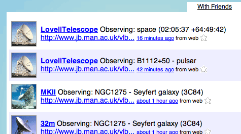
One of the things that’s been making me happiest recently has been the fact that Jodrell Bank’s telescopes have been Twittering. These big machines, peering into the cosmos, chattering to themselves about where they’re currently pointed – and that chatter is overheard and reproduced on the web. Obligatory screengrab, in case Twitter is down:

Jodrell Bank telescopes twittering

It’s cute, and adds to the growing number of non-humans burbling away on Twitter. As I thought about this, it became clear that Twitter isn’t just “the status message turned into communication” (as I usually describe it), but a human-readable messaging bus.

Continue reading this post…

Appealing UX at tourfilter

03 January 2007

I was, partly in jest, invited to join tourfilter by a friend today. What started as an elaborate social-networking joke turned into a really positive piece of user-experience I wanted to document.

What I wanted to share was the sign-up process. Normally, with social-networking sites, you have to endure some form of semi-elaborate sign-up before you’re allowed in… and then you start having to ram content in. Tourfilter neatly turns that on its head.

Tourfilter is a site that scrapes listings pages for information about your favourite bands, generating emails, RSS, or iCalendar files to keep you up-to-date. It’s a really simple, single-minded site that gives music fans personalised listings.

For a new user, there’s a form on the left of the homepage with a large textarea, in which you write the names of bands you like. I entered one band name… and via Ajax, a huge list appeared to the right of the field, of other bands I might like. Of course, I did, so I started clicking on some of them to add them to my form… and the process slowly became addictive. Pretty soon, I had a long list of bands I’d be potentially interested in seeing in London. The Ajax made it very compelling, and pretty quick. And, of course, the more bands I added, the more useful the fly-out Ajax list was, because it had better data to compare against.

Underneath the text box are three fields: username, password, and email address. Once you’ve filled them out, all you have to is click the submit button… and your brand new account is created, with all the information you’ve just filled out.

So tourfilter reverse the customary process: you add your initial data first, and only then create the account. Once you’ve done that, everything’s ready to go. I really enjoyed this experience: the Ajax element quickly showed the value of the site, which only increased the likelihood of me signing up.

I think tourfilter still has a little way to go – sometimes its scraping leaves something to be desired – but still felt its compelling sign-up process was worth commending.

Around a year or more ago, I had an interview for a job (which I was offered, and which for various reasons I had to turn down). There were two great questions in it:

Give me an example of design you love,” and “Give me an example of design you hate“.

The first was tricky. I needed something I not only loved but that I could explain why loved it (and not sound too cliché at the same time). In the end, I went with the Nintendo Wavebird, for its use of technology (the wireless), texture and shape (both of which vary across all buttons).

It was much easier to find something I hated, though. I’ve always hated – with a real passion – the automatic loos on trains, such as those on Virgin. They drive me absolutely mad.

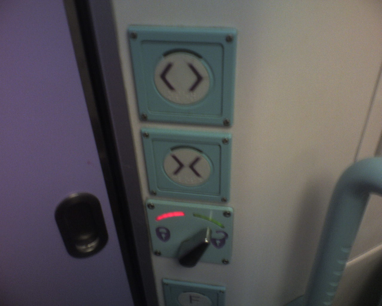
They have three buttons inside: open, close and lock. When you step inside one, the “close” button flashes, indicating you should press it. Fine. Once you press it, the door shuts, and the “lock” button flashes, indicating you should lock it. Again, fine; you push lock and hear a clunk. What frustrates me is that then the open button flashes and so, obviously, you push it, and the door wanders open, leaving you frantically hammering “close” to stop looking like a wally who can’t work the doors. It’s not just me, either; I’ve seen lots of people do it!

I was asked how I could improve this design.

I think the problem comes in the use of three buttons. Open and close as two seperate buttons I can take, but lock isn’t really a button – it’s a toggle; you need to be able to see both locked and unlocked states. So I suggested keeping two buttons for open and close, and implementing a lever for locked/unlocked. Ideally, the lever should be horizontal, to indicate the locking motion, and to distinguish itself from the two vertical buttons.

It’s a design problem I run into quite a lot, usually on the web, where a collection of radio buttons are used not to switch between several states of one condition, but to represent several unrelated ideas.

Train toilet controlsSo imagine my surprise when, on the train home this morning, I found that the First Great Western toilets have been substantially modified (see left). At the top, open and close – and then a flick left/right switch for locking, with a red light for ‘lock’ and green for ‘unlocked’.

Much better. I didn’t make a mistake, and was confident that the door was locked (or unlocked) thanks to the visual indication of a lever. It makes me wonder if someone from FGW was sitting in on that job interview…

Availabot!

25 June 2006

So, now that Jack‘s show is happening, S&W have finally decloaked Availabot.

Wow. Suddenly lots of cryptic conversations with Matt over the past few months make sense – mass production, Chinese toy factories, the hell of USB serial communications.

It’s a lovely thing. I really like the emphasis on the individuality – rapid fabrication of appearance, username hard-coded into hardware – one physical thing represents one digital thing, and it’s obvious and understandable without the need for a Thinglink idea or a product code. Matt Jones’ Availabot looks like Matt Jones. When I hand you the red-headed one with a quiff, you know it’s mine; plug it into your computer and that’ll confirm it.

Also, it harks back to the peripheral vision idea of Glancing, I guess; I really like this quotation on the page:

Rather than showing up on your screen, it shows availability as a physical object in the world. That means that you can move the puppet out of view when you don’t want to be distracted, watch out for it when you’re working on other tasks, and have a background awareness of your friends from the corner of your eye.

Hiding things by hiding them on your desk, not your “desktop”. Paper bags, stacks of books, not command-H. We procrastinate (or indicate busy-ness) physically, after all. Made me grin.

Anyhow: awesome concept, probably complex in execution, but very elegant nontheless. I hope it goes somewhere!

I’ve been thinking about tagging a lot recently. One particular thing came to my attention yesterday, and I think it’s worth noting in public.

Users use tags to hack the UI. Tagging isn’t just metadata; it’s metadata you can use.

To wit: a friend mentioned that one of the problems he had with Flickr was that you couldn’t see al the photos from a particular date. Oh, but you can, I said, and showed him the Archives page which does exactly that – it lets you trawl through photographs by date. It’s a really nice piece of design, in fact, so if you’ve never looked at them, go and check them out.

Of course Flickr lets you see things by date – it’s one of the key pieces of data it associates with every picture. Yes, there’s some confusion between “date uploaded” and “date taken on” but that’s dealt with – Flickr lets you view by both.

My friend hadn’t found this supposed lack in functionality a hinrdance, though. Instead, he’s just tagged his photos with a tag for the year (eg ‘2006’) and, sometimes, a tag for the month (‘September’). He’s not the only one – hunt around Flickr for the preponderance of tags like ‘200506’ or ‘20031224’. Lots of people do it.

Why do they do it? Two reasons. Firstly, they’re adding data that they either don’t think is there or that they can’t find. Even though Flickr stores date information, and they can see that at the bottom right of each picture, if they can’t manipulate that data – if they can’t pivot around it – then they store the data in a way they can use it – they stick it in a tag field. And that leads to the second reason: they’re making something to click on.

Making a tag is like making a shortcut button. One click on “2006” shows me all my pictures from 2006. So does the “archives” function but it’s not quite as fast, to be honest, and not as immediately intuitive.

This is true of all tagging systems – tagging makes links, that’s they way it works. So as well as using tags to store data, tags get used to extend and build upon the user interface. As a developer, this has an unexpected bonus. If you see lots of tags emerging storing data you already track (such as dates), consider that the method for accessing data by date might not be obvious (or simple) enough. And if you see enough data of identical format being tracked – often in the form of machine-readable tags, such as geotags, then perhaps it’s time to consider adding a new feature. Tags are a great way to track how uses actually make use of your service.