I bought a new mouse recently, and was very impressed with it as a piece of product design – so much so that, much like Jack and his Bang and Olufsen radio, I felt it was worth writing about a bit. (Apologies to Mike Migurski for paraphrasing his “blog all dog-eared pages” concept)
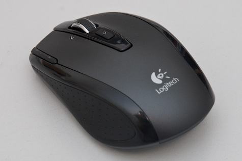
Logitech VX Nano

This is the Logitech VX Nano. It’s a wireless laptop mouse, so it’s quite small. It’s not bluetooth; it has a wireless receiver.
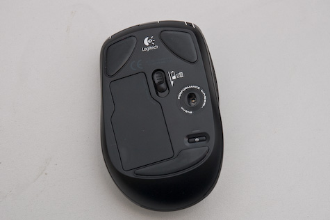
Underside

The wireless receiver is stored inside the battery compartment, on the underside.
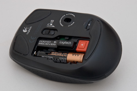
Receiver-20080123.jpg

Here’s the view inside the battery compartment: two AAA batteries stacked, and the receiver just above it. You push the eject button to pop the receiver out. When you pop it out, the mouse turns on; when you click it in, it turns off. You can also turn the mouse off with the power button you can see – eg, when you’re putting your laptop to sleep.
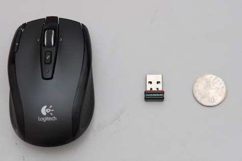
Size comparison

And here’s the receiver. That’s why they call it Nano. Impressive, eh? The reason the receiver’s inside the battery compartment is that they don’t expect you to unplug it from your laptop much – it’s small enough to leave in all the time. Like so:

Receiver in laptop

It’s so small it doesn’t even stick out the side of the new Apple keyboards.

So the receiver’s a marvellous feat of engineering. But it doesn’t stop there; it’s also a lovely mouse to use.

Closeup of top

There are five buttons: left and right, obviously; button 3 is the small “search” button; buttons 4 and 5 – nominally back and forward – can be seen top left.

What’s really exciting is the mousewheel.

Wheel-20080123.jpg

The wheel is weighty, metal, and has a rubberized grip. It’s 2D – you can nudge it left and right. That’s not the cool bit, though.

When you move the scrollwheel, to begin with, it subtly clicks as it passes each detent. So far, so scroll wheel. However, when you push it down, it clicks very loudly, and with a great mechanical feeling. And then, when you spin it… there’s no resistance. It spins entirely freely; the ratchet disengages. And all of a sudden, you understand why it’s a weighty bit of metal – it acts as a flywheel, and spins very freely. You can gently roll it, flick it, and stop it immediately with a light touch. And then a single click puts it back to detented mode.

It’s a wonderful device; a really nice mouse, with lots of lovely design features that manage to be stylish, technically brilliant, and genuinely useful; I’m enjoying it more than my previous Microsoft laptop mouse (which was great, despite its somewhat oversized receiver).

One last touch I really liked. This:
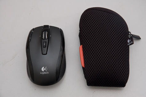
Bag-20080123.jpg

It even comes with a small mesh bag for you to put it in. Why do I like that? Well, it shows that Logitech know that a) you’re going to transport the mouse around a lot and b) that they want you to treat it as a premium product. If you throw it into your bag, it’s going to get all dinged up and scuffed in no time. So you also get a nice, fairly anonymous, perfectly-sized neoprene/mesh bag.

It’s the little touches that make a lot of the difference. A thoroughly recommended product – and it still makes me grin every time I eject that receiver.
I bought an Airport Express this week. They’ve been around for a while now, and I’m sure they’re probably going to end up being refreshed in the near future, but I couldn’t hold off any longer. For various reasons, it made no sense to put it off any longer.

So far, I’ve been really impressed with it. Not so much what it does; it does exactly what I ask of it, which is exactly what the site said it will do. What’s impressive is the way it does it. The experience of owning it, of using it, has been excellent.

Wireless networking is complicated. It’s not designed to be user friendly. It’s not too hard to get a router/modem up and running and sharing around a nice, public, stealable connection, but fine-tuning and configuring it is a total pain for most users. The terminology is complex and unintuitive.

To make matters worse, almost every router (wireless or otherwise) has a miniature webserver in it running an administration interface. This sounds like a good idea for most users: the controls and interactions are familiar, and no special software is required. But in practice, it’s a disaster.

Continue reading this post…

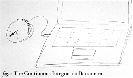
This is an idea spun out of conversation with Ben and Paul at last night’s LRUG – a physical device for alerting developers working in a continuous build environment as to how far they are from the trunk.

Because of the rate of change on an agile project, it’s important to keep your own personal codebase as close to the trunk as possible, otherwise you’ll spend a long while working on code that doesn’t fit with the current state of the system, or working around issues which may have been fixed. It’d be good to have some sort of physical display to alert you to this, rather than relying on typing svn up every five minutes.

Continuous Integration Barometer

Enter the continuous build barometer. It’s dead simple: it’s a dial you connect to your computer via a USB connection. The moment you do a checkout, the needle sets itself to 0. And then, as your codebase diverges from the trunk, the needle indicates how far (proportionally) your code diversifies from the original. And, of course, the moment you check in, the needle resets itself to zero.

Ideally, the continuous-build barometer needs to be made out of something reasonably heavy – I have this image of brass and wood, much like this example, if only to convey the weight that “checking in often” actually carries. In terms of making one… dial indicators seem to be quite pricey. It’d be easy to prototype with something like this ten-bar LED display, an Arduino board, and a short-ish script to compare the trunk with your local version, cronned to run regularly. Of course, I think the physical nature of the object is important, but it’d still be interesting to see what a working version in any form looked like.

That was one of my favourite things this month’s LRUG gave me, and it’s not really even code. Now: who wants one?

iPod Nano

07 September 2005

OK, so Apple have gone completely bonkers with the naming of their new iPod Nano. I’ll let that one go. I can also let go the complete axing of the iPod Mini as a line, as it never really mattered that much to me. What I can’t forgive is whichever lunatic thought that the bottom edge of an audio device was the best place for the headphone socket. That’s before you consider that it comes in black, of all the non-Apple colours in the world. Not that impressed, really – smaller, less space, same money, more whizz-bang. Sticking to my 3G 20gig, then.

(Also, I’m not convinced by this new “streamlined look” for iTunes 5, and will let others download the first stone, as it were – but you heard the prospect of it being “rubbish” here first).