-
"Here we get a glimpse of an alternative figuration of data itself. Rather than some kind of precious (but immaterial) stuff, or fuel for market speculation, data here is a relationship, a link between one part of the world with another, and a trace that can be endlessly reshaped."
-
"Though I lost the original notebooks, I still have the journal. It stood in a complex relationship with, and served as a feeder for, the actual writing of Climbers, which went on concurrently elsewhere; also as a record of one of happiest and most productive times of my life. The pages were carefully numbered. The photographs, especially polaroids, have become faint and dark-looking at the same time, tinged with purples and greens not present in the lived scene." Beautiful documentation of work in progress.
-
"Truth be told, I’m a bit tired of pixel art, but work like this aspired to transcend mere pixels. And I think that’s why it still packs a punch for me today. It’s evidently not content with the paltry colour depth and resolution it’s forced to use. It’s not about celebrating its form, unlike today’s pixel art, which is all about the form and evoking aesthetics of the past without quite nailing their fundamental nature. Instead, these backgrounds are all about what they depict – little scenes, ripe with little stories and humour, and inflected with travel pornography." Great writing from Alex, and a lovely cherrypicking of the selection. I am not a huge SNK fan, systemswise, but I adore their background art – and have a particular fondness for the whole package of Garou: Mark of the Wolves. This post does a lovely job of explaining why.
-
"She is omnipotent. She can conjure up an army of parkour chimney sweep ninjas! But she also has to come and go with the weather, and where there is technology, if you like, it does not always do what it should. It plays up. The umbrella handle is a bit shitty with her. The toys don't always clean themselves up at her command." I always like Schulze on Mary Poppins, and whilst it's quotable, it's probably not the most representative quote of this marvellous article. The main reason I use it is this article, more than many I've read, explains what being in a room with Jack at work is like. It's also lovely to see all the threads, some of which I saw beginning, come together. Good photos, too, of what work looks like.
-
Charming. My favourite thing about this is that it's a picture of home, and, weirdly, it arouses the same emotions in me as it would if it were a poster of a real place.
Complexity
04 February 2013

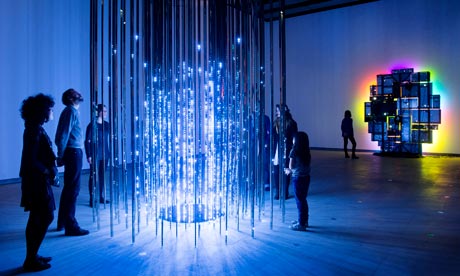
Leo Villarreal’s Cylinder II is the opening work at the Hayward’s Light Show. It’s a very good exhibition, with a few high points; Villarreal’s piece was one of mine.
And yet.
The notes on the piece describes it as featuring “light and movement” composed by “complex computer programming.”
This particular word – complex – frequently annoys me when it comes to technologically manifested art. It annoys me because the craft of the piece is its assembly – both its manufacture, in light and metal, and its programming. But to make a virtue of its complexity… is much like describing Rembrandt as painting in “challenging oil paints”.
It’s one thing to describe the work as complex. But to describe the process the artist took as complex is something else; many artistic processes are complex, but few deserve that complexity highlighting. And in this case… the programming is intricate, and has been executed carefully, but it struck me as just another piece of electronically produced art.
Make no mistake: it’s entirely beautiful. But something about highlighting the complexity of the process when it’s fairly typical of that process rubs up against me; I wonder if it’s the surprise or alienness of technologically manifested work.
Of course, Villarreal’s piece isn’t really about how hard the programming is at all; it’s about how light interacts with a space, how patterns emerge, how we perceive. The programme notes go onto to discuss that, and they do so much better.
It’s a lovely show, though. Not much of it is bad, but the best parts – Villarreal, Eliasson, McCall, Flavin – are wonderful.
(On an entirely separate note: an exhibition in which the ability of the public to read “NO PHOTOGRAPHY” signs was worse than ever. The signs were particularly illegible in the darkened rooms, which rather spoiled my favourite piece of the exhibition – Anthony McCall’s You and I, Horizontal; an exhibit that makes a virtue of carefully shaped light through darkness is somewhat impeded by camera flashes. Leave them at home, folks; it’s art, not a sideshow.)
New Work: Spirits Melted Into Air
22 November 2012
I’m excited to be able to share Spirits Melted Into Air with you: a two-week exploration I produced with the Royal Shakespeare Company, as part of their myShakespeare project.
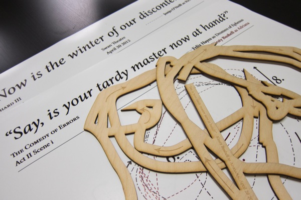
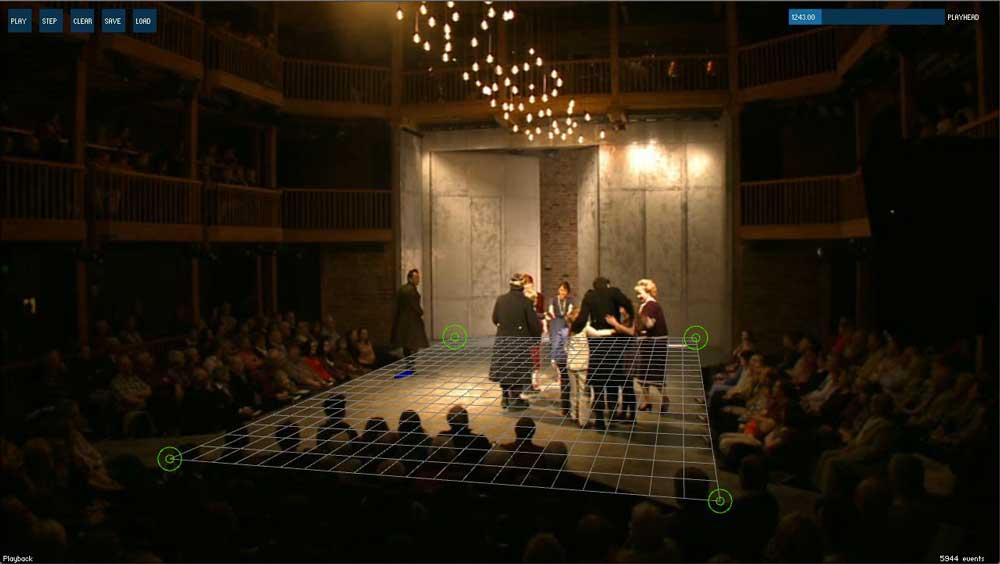
The work is in parts a technology prototype, data visualisation, and artwork. Custom-built, open-source software is used to analyse performance video and generate plots of actors’ positions on stage from a perspective viewpoint. These plots are then used to generate new, secondary artworks: posters, and laser-cut wooden shapes.

The project emerged from an initial workshop and commission by Caper, where we explored various potential ways for technologists to collaborate with the RSC on short projects. From there, I dealt with the RSC direct, meeting key members of their team and understanding a bit more about the various factors influencing performances and productions there.
It was great to be able to take such a fluid, interpretative approach to the work. With hindsight, this was unsurprising: the RSC’s business is interpretation – taking Shakespeare and producing entirely new productions each year, of plays they have often performed countless times. My work was similarly interpretative: initially, building software to explore the data, and then exploring that data as a material – before moving onto the further material exploration of output formats. It’s the sort of structure to work that I’m fond of.

It was also great to have a brief to shape, and ultimately push myself: not just exploring a single technical idea, but seeing it through, end-to-end, to output and display. It was important to me that whatever came out of it – however prototype-y – was both beautiful and accessible. I think the output – especially the lasercuts – has stood up to that internal demand.
Thanks to Rachel and Kat at Caper for setting up the initial commission and the workshops; to Sarah and Ida, for producing the work from the RSC so superbly; and to everyone I met at the RSC who offered insight, ideas, and knowledge.
You can find out more at the Spirits Melted Into Air website.
And, if you’d like to know more about it, or indeed, to work with me on similar work – be it investigative, creative, or artistic – do get in touch.
-
1994 Tom Chick and I have a lot in common – a love of submarine sims and slightly over-technical flight simulators. And X-Com. (Well, UFO, really). A lovely piece of writing about what game design in 2012 looks like (amongst other things) compared to our youth.
-
Beautiful slit-scan photography.
-
"Riders pass through openings in a waterfall created by precisely monitoring their path via axel-housed encoders, creating the thrill of narrowly escaping obstacles." Brilliant.
-
"This simple gesture was as touching as if the art school had put up a banner saying 'Welcome Back Tom'. I was moved. The project's title has now been reinstated. In some special sense I had arrived" Lovely.
-
"The whole memorial, appropriately horizontal and about as long as a modestly sized human being, is to be installed in early August on the wall of the College's dissecting room." Beautiful, as ever.
-
"I'm super happy with the resulting portrait of where the studio is now: 13 people, working in a garden in the middle of a vibrant city, a strong ethic, and maps and visualizations in active use by the public." A lovely description – it's a brilliant office to be in. Also, they totally have a piano. And: how lovely to see the maps laid out: seeing this issue, it reminds me just how beautiful many of them are, and how well they stand the test of time – Cabspotting, for instance, is increasingly iconic.
-
"What was quite nice is seeing the piles of paper at the end of the day. It’s very visible that Work Has Been Done Here. The sawdust, as Bridle points out, that’s missing from software development. You get to see the failed experiments and the changing versions printed throughout the day which would normally be hidden away in git." It was a fun day, and this is a nice thought from Dan. I kept all my sawdust, which I'll be writing about when I get a minute.