-
"Its weird really. You’re standing there in front of something, perhaps its an ancient artefact, buried for thousands of years – perhaps its a mummy, partially unwrapped. A real human being, you can see their face from all those years ago, see how they lived, what they ate. History, right there… But whatev’s. Look! There’s a telly over there!" Yep.
-
Brian Sutton-Smith has died; this is a solid – and impressive – obituary.
-
"Maybe participating in a Game Jam ought be a required rite of passage for anyone who wants to make videogames. It's a deep, oxygen-less dive into the depths of the industry, compressed into 48 hours. Survive it, and you can survive anything." Development as fractal.
-
"Smart things: the design of things that have computers in them, but are not computers". Mike Kuniavsky outlines the book he's currently working on. Looks interesting.
-
35mm, f1.8, crop-factor only, and with a built in motor so all the D40/D60 users can use it. This is big news – the first-party crop-factor prime. If they can make it super-affordable and good quality (at least as good as the 35mm f2 I'm thinking of buying) it's a lock.
-
"I’d recommend that if you’re considering or actively building Ajax/RIA applications, you should consider the Uncanny Valley of user interface design and recognize that when you build a “desktop in the web browser”-style application, you’re violating users’ unwritten expectations of how a web application should look and behave. This choice may have significant negative impact on learnability, pleasantness of use, and adoption." Yes.
-
Video from the side of a solidrocket booster from a shuttle launch – through launch, into the atmosphere, separation, and back down to splashdown. Incredible; hypnotic; magical to think that we made that.
-
"The first UK Maker Faire will take place in Newcastle 14-15 March 2009 as part of Newcastle ScienceFest – a 10 day festival celebrating creativity and innovation." Never been to Newcastle. That could be exciting.
-
"Don't be stuck staring at the screen! Mightier's unique puzzles are designed to be solved by hand with pencil and paper." You print out the puzzle, solve it with a pen, take a webcam picture of it… and the in-game laser carves the path you drew. Wow.
-
A somewhat geeky – and swear-free – Downfall adaptation, but pretty spot-on nontheless.
-
A better way of handling TextMate projects, or so I'm told. Giving this a crack.
-
"…what is user experience design by itself, those areas that aren’t filled up with other bubbles? I tried to answer some of that in an earlier post, but the short answer is: not much, aside from coordination between the various disciplines, or what used to be called creative direction. It’s about the joining of the different disciplines, and not particularly a discipline in and of itself… Without the “raw materials” of the disciplines that make up UX, UX would be empty indeed." Some nice thoughts, clearly delineated, from Dan.
-
"I'm passionate about this because I'm building the camera I've always wanted to shoot with," he says. "When my grandkids and great-grandkids look back, they're going to say I was a camera builder. I did handgrips and then goggles and then sunglasses to prepare myself. But cameras are magic." Fantastic article about Jim Jannard and his Red digital movie-camera business.
-
Brilliant, brilliant little advert.
-
"VideoGamesHero brings you homebrew action at it's best – offering lasting fun and challenging action with over 65 Songs, 5 Game modes, Motion Card and Guitar Grip support, there is something for everyone!" Homebrew Harmonix-style rhythm action game for the ds. Awesome.
-
"In this extensive interview, Yasuhara outlines his carefully constructed theories of fun and game design, including the differences between American and Japanese audiences, with illustrated documents." Lots of nice things in here, including a section on "tidying up".
-
"APIdock is a web app that provides a rich and usable interface for searching, perusing and improving the documentation of projects that are included in the app." Handy.
-
"I think the role of the architecture diagram, user flow, and wireframe belongs very much after the fact, after we’ve sketched and prototyped an experience. Those are tools to document what has been agreed through sketching and prototyping. They are not the best means for solving challenging design problems." That seems like a good way of putting it.
-
"In this template you'll find shared layers (masters) for a title page, wireframe, wireframe/storyboard hybrid, simple storyboard, and storyboard with notes. Column guides and a regular grid make it easy to use and keep your layout tight." Nice .graffle templates for UX designers.
-
Timelapse, merged photographs of videogames. Beautiful, especially Tempest.
Good Experience: Apple Airport Express
06 September 2007
I bought an Airport Express this week. They’ve been around for a while now, and I’m sure they’re probably going to end up being refreshed in the near future, but I couldn’t hold off any longer. For various reasons, it made no sense to put it off any longer.
So far, I’ve been really impressed with it. Not so much what it does; it does exactly what I ask of it, which is exactly what the site said it will do. What’s impressive is the way it does it. The experience of owning it, of using it, has been excellent.
Wireless networking is complicated. It’s not designed to be user friendly. It’s not too hard to get a router/modem up and running and sharing around a nice, public, stealable connection, but fine-tuning and configuring it is a total pain for most users. The terminology is complex and unintuitive.
To make matters worse, almost every router (wireless or otherwise) has a miniature webserver in it running an administration interface. This sounds like a good idea for most users: the controls and interactions are familiar, and no special software is required. But in practice, it’s a disaster.
Continue reading this post…
Appealing UX at tourfilter
03 January 2007
I was, partly in jest, invited to join tourfilter by a friend today. What started as an elaborate social-networking joke turned into a really positive piece of user-experience I wanted to document.
What I wanted to share was the sign-up process. Normally, with social-networking sites, you have to endure some form of semi-elaborate sign-up before you’re allowed in… and then you start having to ram content in. Tourfilter neatly turns that on its head.
Tourfilter is a site that scrapes listings pages for information about your favourite bands, generating emails, RSS, or iCalendar files to keep you up-to-date. It’s a really simple, single-minded site that gives music fans personalised listings.
For a new user, there’s a form on the left of the homepage with a large textarea, in which you write the names of bands you like. I entered one band name… and via Ajax, a huge list appeared to the right of the field, of other bands I might like. Of course, I did, so I started clicking on some of them to add them to my form… and the process slowly became addictive. Pretty soon, I had a long list of bands I’d be potentially interested in seeing in London. The Ajax made it very compelling, and pretty quick. And, of course, the more bands I added, the more useful the fly-out Ajax list was, because it had better data to compare against.
Underneath the text box are three fields: username, password, and email address. Once you’ve filled them out, all you have to is click the submit button… and your brand new account is created, with all the information you’ve just filled out.
So tourfilter reverse the customary process: you add your initial data first, and only then create the account. Once you’ve done that, everything’s ready to go. I really enjoyed this experience: the Ajax element quickly showed the value of the site, which only increased the likelihood of me signing up.
I think tourfilter still has a little way to go – sometimes its scraping leaves something to be desired – but still felt its compelling sign-up process was worth commending.
Train toilets: not such a design nightmare any more.
23 December 2006
Around a year or more ago, I had an interview for a job (which I was offered, and which for various reasons I had to turn down). There were two great questions in it:
“Give me an example of design you love,” and “Give me an example of design you hate“.
The first was tricky. I needed something I not only loved but that I could explain why loved it (and not sound too cliché at the same time). In the end, I went with the Nintendo Wavebird, for its use of technology (the wireless), texture and shape (both of which vary across all buttons).
It was much easier to find something I hated, though. I’ve always hated – with a real passion – the automatic loos on trains, such as those on Virgin. They drive me absolutely mad.
They have three buttons inside: open, close and lock. When you step inside one, the “close” button flashes, indicating you should press it. Fine. Once you press it, the door shuts, and the “lock” button flashes, indicating you should lock it. Again, fine; you push lock and hear a clunk. What frustrates me is that then the open button flashes and so, obviously, you push it, and the door wanders open, leaving you frantically hammering “close” to stop looking like a wally who can’t work the doors. It’s not just me, either; I’ve seen lots of people do it!
I was asked how I could improve this design.
I think the problem comes in the use of three buttons. Open and close as two seperate buttons I can take, but lock isn’t really a button – it’s a toggle; you need to be able to see both locked and unlocked states. So I suggested keeping two buttons for open and close, and implementing a lever for locked/unlocked. Ideally, the lever should be horizontal, to indicate the locking motion, and to distinguish itself from the two vertical buttons.
It’s a design problem I run into quite a lot, usually on the web, where a collection of radio buttons are used not to switch between several states of one condition, but to represent several unrelated ideas.
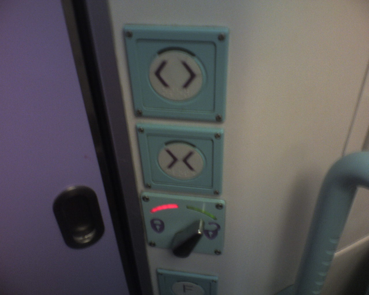 So imagine my surprise when, on the train home this morning, I found that the First Great Western toilets have been substantially modified (see left). At the top, open and close – and then a flick left/right switch for locking, with a red light for ‘lock’ and green for ‘unlocked’.
Much better. I didn’t make a mistake, and was confident that the door was locked (or unlocked) thanks to the visual indication of a lever. It makes me wonder if someone from FGW was sitting in on that job interview…
Hacking the user interface through tags
30 March 2006
I’ve been thinking about tagging a lot recently. One particular thing came to my attention yesterday, and I think it’s worth noting in public.
Users use tags to hack the UI. Tagging isn’t just metadata; it’s metadata you can use.
To wit: a friend mentioned that one of the problems he had with Flickr was that you couldn’t see al the photos from a particular date. Oh, but you can, I said, and showed him the Archives page which does exactly that – it lets you trawl through photographs by date. It’s a really nice piece of design, in fact, so if you’ve never looked at them, go and check them out.
Of course Flickr lets you see things by date – it’s one of the key pieces of data it associates with every picture. Yes, there’s some confusion between “date uploaded” and “date taken on” but that’s dealt with – Flickr lets you view by both.
My friend hadn’t found this supposed lack in functionality a hinrdance, though. Instead, he’s just tagged his photos with a tag for the year (eg ‘2006’) and, sometimes, a tag for the month (‘September’). He’s not the only one – hunt around Flickr for the preponderance of tags like ‘200506’ or ‘20031224’. Lots of people do it.
Why do they do it? Two reasons. Firstly, they’re adding data that they either don’t think is there or that they can’t find. Even though Flickr stores date information, and they can see that at the bottom right of each picture, if they can’t manipulate that data – if they can’t pivot around it – then they store the data in a way they can use it – they stick it in a tag field. And that leads to the second reason: they’re making something to click on.
Making a tag is like making a shortcut button. One click on “2006” shows me all my pictures from 2006. So does the “archives” function but it’s not quite as fast, to be honest, and not as immediately intuitive.
This is true of all tagging systems – tagging makes links, that’s they way it works. So as well as using tags to store data, tags get used to extend and build upon the user interface. As a developer, this has an unexpected bonus. If you see lots of tags emerging storing data you already track (such as dates), consider that the method for accessing data by date might not be obvious (or simple) enough. And if you see enough data of identical format being tracked – often in the form of machine-readable tags, such as geotags, then perhaps it’s time to consider adding a new feature. Tags are a great way to track how uses actually make use of your service.