After a long period underground, Ubisoft’s Splinter Cell: Conviction emerged at E3 substantially different to its previous incarnations. And whilst I, for one, am grateful for the removal of Sam Fisher’s trampy hairdo, the new feature that got me really, really excited seems to have passed with relatively little fanfare. Here it is:

Mission objectives – or, at least, reminders thereof – written into the environment, mapped over space, appearing to the player along; subjective and stylistic, but never part of a HUD. It’s classy and striking, and not something people are playing with in games nearly enough. Prior to this, easily my favourite type design in games came from Codemasters’ GRID:

which placed text into the world as first-class 3D objects, and let the player spin and pivot the camera around it, as if to emphasise both its subjectivity and genuine 3D-ness.
But this has been a thing in movies and TV for a while, now. Here’s JJ Abrams’ Fringe:
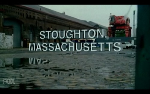
which even nails the reflections in the water. And, of course, one of the earliest points of reference for this in genuine 3D is David Fincher’s Panic Room:

which, as Ben has pointed out, owes a great debt to Saul Bass’ titles for North by Northwest:

which makes quite a nice list.
Matt | 7 Jul 2009
Softening us up for AR.
MacDara | 8 Jul 2009
I have to say, I hate the way that titling is done in Cringe. Sorry, Fringe. In fact, it’s one of the things that made me take an instant dislike to the show.
Andy Baio | 11 Jul 2009
Reminds me of the artist Wayne White, who hand-paints text onto the landscapes in thrift store paintings. I wrote about him on Waxy a few years back.
Jason Scott | 11 Jul 2009
Also Grand Theft Auto IV. And the groundbreaking demoscene demo “Debris” (2007).
Ben | 11 Jul 2009
When the typographical singularity happens this is what the world will look like. And it will be great.
Matt Carey | 11 Jul 2009
@MacDara “I have to say, I hate the way that titling is done in Cringe. Sorry, Fringe. In fact, it’s one of the things that made me take an instant dislike to the show.”
Why do you hate it?
Sometimes in Fringe the text is static, floating still in space. Others they actually pan the camera through the text, which is really nice.
Jim Pierce | 12 Jul 2009
This technique is becoming very popular in TV promos an movie trailers as well. In a year, we’ll likely all be sick of it.
MacDara | 14 Jul 2009
@Matt Carey “Why do you hate it?”
I think I hate it (or more accurately, have an instinctive aversion to it) is because it disturbs my suspension of disbelief; I can’t get into the headspace of perceiving the show as ‘reality’ as such when I’m being confronted with 3D elements purporting to be intrinsic to the environment, but that aren’t perceived by the show’s characters.
By all means it’s not the only thing I don’t like about Fringe (I could rant on like a crazy man for hours about that) but it’s one of the elements that turned me off from the get-go.
That being said, I’ve got no objection to the concept of ‘text in the world’ itself in other situations (such as the film title sequences noted above) – it just jars for me in the context of a narrative.
Lee Benson | 15 Jul 2009
My Man Godfrey did something similar, only with light-up signs bearing the actor’s names, designed to be real within the space. An interesting starting point, to be sure.
Felix | 23 Jul 2009
Spotted these, seem appropriate;
http://www.andrewbyrom.com/type.html