Making things is fun. It’s satisfying to watch things spring forth from nothing, made by your own hands.
The greater the gap between your own capabilities (or your perception of them) and your output, the more satisfying – not to mention bemusing – the process is. That’s why Moo‘s public API is so exciting – using nothing but code, you can create real, physical, things. Imagine that! Objects you can hold that sprung forth out of bits and bytes.
I mentioned last week that I’d worked on extending Ruminant, a Ruby library for interfacing with Moo’s API, to also handle the creation of stickers. I wasn’t doing so purely out of generosity, though; I had a project up my sleeve that I wanted to work on.
I can now show you the results of that project. Why only now? Because now, I have the physical products in my hands. I think it’s really important with something like the Moo API that you only talk about what you’ve made when it’s actually real – no showing off code and saying “oh, they’ll be here soon“. You’ve got to make the things.
Anyhow: now I can tell you what I was up to.

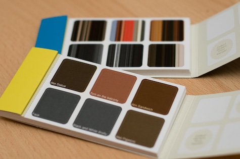
These are two books of stickers, made from of my most recent photos on Flickr. They’re built by taking data from the Flickr API, processing it on my computer, uploading it to the web, and sending it to Moo’s API. This is a single shell command. You fill out a configuration file with the important details – such as your API keys for both Moo and Flickr – and run the file. A short while later, you’ll be asked to pay for your stickers, and off you go.
The fun part of this isn’t the whole one-step thing; it’s what goes on when we process the images. We don’t just print them straight, you see.
Another short aside: making real things out of code is fun because you don’t think it should be possible, and image-processing is actually similarly entertaining, just because it feels like it should be harder than it is. Most “easy” programming comes down to processing text in, and text out. Images seem like they should be harder. In fact, images are now much easier than they used to be thanks to things like GD and ImageMagick. I had a lot of fun playing with RMagick, and it wasn’t difficult at all.
So, what did I make?

The first are what I called Dadaist Photographs. Moo stickers are small; it’s quite hard to see a proper photo on their small dimensions. So why not make something at once very vague, and yet also entirely precise? That’s what these are. The background of the image is the average colour of the photo, determined by summing the red, green, and blue values of each pixel in the image, and then dividing each of those by the area of the image to get the average red, green, and blue values – and then making a colour out of those. In the foreground, we super-impose the title of the photograph in text. This is, as you can tell, somewhat silly. But! It’s a hyper-realistic single-pixel photograph, and ideal for Moo’s stickers. (A quick note – I didn’t quite add enough padding to the text on these. I’ve learned my lesson for next time).
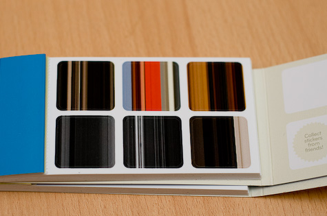
Whilst I was working on that, I had another fun idea. It turned out to be just as easy to build, as it resuses most of the same code as the Dadaist Photographs. This let me abstract lots of things out, and at the same time learn how to write slightly tidier object-oriented Ruby. Anyhow, a short while later, and we had these:

These are less silly, and to my mind more beautiful – they render wonderfully on paper. They are very simple to make. First, we squash the photo down to being a 500×500 square. Then, we take the middle row of pixels in the image, and replace every row of pixels in the image with the middle row. The net result is essentially a “stretched” image, based on a single row from the image. RMagick made this very easy. Like I said, I think the results are very beautiful, and it’s amazing how easily identifiable they all are.
I wrote these by first creating the image processing code. That’s the stuff I was least familiar with, and took the longest to get my head around. Once that was done, it was relatively easy to bolt proper Flickr API import on (thanks to the Net::Flickr gem), and subsequently take my processed images and throw them directly at Moo’s API, thanks to Ruminant. A small amount of tidying, abstraction, and the creation of simple config files later, and we were done.
The only slight catch is that Moo need to get pictures from the public web. I’m running my script locally, because it’s quite processor/memory intensive, so the script SFTPs the pictures to a destination of your choosing before sending them to Moo.
But that’s it. It’s one click. It works most of the time (but with 90 images sometimes chokes a little; still, it’s not hard to salvage that by generating the XML for the order yourself). Because of the processor/memory overhead on rendering the images, I haven’t put this online as a web tool – I’m still thinking if there’s an easy way to do that. This could end up on EC2 one day.
What I’ve done instead is to put it on github, so you can at least see the code to learn from it, and, if you want, download and run your own copy. (If you’re not sure what to do: install git, and then click “clone” on the github page to get the command to type to clone the repository), I can’t guarantee it’ll work on your machine, and I can’t offer any support to help you get it running, but I hope you have fun with it regardless.
So there you go. First, an idea; then, the physical product; finally, the code that makes it all work. This doesn’t serve much real purpose, I’ll admit, but it was a fun making project, and it’s hugely satisfying to see how easy it is to make things out of pictures and paper with code, starting with a simple idea.
I’m not sure if I’ll take this any further – it stands alone quite nicely – but for starters, I’m going to see if I can extend Ruminant to handle other product types – though for various reasons, that might take a little while. If I do anything with it, you’ll hear it here first. In the meantime, I hope this serves as a little inspiration for how easy it is to make fun stuff with Moo, and perhaps that my silly, surreal stickers raised a smile.
Roland Swingler | 6 Oct 2008
Cool!
These remind me a little of something that I saw in Creative Review years ago – taking a series of photos of a city, extracting the colors from them and then producing striped images like your second example. Its really cool to see (for example) a huge block of yellow in New York (from the taxis); lots of blue from Sydney etc. They managed to give a really distinct impression of place, even though they were so abstract.
rodcorp | 6 Oct 2008
Lovely work Tom. Might intersect with a work project coming up, hmmm…
The first set reminds me of Tom Phillips’s (yes him again) Colour catalogues and terminal greys; the second of Bryan Boyer’s averaged shelving http://www.flickr.com/photos/bryan/sets/584137/ and my analogue of the same http://rodcorp.typepad.com/rodcorp/2005/11/richard_of_york.html
Paul Mison | 6 Oct 2008
What, no mention of favcol? (See also its previous implementation.)
Nice hack though.
Tom | 6 Oct 2008
Paul: well spotted. I probably should have mentioned favcol as one of the sources of inspiration for the first set; good catch, and I stand duly chastised.
3 Jun 2009
Trackback: adoption curve dot net » Blog Archive » What’s an API and why do I want one?
11 Jun 2009
Trackback: Zipsites Official Blog - Create Your Own Mashup