-
Github experimenting with a formalised approach for using Actions/repositories as datastores. Interesting to see their end-to-end approach, including, in particular, custom VS Code plugins for generating configurations; it's a neat and accessible way to build end-user UI.
Putting the nuclear option front-and-centre
15 January 2015
I was talking to Tom and some other people at Matt’s coffee morning this morning, and I mentioned a tiny piece of interaction design I was fond of (that was pertinent to our conversation). Tom said ‘write that up so I can point to it‘, so that’s what I’m doing.
A long while ago, at an agency job, I was sketching out wireframes and interactions for a web-based feed reader. It was designed for users who possibly weren’t that used to RSS, and so it needed to guide them a bit through the best practices of interactions.
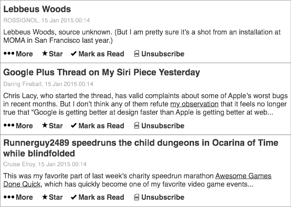
The list of articles looked a bit like this:

Pretty standard, although the important component was the unsubscribe button.
I put an unsubscribe button on every feed item.
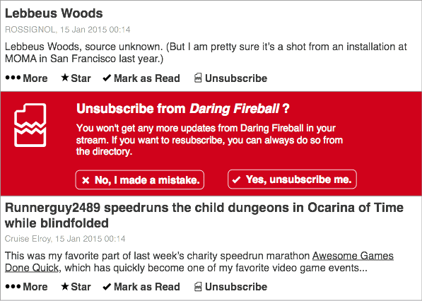
I wanted to stress that if you weren’t enjoying a feed, you didn’t have to read it. Just bin it! You’ll be a lot happier. Clicking the unsubscribe button would do something like this:

to indicate the severity of your action. I felt that was reasonable – little button, big confirm dialogue. And then boom: the entire feed is gone.
It’s amazing how often you can mark an item as read, or archive an email, before committing to unsubscribing. I wanted to capture how ephemeral subscriptions could be. They weren’t commitments; they were just things you’re interested in.
I think the me-of-2015 would also ensure that there was a way of triggering this interaction based on patterns of behaviour. For instance, asking the user if they want to unsubscribe from a feed if they’ve marked it as read a surprisingly short time after they looked at it (indicating they hadn’t read an entry). And, similarly, checking a few weeks later that you didn’t want to subscribe back: frequently, I unsubscribe from things just because I need a break, or I don’t have the space – not because I want them gone forever.
It’s very easy to offer final, decisive actions; they’re very native to dialogue boxes, buttons, and digital systems. But some things are ephemeral, and it’s important to stress that in design. Just because I unsubscribe form a feed, or unfollow someone on Twitter, doesn’t mean it’s final: I might want it back one day; I might be taking a break from my higher-traffic friends. I wanted to try encouraging that.
And I wanted to remind users that there was an alternative to ‘inbox overload’: you could just have a break.
In these two stills, drawn a bit from memory, there’s a lot of gaps – and I’ve not sketched any of the possible animation or motion that would help convey what was going on. Still, that interaction – offering what feels like the nuclear option front and centre, reminding the user that it isn’t a nuclear option – I quite like that.
-
"AlterEgo is a Ruby implementation of the State pattern as described by the Gang of Four. It differs from other Ruby state machine libraries in that it focuses on providing polymorphic behavior based on object state. In effect, it makes it easy to give an object different “personalities” depending on the state it is in." Oh, that could be really handy.
-
Oh gosh this is brilliant.
-
"Simply stick your finger in the hole and a virtual representation appears on the screen. Then you can use your virtual finger to play all kinds of cool mini games… from swinging a panda to having a karate fight with a tiny little man." Um, wow. Although I'm always afraid of putting appendages in boxes I can't see inside, though.
-
I think they're wrong, you know. It's not theatre; it's protocol. Maybe people aren't used to the protocol; if yours is the first app they encounter, they'll think that it's OK to show what passwords are – and perhaps that it's OK to write them down elsewhere in plaintext. Applications have a degree of responsibility for users' interactions across the internet, and quirky and cute as this may be, it's just not the place to demonstrate your shining personality.
-
The Brian Dettmer is beautiful. Also: didn't realise the heart/cube cogs were paper, not wood.
-
"…it's another little example of the way the ipod/iphone is such an attention-demanding device. It doesn't orient to you, it orients to itself." Yes. This is a problem.
-
"The US auto industry is on the verge of imploding. People are losing their homes to foreclosure. And, on the off chance that you had the nerve to try to buy something, credit is almost impossible to come by. It is against that backdrop that I would like to talk about working for free. Why? Because I think it is one of the fastest ways to make yourself a better photographer, whether you are a pro or an amateur."
-
"To the extent that the web is becoming truly ubiquitous, and involves increasingly multimodal paradigms of interaction, it seems appropriate to define a Web standard for representing emotion-related states, which can provide the required functionality." No, it does not seem appropriate. It seems bonkers.
-
Hey, I've been in that relationship too! These made me laugh a lot.
-
"bill. francis. louis – look here. help." Ah, the fun of the farm. It's all coming back to me now.