-
"Basically Lion handles .local TLDs differently to Snow Leopard. Whenever I would try to access my phpMyAdmin installation at http://xampp.local/phpMyAdmin, Lion would take a ridiculously long time to resolve the host and it probably has something to do with the Multicast DNS feature of Bonjour." What the hell? That explains a lot.
Last weekend, BERG invited a selection of friends to participate in their first Little Printer hackday. Over the course of a short Saturday, we were asked to explore the API for making “publications” for Little Printer, and test them out on sample devices.
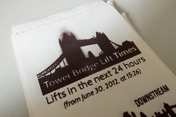
I had a few ideas, but decided for expediency to return to my “Hello World” of connected things: Tower Bridge.
My publication would be something you could schedule at pretty much any time, on any day, and get a list of bridge lifts in the next 24 hours (if there were any).
I could have made this a very small, simple paragraph, to fit into a busy list of publications. Instead, I decided to explore the capacities of the Little Printer delivery as a medium.
I was interested in the visual capacity of the Printer: what could I communicate on a 2-inch wide strip of paper? All of BERG’s publications to date have been very beautiful, and the visual design of publications feels important – it’s one of the many things that distinguishes Little Printer, and I wanted to try to aspire to it at the very least.
So I built an Observer’s Guide to Tower Bridge, based on a chlidhood of Observer’s Guides and I-Spy books. As well as listing lifts for the next 24 hours, I’d show users pictures of the boat that would be going through, so they could identify it.
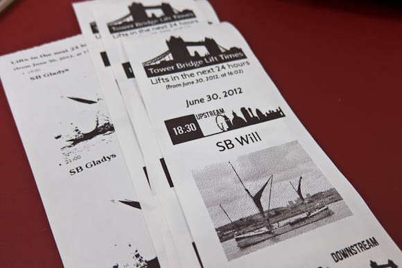
I also visually communicated which direction upstream and downstream are. I don’t think it’s immediately obvious to most people, and so the “downstream” icon shows that it’s towards Tower Bridge, whilst the offset of the “upstream” icon illustrates that it’s towards Big Ben and the Millennium Wheel. It felt like a natural way to make this clear visually, and was economical in the vertical dimension (which is one of Little Printer’s bigger constraints).
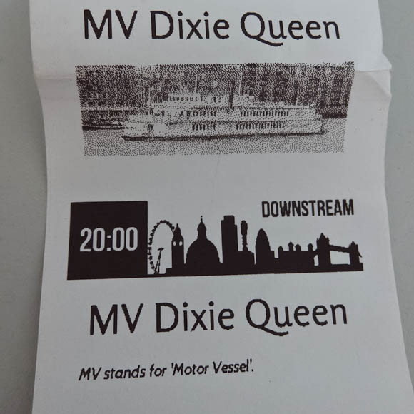
Early versions showed a photo for every lift, which turned out to make the publication too big: I needed to shrink that vertical axis. I did this by only including photos of an individual boat once per delivery – you don’t need multiple pictures of the same boat. The second time a boat passed through the bridge, I instead displayed a useful fact about it (if I knew one) – and otherwise, just the lift time.
By making the publication shorter, I also avoided an interesting side-effect of running the printhead too hard. The grey smudging you see above is where the printhead is running very hot having printed eight inches of bridge lifts and photos (it prints bottom-to-top, so the text is the “right way up”). Because I’d printed so much black up top, it seemed like the head had a bit of residual heat left that turns the paper grey. This is a side-effect of how thermal printers work. You don’t get this if you don’t go crazy with full-black in a long publication (and, indeed, none of the sample publications have any of these issues owing to their careful design) – a constraint I discovered through making.
The Observer’s Guide was an interesting experiment, but it made me appreciate the BERG in-house publications even more: they’re short and punchy, making a morning delivery of several things – bridge lifts, calendar details, Foursquare notes, a quote of the day – packed with information in a relatively short space.
I was pleased with my publication as an exploration of the platform. It’s not open-source because the LP API is very much work in progress, but rest assured, this was very much a live demo of real working code on a server I control. If I were making a functional tool, to be included with several publications, I’d definitely make something a lot shorter.
It was lovely to see Little Printer in the world and working away. It was also great to see so many other exciting publications, cranked out between 11am and 4:30pm. I think my favourite hack might have been Ben and Devin’s Paper Pets, but really, they were all charming.
Lots of fun then, and interesting to design against the physical constraint of a roll of thermal paper and a hot printhead.
-
Really beautiful, and a nice reminder of how robust installation design can be. Also: music by Todd Terje!
-
"I'm super happy with the resulting portrait of where the studio is now: 13 people, working in a garden in the middle of a vibrant city, a strong ethic, and maps and visualizations in active use by the public." A lovely description – it's a brilliant office to be in. Also, they totally have a piano. And: how lovely to see the maps laid out: seeing this issue, it reminds me just how beautiful many of them are, and how well they stand the test of time – Cabspotting, for instance, is increasingly iconic.
-
"What was quite nice is seeing the piles of paper at the end of the day. It’s very visible that Work Has Been Done Here. The sawdust, as Bridle points out, that’s missing from software development. You get to see the failed experiments and the changing versions printed throughout the day which would normally be hidden away in git." It was a fun day, and this is a nice thought from Dan. I kept all my sawdust, which I'll be writing about when I get a minute.
-
"Parametric models indicate how a change to one component of a structure causes ripples of changes through all the other connected elements, mapped across structural loads but also environmental characteristics, financial models and construction sequencing. FC Barcelona's activity is also clearly parametric in this sense. It cannot be understood through sensors tracking individuals but only through assembling the whole into one harmonious, interdependent system: the symphony and orchestra, rather than the midfield string section, or Lionel Messi as the first violinist." A brilliant article from Max; finally, he's written his long-promised article on 'realtime sports graphics' and it's really excellent: insightful about football and data visualisation alike. Top stuff.
21st-century camouflage
29 June 2012
Max has finally written the brilliant article about real-time data visualisation, and especially football, that has always felt like it’s been in him. It’s in Domus, and it’s really, really good.
This leapt out at me, with a quick thought about nowness:
Playing with a totaalvoetbal sense of selforganisation and improvisation, the team’s so-called constant, rapid interchanges — with their midfielders often playing twice as many passes as the opposition’s over 90 minutes — has developed into a genre of its own: “tiki-taka”. Barça have proved notoriously difficult to beat, and analyse. Tactical intentions are disguised within the whirling patterns of play.
(emphasis mine)
It serves as a reminder of the special power to be gained from resisting analysis, of being unreadable. Resisting being quantified makes you unpredictable.
Or, rather, resisting being quantified makes you unpredictable to systems that make predictions based on facts. Not to a canny manager with as much a nose for talent as for a spreadsheet, maybe, but to a machine or prediction algorithm.
This is the camouflage of the 21st century: making ourselves invisible to computer senses.
I don’t say “making ourselves invisible to the machines”, because poetic as it is, I want to be very specific that this is about hiding from the senses machines use. And not to “robot eyes”, either, because the senses machines have aren’t necessarily sight or hearing. Indeed, computer vision is partly a function of optics, but it’s also a function of mathematics, of all manner of prediction, often of things like neural networks that are working out where things might be in a sequence of images. Most data-analysis and prediction doesn’t even rely on a thing we’d recognise as a “sense”, and yet it’s how your activities are identified in your bank account compared to those of a stranger who’s stolen your debit card. Isn’t that a sense?
The camouflage of the 21st century is to resist interpretation, to fail to make mechanical sense: through strange and complex plays and tactics, or clothes and makeup, or a particularly ugly t-shirt. And, as new forms of prediction – human, digital, and (most-likely) human-digital hybrids – emerge, we’ll no doubt continue to invent new forms of disguise.
-
Valve really are incredible; just watching the UI and technology for this in action is a little jawdropping. (Also, one for my friends who work in After Effects/3D prototyping and video…)
-
"If you ever needed a thorough introduction to the series or the new stuff in Final Showdown, look no further. What top American VF player LA Akira teaches in his appearance on UltraChanTV is more than spectacular. More than 4 hours of video goodness fit for beginners as well as more advanced players." So. Much. Virtua. Fighter. (That tip about holding G+P for both blocks and auto throw escapes is a useful one. Throw escapes got so much easier!)
-
Excellent slides from Paul with some super-solid points, and a few tools I'd not encountered (Papertrail, notably).
-
"The [Manufactured Normalcy] Field is Rao’s attempt to explain the process of technical adoption. Rao argues that when they’re presented with new technological experiences people work hard to maintain a “familiar sense of a static, continuous present”. In fact, he claims that we change our mental models and behaviors the minimum amount necessary to work productively with the results of any change." Cracking post from Greg, which pretty much resists blockquoting, so go and read it all.
-
"Dreams of Your Life is not likely to change your life; but that it has the remotest chance of doing so, despite its simplicity of structure and odd subject, makes it an important work." High praise – but also thoughtful writing – from Greg Costikyan about Dreams of Your Life.
-
"My interest in materials… is like my interest in tools. What can be made with this? What can this do that other materials cannot? Materials with special properties are cool because they can open new possibilities in manufacturing, design, or even behavior. Additionally, they’re such an amazing cultural artifact. Where and how something gets made says so much about us as people, as a species, even. In a beautiful fabric, the simplest thing can be magic."