I was talking to Tom and some other people at Matt’s coffee morning this morning, and I mentioned a tiny piece of interaction design I was fond of (that was pertinent to our conversation). Tom said ‘write that up so I can point to it‘, so that’s what I’m doing.
A long while ago, at an agency job, I was sketching out wireframes and interactions for a web-based feed reader. It was designed for users who possibly weren’t that used to RSS, and so it needed to guide them a bit through the best practices of interactions.
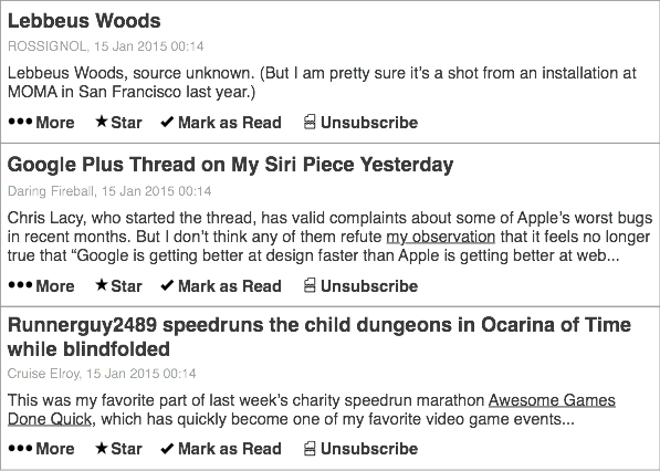
The list of articles looked a bit like this:

Pretty standard, although the important component was the unsubscribe button.
I put an unsubscribe button on every feed item.
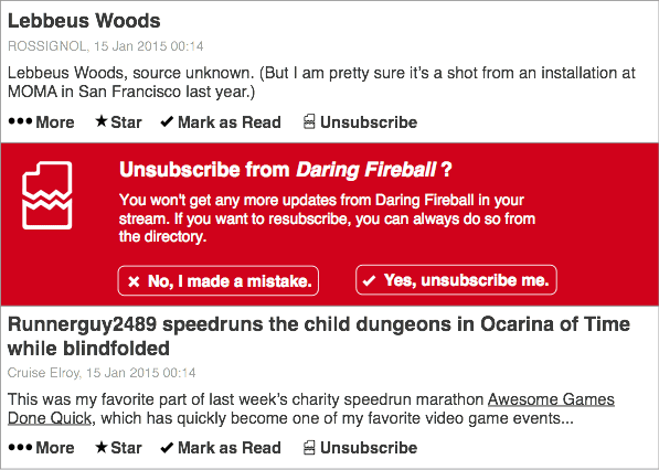
I wanted to stress that if you weren’t enjoying a feed, you didn’t have to read it. Just bin it! You’ll be a lot happier. Clicking the unsubscribe button would do something like this:

to indicate the severity of your action. I felt that was reasonable – little button, big confirm dialogue. And then boom: the entire feed is gone.
It’s amazing how often you can mark an item as read, or archive an email, before committing to unsubscribing. I wanted to capture how ephemeral subscriptions could be. They weren’t commitments; they were just things you’re interested in.
I think the me-of-2015 would also ensure that there was a way of triggering this interaction based on patterns of behaviour. For instance, asking the user if they want to unsubscribe from a feed if they’ve marked it as read a surprisingly short time after they looked at it (indicating they hadn’t read an entry). And, similarly, checking a few weeks later that you didn’t want to subscribe back: frequently, I unsubscribe from things just because I need a break, or I don’t have the space – not because I want them gone forever.
It’s very easy to offer final, decisive actions; they’re very native to dialogue boxes, buttons, and digital systems. But some things are ephemeral, and it’s important to stress that in design. Just because I unsubscribe form a feed, or unfollow someone on Twitter, doesn’t mean it’s final: I might want it back one day; I might be taking a break from my higher-traffic friends. I wanted to try encouraging that.
And I wanted to remind users that there was an alternative to ‘inbox overload’: you could just have a break.
In these two stills, drawn a bit from memory, there’s a lot of gaps – and I’ve not sketched any of the possible animation or motion that would help convey what was going on. Still, that interaction – offering what feels like the nuclear option front and centre, reminding the user that it isn’t a nuclear option – I quite like that.