I really like Carcassonne.
I like it because it’s as interesting with two players as with four – just a very different game in each case. I like it because of the various scoring methods it combines: simple play-piece/gain score for roads/abbeys/towns; longer-term risks with potentially higher rewards for farmers. I like that it forces you to juggle a limited number of scoring opportunities.
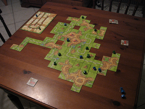
But I like it best because it’s about making pretty landscapes.

photograph: “Carcassonne: Inns & Cathedrals” by SimDawdler
When The Coding Monkeys (who, a good while ago, wrote the excellent SubEthaEdit), released their iPhone version of Carcassonne, I had to check it out. After all, if they can make a multiplayer text editor as good as SubEthaEdit, they might well be an ideal fit for an asynchronous, multiplayer boardgame.
Turned out I was right: they’ve really put some time and thought into their iP:hone version. The UI is lovely, as simple as possible, but rich where it needs to be: it’s very clear what’s going on and what the options available to you are. There’s also a nice focus on playing asynchronously – multiple games, taking turns as and when – which is only enhanced by the “next table” button that lets you ripple through open games without constantly returning to a menu.
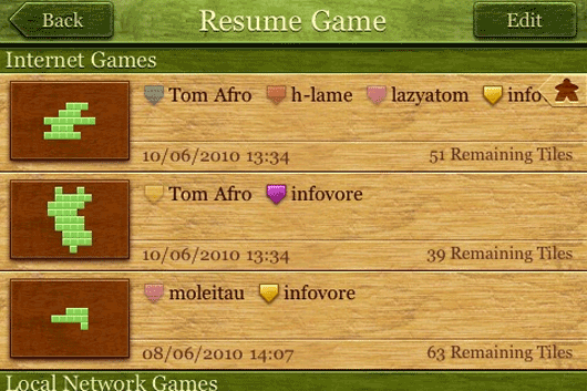
But best of all is this screen:

The tile-layouts of each game are the thumbnail used to represent them.
As the games go on, this screen updates, their icons evolving from single green dots to sprawling landscapes. Of course the layout is the element of the game you place front and centre when it comes to navigation; it’s the most iconic part of any single game, and it works as a lovely aid to recognition.
Nicely done.