-
Brilliant.
-
"…how does Charland describe his own work? He says, "Its like 5th grade science mixed with sculpture. Its about being curious and playful. There is still a lot to wonder about."" Lovely, lovely long-exposure work, proving again that in very long exposures, you can wander around and not really show up. My favourites are the most elegant – the final image, of a candle burning down over an hour, is stunning.
-
"National Geographic has closely documented the journey of the final roll of Kodachrome manufactured, down to its being processed. Dwayne's is only photo lab left in the world to handle Kodachrome processing, so National Geographic Television producer Yvonne Russo and National Geographic magazine senior video producer Hans Weise found themselves in Parsons Monday, along with McCurry, with the final roll of the iconic film of the 20th century." Steve McCurry shot the final roll of Kodachrome in the world.
-
Jeffrey does that hard work so you don't have to. I'm going to leave my slider set around 75, but it's still good to know what the hell is (vaguely) going on under the hood…
-
"I thought this was a fascinating take on the need within companies for stories… Companies spend a lot of money looking for these stories. Traditional product companies had to ask people and users to tell their stories, normally through market research. Web companies are at a huge advantage: they have rivers of usage data flowing through their servers, and the problem inverses – how to make sense and tease out meaning and interest from such a torrent." This is very good; I'm looking forward to future installments.
-
"If Ferelden has room for priests, elves, mages and golems then why doesn’t it have room for sceptics and scientists too?" Lovely notion – roleplaying an aetheist in Dragon Age (as best possible within the game). In this case, the player character believes in magic, but not in the montheist religion that much of the world ascribes to; miracles are really just magic at work. Subsitute "magic" for "science" and you begin to see his point. It's a nicely thought-through piece.
-
"The closer has confounded hitters with mostly one pitch: his signature cutter." Lovely motion infographics – informative, and powerfully confirming the narration.
-
"The move during the past 10 years or so has been from cameras being precision mechanical devices to molded polycarbonate containers for electronic components. This has meant a lowering of overall physical quality. What one gets in terms of features, functions and image quality is higher than ever before, but the satisfaction of owning and using a high quality mechanical and optical device has for the most part evaporated. Only the top models within any brand produce a tactile satisfaction and please one's esthetic sense." The quotation is from Michael Reichmann; the discussion that follows is as thoughtful as usual from TOP's readers.
-
"People are understandably jittery, after the numerous social networking data breach debacles of three years ago that seemingly turned a generation off of oversharing. MTC have gone to great pains to assure users of the system that their data is safe from "getting zucked", and they've begun to provide free personal monitoring services to users of Clipper." Mike writes future-history, and in the midst of it, coins a lovely neologism.
-
Some interesting things here – most notably, the link on 180º shutter; something I wasn't aware of until now.
-
"What a person desires in life<br />
is a properly boiled egg.<br />
This isn’t as easy as it seems."<br />
(this is good). -
"Even if you don’t find Starship Troopers as prescient as I do, the years have been kind to it, if only because it’s now removed from the context of whatever expectations people might have had for it at the time. It seems absurd now to write it off as some silly piece of escapism, as its detractors complained, and the amount of detail Verhoeven and Neumeier… I suspect its future is bright: The line between the world of Starship Troopers and Sarah Palin’s Twitter feed gets thinner every day."
-
Microcontrolled Lego printer, running off some kind of postscript driver, I guess. Properly awesome – and, of course, the most important thing is all the little chaps that keep it working.
-
Nikon IR intervalometer, hooked up to an Arduino, without even needing another remote. Definitely interested in building one of these.
-
"Hitotoki stores literary 'sketches' of moments you experience every day. No check-ins. No bullshit badges. We think the most interesting stuff happens in the space between places. Hitotoki is built to help you capture those moments."
-
Bookmarked because I'm fed up of watery allusions to this (last seen: Malcolm Gladwell, Freakonomics (which is annoying because it's watery despite Levitt having *worked on the paper*)). $5 for the *actual information* seems far more interesting than any volume of popular economics books.
-
Hard to explain, but a must-watch; lovely spatial music sequencer/toy. (And: I miss Offworld :( )
-
"The picture clearly shows the path of the sun through the sky over the last six months." Brilliant. (And: so simple!)
-
"Philip K. Dick fans from around the world have contributed to this scanned collection of over 650 PKD book covers." Some of these are awesome, from the crazy french covers for VALIS to the German editions of The Three Stigmata of Palmer Eldritch – retitled as "LSD-Astronauten".
A book of photographs that I made
20 March 2010

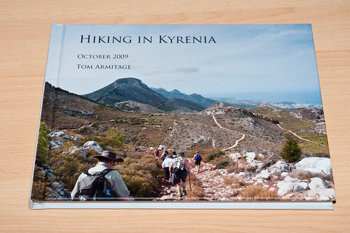
I made a book.
Specifically: I made a book of photographs from my week hiking in Cyprus. I’ve wanted to make a book of some of my photography for a while now, but not really had anything that hung together well enough to devote a large number of pages to.
The magic of print-on-demand is that, really, that shouldn’t matter: you can slap a bunch of images together, hit print, and get a book back. But I felt if I was going to make a book, it should feel book-ish. So: it would need a degree of focus, enough material to make a decent length, and it ought to look like somebody took some care over it.

I was very pleased with many of my pictures from Cyprus, and there was certainly enough of them to make a decent book. But I decided to give it a bit of focus. I stripped out people pictures (because really, they’re not of interest to anyone other than the group walking, and they’re not my best portraits). I stripped out pictures of food. The focus was to be the environment around Kyrenia, as experienced on foot: a lot of landscape, some pictures of walking, some architectural/indoors shots, and a set of pictures from Kyrenia Harbour. One chapter per hike; an extra chapter from the harbour.
That would be enough for a 70-80 page book, 10×8 landscape.

I went with Blurb, mainly because I liked their tool for making books (BookSmart) the most. I’m not much cop with InDesign, and this wasn’t the project to be learning it on. BookSmart was nice because, unlike so many other print-on-demand publishers’ tools, it wasn’t a laggy, overcomplex browser-based tool written in Flash. It was a native application to download, meaning I could work locally.
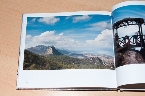
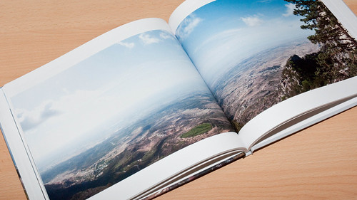
It turned out to be just fine. Its templating engine is good, although it doesn’t let you spread contents across pages – some cunning workarounds are necessary to make double-page spreads, although it’s totally possibly with some work.
I spent some extra time on doing my best to make it not look thrown together: starting chapters on right-hand pages, aligning photographs identically wherever possible, printing a few proofs to double-check it all. And then, when I was pretty sure I couldn’t do much else, I hit print.

I’m very happy with the results. It’s a set of photographs I’m pleased with, and seeing them displayed like this makes me proud of the consistency and quality. I’m also pleased with the book: the double-page spreads were obviously tricky, but by and large, everything has come out well, and the imagewrap cover is very good. My only disappointments are with some text-sizing – I could have made a few bits of text much smaller and better line-spaced. And the quality is great, all things considered: I went for Blurb’s premium quality paper stock, because, you know, if I’m going to spend £20+ on a book, the extra £2 is worth it for pictures that I care about. That worked well.
It’s also great to see images first seen on screen, and then as small prints, in book form. And: it really does feel like I book. That’s the most satisfying part – that I achieved my goal with it. I’m now thinking about what other photographic projects might turn into books.
And, finally: I’m making it available to buy. I doubt anyone will buy it – it’s just some pictures I took one holiday and grouped together – but Blurb essentially makes it a one-click operation to make the book available to others. And so I thought I may as well, and we’ll see what happens. If you’re interested, it’s available here.
One more thing ticked off my todo in 2010 list. What’s next?
-
"There is a rhythm to hiking, as there is in walking. And once you find the cadence — after a day or two — your mind empties. All your social obligations related to work and friends and life are muted. They aren’t gone: they just no longer require your direct attention. There is a shocking beauty to this silence. It’s as if every day of our lives is filled with a white noise. And suddenly, in the presence of these unbelievable peaks, the noise is gone." Lovely pictures, but, more to the point, strong truth, from Craig Mod.
-
"DOOM doesn’t belong in a museum, not because it’s not worthy, but because it’s rock and roll. It’s too fast, too loud, too hard, and too fucked up to be in a museum. There are some games that will work in a museum and some that won’t ever and that, by itself, doesn’t say anything about their value. We need both." Frank Lantz is right.
-
"In this digitally distant world full of information that appears to only be moving faster and faster, you get to choose: how much will I consume and how much will I create?"
-
Fascinating article on pseudo-3D graphics, and raster-based road graphics in particular; coders and gamers alike might enjoy this, although it's quite technical. (And: Racin' Force is just beautiful; I forgot how gorgeous voxels could be).
-
"…you can’t help but wonder if there was some genius in the aggregate. Like Gerhard Richter’s “Atlas”, perhaps Winogrand’s greatest work wasn’t in the brilliant moments or creative editing, but in the Complete Everything, in the performative act of making hundreds of thousands of images, of the people, with the people?" Michael David Murphy on Gary Winogrand, and the value of his work perhaps being in the entirety of it.