-
"Popular media plays an important part in how technology is understood and how it is expected to be. Which, I would argue, also could mean that these understandings can be challenged through stirring popular imagination. And using media and communication as a tool." Einar's talk from Playful was a real favourite, and I'm glad he's put the whole thing online now. Completely worth a read.
Recent Work: Good Night Lamp
17 October 2012
I did a few days working with the Good Night Lamp team this week, on some interaction design explorations. A couple of days of talking, thinking and sketching with Adrian and Alex led to some writing, wireframes, storyboards, and animatics.
Alex asked me to write a bit more about the work, for the Good Night Lamp blog, and there’s now a post over there about it.
Out of all this work, common strands emerged; in particular, a focus on the vocabulary of the product. One of the things I find most important to pin down early in projects – and which design exploration like this helps with a lot – is the naming of things. How are core product concepts communicated to an end-user? How are they made explained? Making sure nomenclature is clear, understandable, and doesn’t raise the wrong associations in a user’s mind, is, for me, a really core part of product design. Even though many of the core concepts of GNL were clear in our head, by sitting down and drawing things out in detail, I started having to discover what to call things, often bringing Alex and Adrian back to my screen to discuss those ideas.
…
This kind of design work initially appears very tactical. It focuses on small areas almost in isolation from one another, exploring the edges and seams of the product. But by forcing oneself to confirm what things are called, confirm what interactions or graphic language are repeated throughout the product, it turns into a much more strategic form of design, which impacts many areas of a product.
You can read more at the Good Night Lamp site. It was a pleasure working with Adrian and Alex. If this kind of work is something you’re looking for, do get in touch.
-
"We always knew Magic: the Gathering was a complex game. But now it's proven: you could assemble a computer out of Magic cards." Oh lordy. Via Aanand, this proof that you can make a Turing Machine out of Magic The Gathering.
-
"Perhaps the best Wii idea of all, and one too little copied in other consumer electronics, was that the device itself lit up when something important had happened to it. If a friend sent you a message or if a game needed an update, the system would start emitting a blue glow from its disc drive. You didn't have to turn the Wii on to know something was ready for your attention; the device's light pattern showed it. Most inert consumer electronics do nothing like this, which is a pity. What a disappointing failure that we don't have more electronics that make themselves useful even while they are more or less turned off." Steven Totilo's farewell to the Wii is full of some lovely thought and analysis – as well as great game write-ups – but this in particular bears repeating. (It drove me mad, but, still).
-
"One of the most important things I learnt throughout the process was that through ‘performing’ ideas – including getting members of the audience involved – it was evident whether or not the experience/idea/design would be valuable, exciting or intriguing. During the presentations, you could instantly tell if the project was a success. In some ways this combines presentation with a form of fictional user testing, they were performing to know. Here, prototyping is taken to another level, where ideas are exposed to an audience, events are ‘acted out’ and success is evaluated. Performance as a prototyping medium." I like 'performing to know'
-
"Three design principles from Lego CEO Jorgen Vig Knudstorp: When it’s advertised does it make a child say: ‘I want this!’? Once he opens the box, does it make him go: ‘I want more of this’? One month later, does he come back to the toy and still play with it? Or does he put it on the shelf and forget about it?" Useful for things that aren't toys, too.
-
"Looking at the Little Printer, I feel a little bit like I do about the cats and Ada's toys – I want to pick it up and give it a cuddle. I do not feel that way about our Samsung MNL-2855ND laser printer in the office. A different thing, in a different place, used differently. I hope BERG will do a Little Eye sibling."
Last weekend, BERG invited a selection of friends to participate in their first Little Printer hackday. Over the course of a short Saturday, we were asked to explore the API for making “publications” for Little Printer, and test them out on sample devices.
I had a few ideas, but decided for expediency to return to my “Hello World” of connected things: Tower Bridge.
My publication would be something you could schedule at pretty much any time, on any day, and get a list of bridge lifts in the next 24 hours (if there were any).
I could have made this a very small, simple paragraph, to fit into a busy list of publications. Instead, I decided to explore the capacities of the Little Printer delivery as a medium.
I was interested in the visual capacity of the Printer: what could I communicate on a 2-inch wide strip of paper? All of BERG’s publications to date have been very beautiful, and the visual design of publications feels important – it’s one of the many things that distinguishes Little Printer, and I wanted to try to aspire to it at the very least.
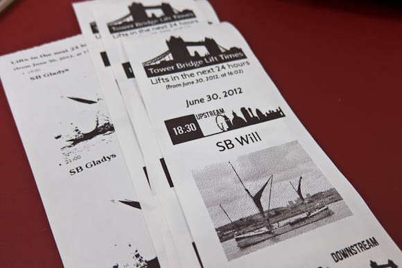
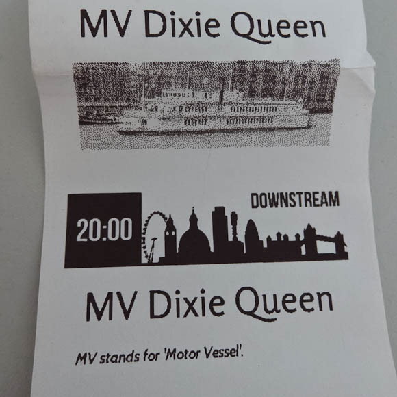
So I built an Observer’s Guide to Tower Bridge, based on a chlidhood of Observer’s Guides and I-Spy books. As well as listing lifts for the next 24 hours, I’d show users pictures of the boat that would be going through, so they could identify it.

I also visually communicated which direction upstream and downstream are. I don’t think it’s immediately obvious to most people, and so the “downstream” icon shows that it’s towards Tower Bridge, whilst the offset of the “upstream” icon illustrates that it’s towards Big Ben and the Millennium Wheel. It felt like a natural way to make this clear visually, and was economical in the vertical dimension (which is one of Little Printer’s bigger constraints).

Early versions showed a photo for every lift, which turned out to make the publication too big: I needed to shrink that vertical axis. I did this by only including photos of an individual boat once per delivery – you don’t need multiple pictures of the same boat. The second time a boat passed through the bridge, I instead displayed a useful fact about it (if I knew one) – and otherwise, just the lift time.

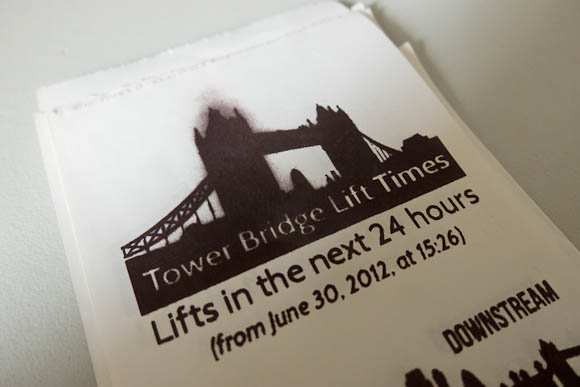
By making the publication shorter, I also avoided an interesting side-effect of running the printhead too hard. The grey smudging you see above is where the printhead is running very hot having printed eight inches of bridge lifts and photos (it prints bottom-to-top, so the text is the “right way up”). Because I’d printed so much black up top, it seemed like the head had a bit of residual heat left that turns the paper grey. This is a side-effect of how thermal printers work. You don’t get this if you don’t go crazy with full-black in a long publication (and, indeed, none of the sample publications have any of these issues owing to their careful design) – a constraint I discovered through making.
The Observer’s Guide was an interesting experiment, but it made me appreciate the BERG in-house publications even more: they’re short and punchy, making a morning delivery of several things – bridge lifts, calendar details, Foursquare notes, a quote of the day – packed with information in a relatively short space.
I was pleased with my publication as an exploration of the platform. It’s not open-source because the LP API is very much work in progress, but rest assured, this was very much a live demo of real working code on a server I control. If I were making a functional tool, to be included with several publications, I’d definitely make something a lot shorter.
It was lovely to see Little Printer in the world and working away. It was also great to see so many other exciting publications, cranked out between 11am and 4:30pm. I think my favourite hack might have been Ben and Devin’s Paper Pets, but really, they were all charming.
Lots of fun then, and interesting to design against the physical constraint of a roll of thermal paper and a hot printhead.
-
Really beautiful, and a nice reminder of how robust installation design can be. Also: music by Todd Terje!
-
"I'm super happy with the resulting portrait of where the studio is now: 13 people, working in a garden in the middle of a vibrant city, a strong ethic, and maps and visualizations in active use by the public." A lovely description – it's a brilliant office to be in. Also, they totally have a piano. And: how lovely to see the maps laid out: seeing this issue, it reminds me just how beautiful many of them are, and how well they stand the test of time – Cabspotting, for instance, is increasingly iconic.
-
"What was quite nice is seeing the piles of paper at the end of the day. It’s very visible that Work Has Been Done Here. The sawdust, as Bridle points out, that’s missing from software development. You get to see the failed experiments and the changing versions printed throughout the day which would normally be hidden away in git." It was a fun day, and this is a nice thought from Dan. I kept all my sawdust, which I'll be writing about when I get a minute.
-
"Parametric models indicate how a change to one component of a structure causes ripples of changes through all the other connected elements, mapped across structural loads but also environmental characteristics, financial models and construction sequencing. FC Barcelona's activity is also clearly parametric in this sense. It cannot be understood through sensors tracking individuals but only through assembling the whole into one harmonious, interdependent system: the symphony and orchestra, rather than the midfield string section, or Lionel Messi as the first violinist." A brilliant article from Max; finally, he's written his long-promised article on 'realtime sports graphics' and it's really excellent: insightful about football and data visualisation alike. Top stuff.