This week I had to take a trip to Ikea Croydon (like Croydon, only Swedish)to buy a sofa. Pretty mundane, really. But on the way I got to use the Tramlink service, that runs from Wimbledon to Croydon, and stumbled across a rather interesting piece of UI design.
Ticket machines in London are funny beasts; the simplest (Tube quick ticket machines/bus ticket machines) require a single button press to choose a ticket. There used to be those huge matrix-of-buttons Tube ones, but they’ve now been replaced with touch screens. Touch screens are all over the place on the railways. And the railway quick ticket machines require far too many different coloured buttons to qualify as “entirely easy to use” (at first glance, anyhow).
Tramlink ticket machines are great. They’re quite chunky, and need to be weatherproof. The screen is encased in metal, and initially I thought it was a touchpad. Oh no. Really, it’s a giant, weatherproof, iPod.
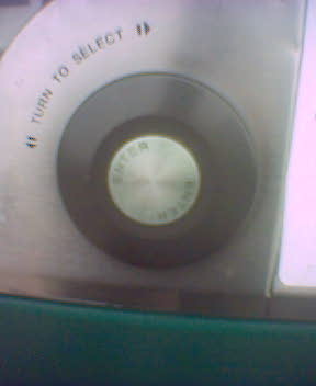
Bottom left of screen is a metallic cancel button. Bottom right is a large (2.5″ diameter) rubber wheel, with a metal button in the middle of it. You turn the wheel to select things on screen, hit the center button to select. It’s weatherproof, it’s durable, it’s easy to maintain, and doesn’t lead to the whole “hitting the wrong thing” problem that touchscreens have. Sure, it’s entirely cobbled from an iPod, but it’s interesting to see that piece of consumer design reinterpreted on a more industrial level.

That’s the wheel in the bottom right.
Chris | 24 Apr 2004
I’m not sure which came first – I suspect the ticket machine. Tramlink opened in 2000, iPod arrived in 2001. Many public transport systems have rotate and click interfaces for ticket machines, such as the Paris Metro, which has a scroll cylinder, OK and cancel buttons:
http://blanche.paris.iufm.fr/jaidixans/Paris/deplacer/Ticket/ticket.htm